Industry

Industry

Healthcare

Healthcare

Scope

Scope

UX/UI Design & Design

UX/UI Design & Design

Timeline

Timeline

4 Weeks

4 Weeks

Mobile mockups
Mobile mockups

The Challenge

The Challenge

Booking a doctor appointment should be straightforward. Unclear information can make patients hesitate before confirming an appointment.
Healthora needed a more transparent booking experience. Patients struggled to find the right doctor, understand consultation fees, and know which appointment slots were actually available.
Mobile mockups
frustrated woman looking at her smartphone
Mam

Our Approach

Our Approach

We designed the booking journey around three simple steps:
Red, purple, and black gradient
Find

01

Overhead view of a man sitting at a wooden table looking up while working on his laptop
Choose

02

Overhead view of a man sitting at a wooden table looking up while working on his laptop
Book

03

Overhead view of a man sitting at a wooden table looking up while working on his laptop
Red, purple, and black gradient

Find

01

Overhead view of a man sitting at a wooden table looking up while working on his laptop

Choose

02

Overhead view of a man sitting at a wooden table looking up while working on his laptop

Book

03

Overhead view of a man sitting at a wooden table looking up while working on his laptop
Red, purple, and black gradient

Find

01

Overhead view of a man sitting at a wooden table looking up while working on his laptop

Choose

02

Overhead view of a man sitting at a wooden table looking up while working on his laptop

Book

03

Overhead view of a man sitting at a wooden table looking up while working on his laptop
The focus was on reducing unnecessary decisions. We surfaced important information at the right time, giving patients greater confidence before confirming an appointment.
  • rol 01
  • rol 02

The Solution

The Solution

mobile mockup
Image
Smarter Doctor Discovery

Smarter Doctor Discovery

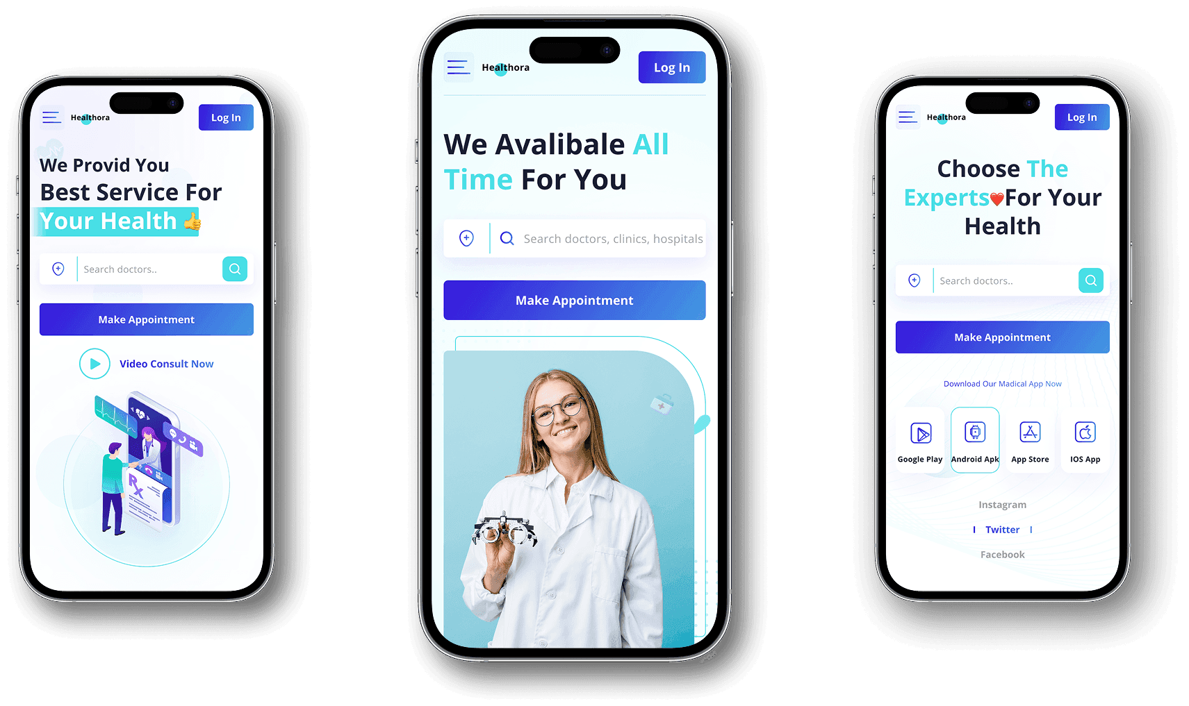
We introduced intuitive filters to help patients narrow down doctors based on relevant criteria and find suitable options faster.

We introduced intuitive filters to help patients narrow down doctors based on relevant criteria and find suitable options faster.

Image
Transparent Booking Flow

Transparent Booking Flow

We designed a focused 3-step booking journey that keeps appointment selection and confirmation simple while making key details visible throughout the process.

We designed a focused 3-step booking journey that keeps appointment selection and confirmation simple while making key details visible throughout the process.

Image
Clear Doctor Information

Clear Doctor Information

Doctor profiles were structured to make essential information easier to scan. This includes expertise, ratings, availability, and consultation details.

Doctor profiles were structured to make essential information easier to scan. This includes expertise, ratings, availability, and consultation details.

Image
Patient Dashboard

Patient Dashboard

A dedicated dashboard gives patients a central place to manage their appointments and stay connected with their booking activity.

A dedicated dashboard gives patients a central place to manage their appointments and stay connected with their booking activity.

Mobile mockups
Mobile mockups

Design System

Hex | 49DFE5

Hex | EFEFEF

Hex | EFEFEF

Hex | 171C33

SVG icon image
SVG font image
SVG font image

Regular

Medium

Bold

wireframes Mobile mockups
mockups Logo

The Outcome

The Outcome

Healthora transforms doctor appointment booking into a clearer and more predictable experience.
By combining smarter discovery, transparent doctor information, visible availability, and a streamlined booking flow, we designed an experience that helps patients move from finding a doctor to confirming an appointment with less friction.