UI/UX Design
By

Abhinav Sharma


Hi there. Meet Sam. Sam is a curious college student who loves technology, but doesn't really know much about how things are designed on apps and websites. One day, Sam's best friend showed them a clunky old website. It was hard to read. Buttons didn't work properly, and the colors hurt Sam's eyes. Sam said, "Why is this website so bad?"
Seeing how frustrating a poorly made website could be made Sam wonder how these issues get fixed. He discovered that websites undergo a constant process of UX Optimization to improve how people interact with them, ensuring that everything runs smoothly and makes sense to the user.
Sam started doing research online trying to understand how websites are designed and how they can improve. That's when Sam stumbled into the exciting world of UI and UX. Let's go on a journey with Sam to find out what UIUX is and why it's so important.
What is UI?
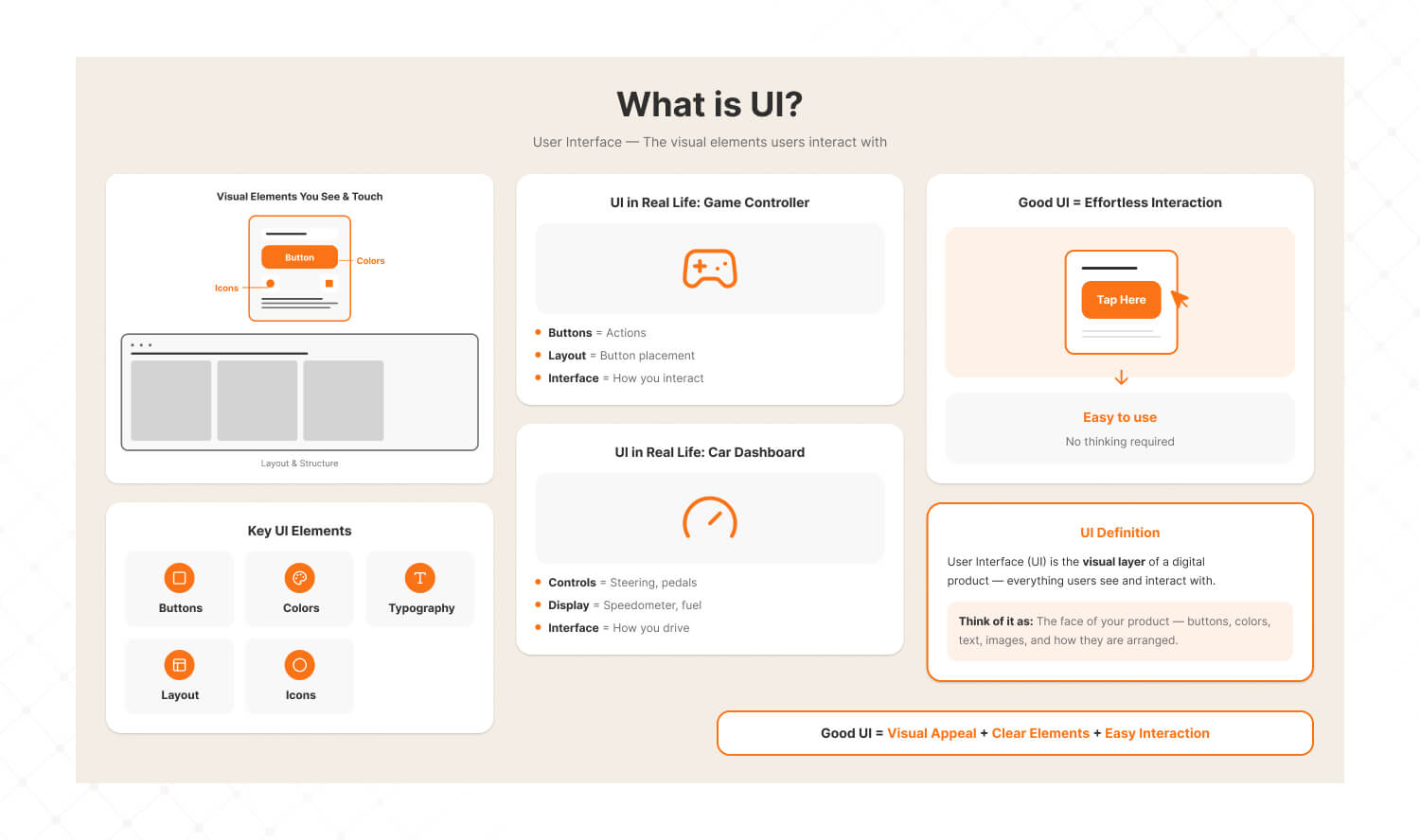
Sam learned that UI stands for user interface. It's what you see on a screen, buttons, colors, text, and layout. Think of it like the controls on a video game or the dashboard of a car. If the interface is well designed, you know exactly where to press or click without even thinking about it.
What is UX?
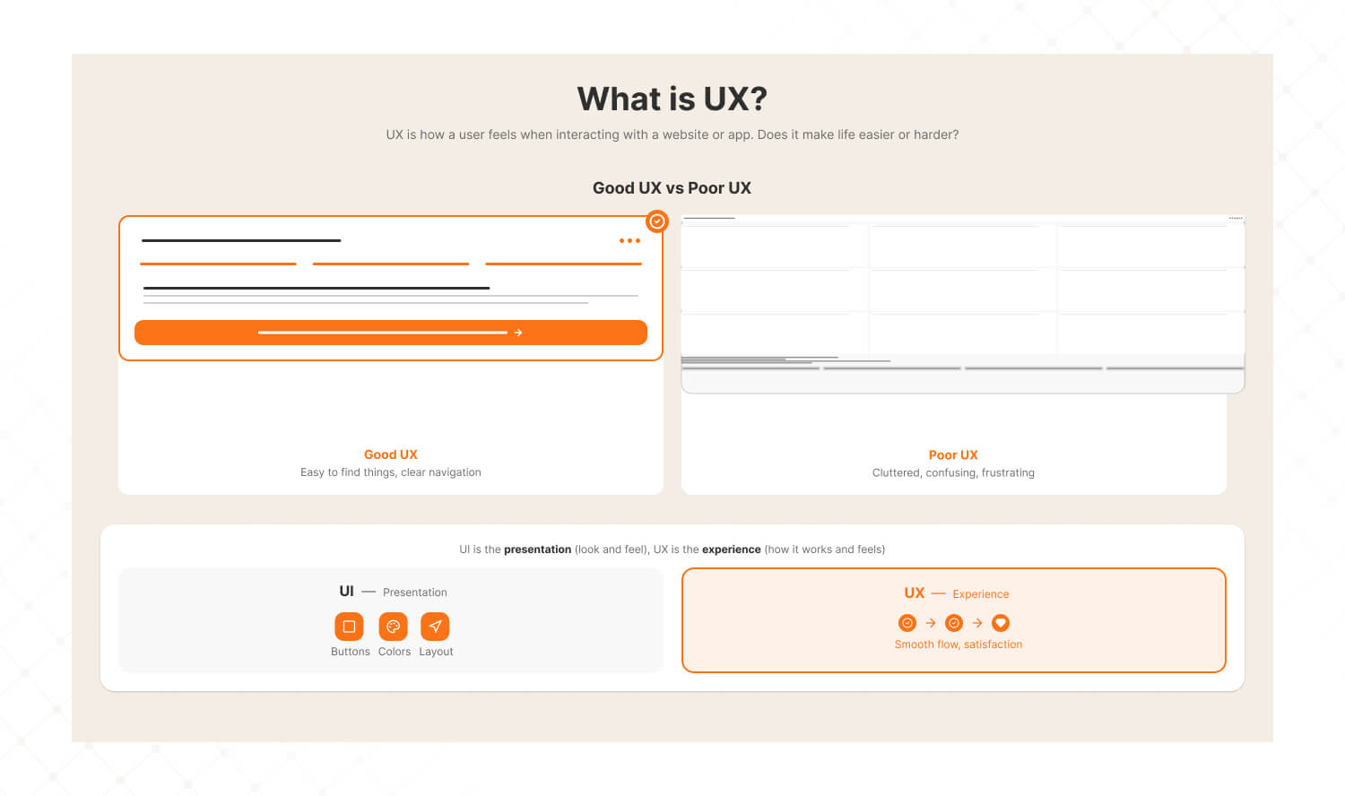
UX, on the other hand, stands for user experience. It's all about how you feel when using a website or an app. Does it make your life easier or harder?
For example, if you can easily find what you're looking for, the UX is good. If you feel confused or frustrated, the UX isn't doing its job.
Together, UI and UX are like the perfect recipe. UI is the presentation, the look and feel, while UX is the flavor, making sure the whole experience is enjoyable and effective.
Sam’s App Idea
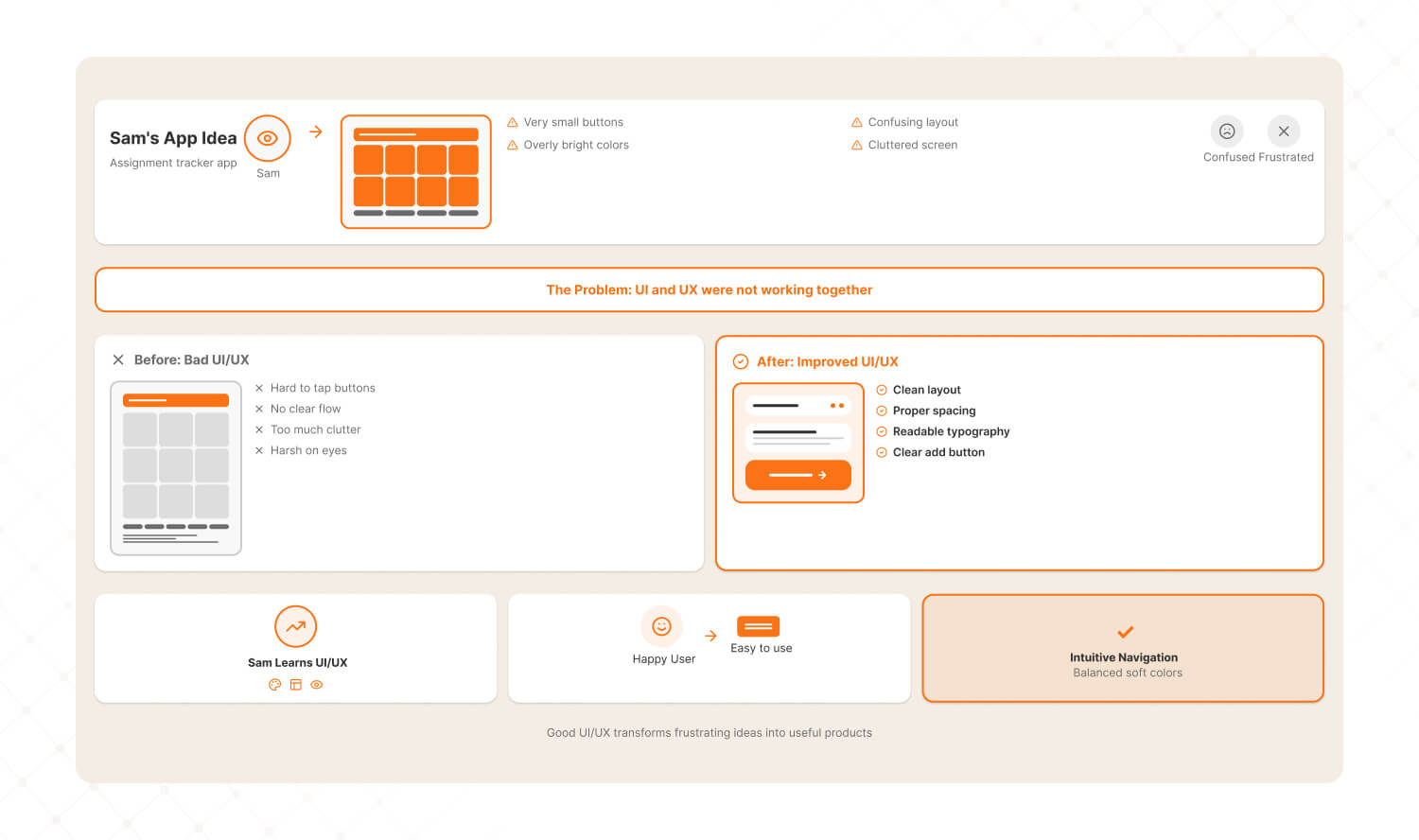
Sam had an idea for an app that helps students organize their homework. But every time they showed the app design to their friends, the feedback was disappointing.
The buttons were too small to tap. Nobody could figure out where to add assignments. The colors were so bright that it hurt their eyes. The app felt messy, like too much was happening on one screen.
Sam realized something important. The way the app looked, UI, and the way it worked, UX, weren't right. That's when Sam decided to dive into the world of UIUX to fix it.
Step 1: Understanding User Needs
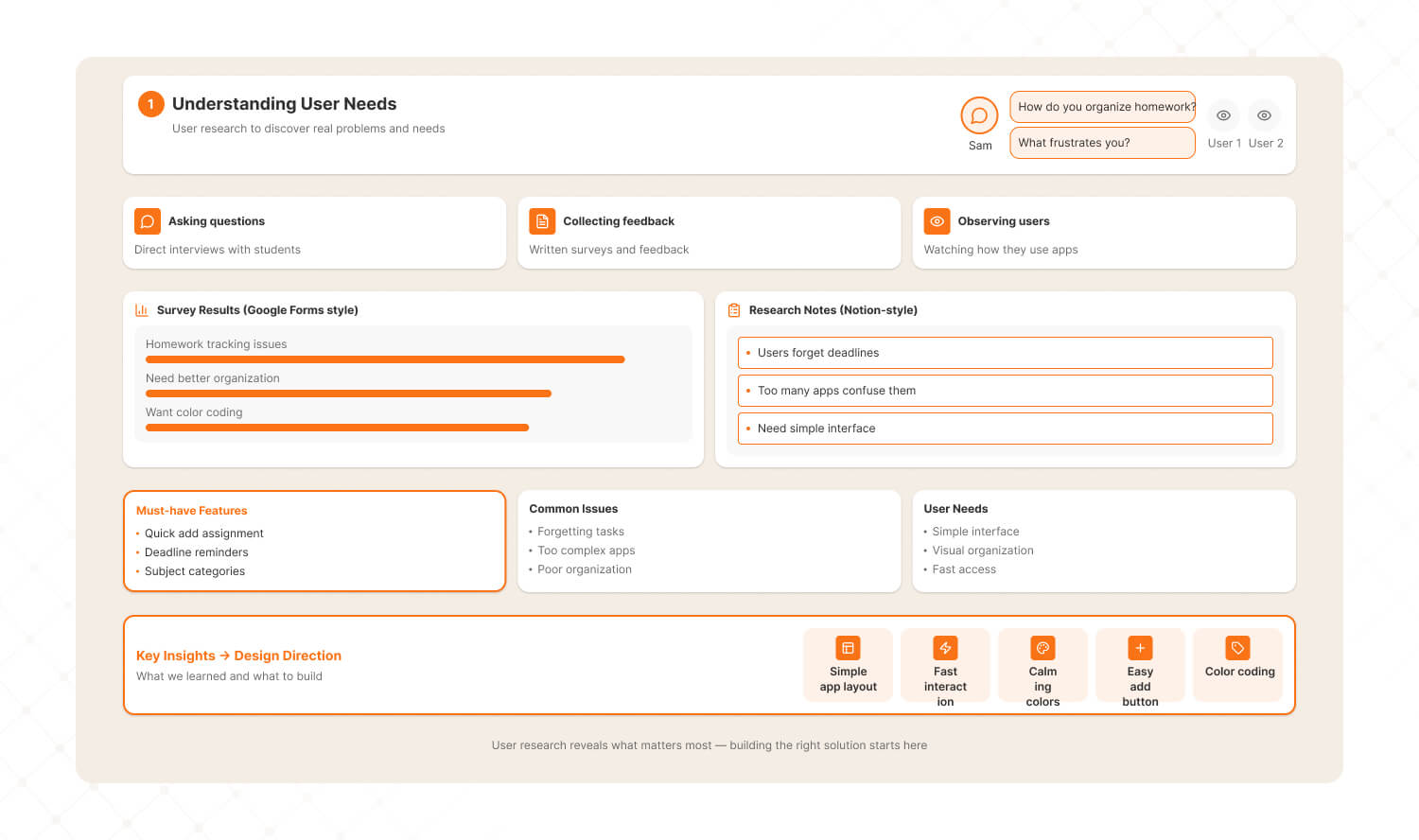
Sam realized that to create a great homework organization app, they needed to start by understanding what users truly wanted.
Instead of guessing, Sam decided to talk to their friends, asking them questions like:
· "How do you currently organize your homework?"
· "What frustrates you about it?"
They also observed their friends using similar apps to see what worked well and what didn't.
To make this process easier, Sam used tools like Google Forms to create surveys and collect feedback and notion to organize the responses into categories like must-have features and common issues.
By the end of this research, Sam discovered that users wanted an app that was simple, fast, and visually calming with features like an easy way to add assignments and a color coding system for subjects.
Step 2: Wireframing
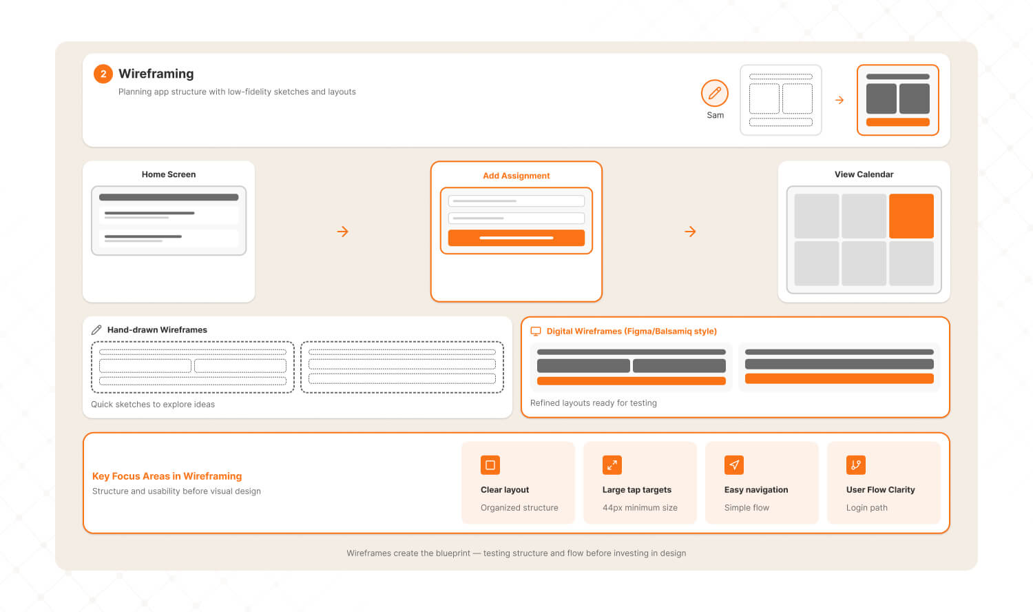
With a clear understanding of user needs, Sam moved on to sketching a plan for the app.
This stage, called wireframing, was all about creating a basic outline of the app's structure without worrying about colors or details.
Sam drew a rough sketch of the home screen, ensuring it had large, clear buttons for essential actions like add assignment and view calendar. They also planned a smooth navigation flow so users could easily move from one screen to another without feeling lost.
To bring these sketches to life, Sam used tools like Figma, a beginner-friendly tool for creating digital wireframes, and Balsami, which allowed them to brainstorm quickly with hand drawn style designs.
This step helped Sam focus on the app's structure and how users would interact with it.
Step 3: Visual Design
Once the wireframes were ready, it was time to think about how the app would look.
This stage, called visual design, was about choosing colors, fonts, and icons that would make the app visually appealing and user friendly.
Sam selected soft pastel colors to create a calming vibe and picked clean, simple fonts that were easy to read, even on small screens. To make the app more intuitive, they added friendly, recognizable icons such as a calendar icon for the view calendar button.
Sam relied on tools like Canva to experiment with different visual styles and create mood boards and coolers to generate harmonious color schemes.
This step ensured the app looked professional and consistent while being pleasant to use.
Step 4: Information Architecture
While the app's design was taking shape, Sam noticed that users had trouble finding what they needed in the earlier version.
To fix this, they focused on information architecture, which involves organizing the app's screens logically.
Sam mapped out the flow of the app so that the home screen offered two clear options, add assignment and view calendar, while less frequently used actions like settings were tucked into a drop- down menu.
To visualize this flow, Sam used Miro, a digital whiteboard tool that helped them create a clear and logical layout.
This organization made it easier for users to find what they were looking for without feeling overwhelmed.
Step 5: Usability Testing
Finally, with a fully designed app, Sam needed to make sure it worked well in real world use.
This step, called usability testing, involved giving the app prototype to their friends and observing how they interacted with it.
Sam gathered valuable feedback such as suggestions to make the save button bigger and requests for a color coding feature to organize assignments by subject.
To facilitate this testing, Sam used tools like Maze, which provided detailed reports on how users navigated the app, and Zoom to record their friends interactions.
Based on this feedback, Sam made the necessary changes and tested the app again.
After several iterations, users found the app simple, intuitive, and effective.
Final Result
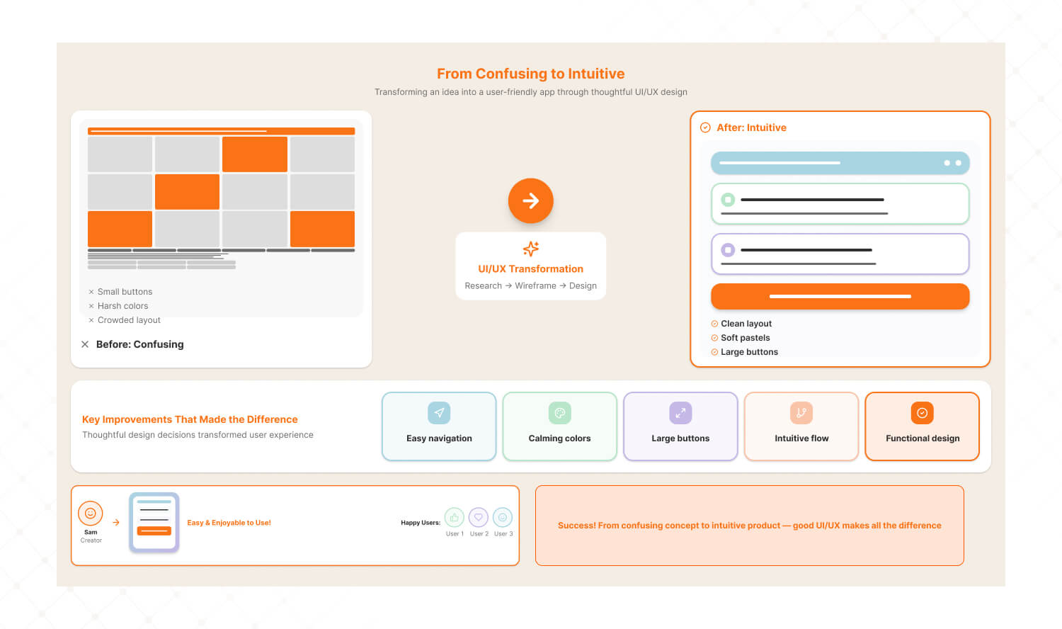
After following these steps and using these tools, Sam's app transformed.
What was once a confusing and cluttered design became a user friendly, visually appealing, and highly functional app.
Sam's friends now found it super easy to organize their homework. They loved the intuitive flow, the calming colors, and the big clear buttons.
By understanding user needs, creating wireframes, designing thoughtfully, and testing the app, Sam turned their idea into something truly useful.
This is the power of UIUX. It helps solve real problems and creates designs that people love to use.
Quiz
Which tool is best for creating wireframes and app designs?
Google Forms
Figma
Canva
Maze
Let us know your answer in the comments below, and three lucky winners will get a chance to win an Amazon voucher.
We hope that you enjoyed this video and found it informative and exciting. If yes, then we would appreciate a thumbs up, a gentle reminder to get subscribed to The Mad Brains and click that bell icon to never miss any updates from The Mad Brains.
Credit by Simplilearn
Last updated:
Abhinav Sharma
Founder & CEO | Enterprise UX & Growth Strategy
Abhinav Sharma is the Co-Founder & CEO of Mad Brains, specializing in enterprise UX audits, conversion-focused product design, and high-impact experience systems. He helps SaaS, healthcare, and fintech companies reduce usability risk, increase conversions, and build scalable, user-centered platforms.


