UX Audit
Healthcare UI UX Design That Doesn’t Kill Patients: Why a $427B Industry Still Scores F on Usability
By

Abhinav Sharma


TL;DR — Key Takeaways
✓ Healthcare UI UX design isn’t about pretty interfaces — it’s about patient safety. EHRs scored 45/100 (Grade F) on the System Usability Scale across 30,000 US physicians.
✓ Nearly 50% of US physicians experience burnout driven by inefficient EHR design, and 75% of burned-out doctors cite the EHR as the source.
✓ The FDA has recalled 50+ medical devices for usability failures in just five years. “Use error” is design failure, not user failure.
✓ Patient portal adoption averages 20–30% in the real world — billions spent building tools nobody uses.
✓ Every $1 invested in UX returns $100 (Forrester). In healthcare, the ROI includes something money can’t buy: patient lives.
Here’s a number that should keep every health-tech founder awake at night: the digital health market hit $427 billion in 2025 and is racing toward $1 trillion by 2034. Healthcare organizations are spending more on digital tools than almost any other industry on the planet.
And yet.
When 30,000 US physicians rated the usability of the Electronic Health Records they use every day, the average score was 45 out of 100 — a Grade F on the System Usability Scale. That’s not a rounding error. That’s the most critical software in the most life-critical industry on earth performing worse than a first-generation smartphone app.
This guide breaks down why healthcare UI UX design is failing, what it costs in patient safety, clinician burnout, and wasted investment — and the audit-first framework that fixes it without adding another layer of technology to an already-overwhelmed system.
What Does Healthcare UI UX Design Actually Mean (and Why Should You Care)?
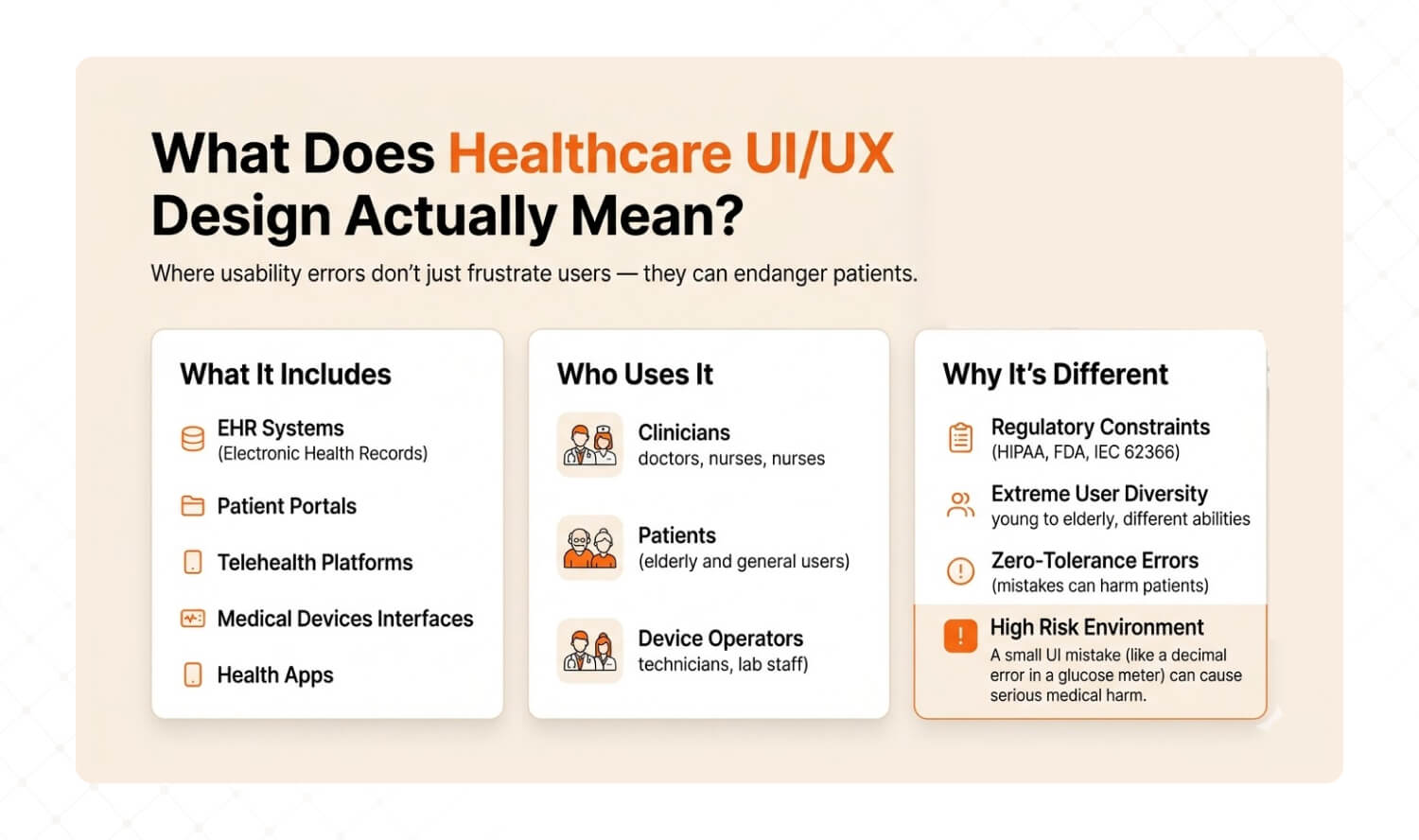
Answer: Healthcare UI UX design is the discipline of designing digital interfaces — EHRs, patient portals, telehealth platforms, medical devices, and health apps — where usability errors don’t just frustrate users, they endanger patients. It encompasses three user groups (clinicians, patients, device operators) and operates under regulatory constraints (HIPAA, FDA, IEC 62366) that don’t exist in consumer tech. |
Let’s clarify what we’re talking about, because “healthcare UI UX design” gets confused with two very different things. There’s designing health-themed marketing websites (low stakes), and there’s designing the interfaces that clinicians, patients, and device operators use to deliver, receive, and monitor care (life-or-death stakes).
This guide is about the second.
Healthcare UX sits at the intersection of three forces that don’t exist in consumer tech: regulatory compliance (HIPAA, FDA Human Factors guidance, IEC 62366), extreme user diversity (a 28-year-old nurse, a 72-year-old patient with macular degeneration, and a technician wearing surgical gloves all use the same system), and zero-tolerance error environments (a misread decimal point on a glucose meter sent patients into diabetic comas — and triggered an FDA recall).
Dimension | Consumer UX | Healthcare UX |
Stakes of error | User frustration, lost sale | Patient harm, regulatory recall, death |
Regulatory burden | Minimal (GDPR/privacy) | HIPAA, FDA HFE, IEC 62366, EU MDR Annex I |
User diversity | Demographics and preferences | Clinicians, patients, caregivers, technicians — across ages, abilities, stress levels |
Error tolerance | Ship fast, patch later | Every error must be anticipated, designed out, and validated before launch |
Validation requirement | A/B test and iterate | Formal usability validation testing with representative users in realistic conditions |
Cost of redesign | Sprint cycle | $200K+ regulatory resubmission if post-market |
Product leaders care about healthcare UX because it drives three business outcomes: clinician adoption (and thus contract renewal for B2B health-tech), patient engagement (and thus outcomes data that drives payor partnerships), and regulatory clearance speed (usability validation failures delay market entry by 6–18 months). According to Forrester, every $1 invested in UX returns $100. In healthcare, the ROI includes something money can’t measure: lives.
Why Does Healthcare UX Score F on Usability?
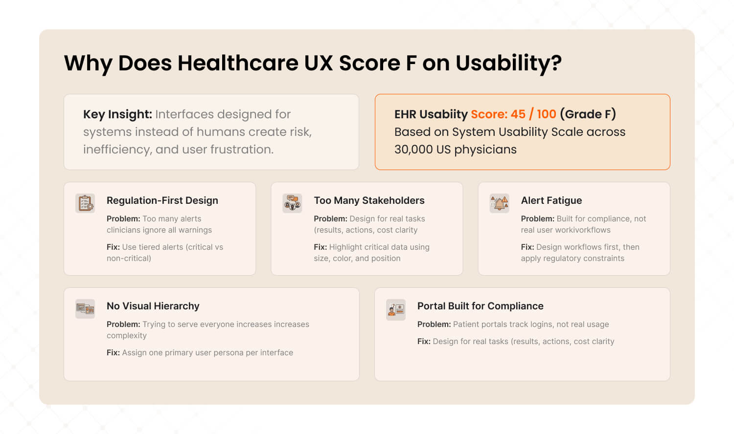
Answer: EHRs scored 45 out of 100 (Grade F) on the System Usability Scale across 30,000 US physicians. Five root causes drive this: regulation-first design that ignores users, too many stakeholders with no single advocate, alert fatigue that trains clinicians to click past warnings, data-dense screens with no visual hierarchy, and patient portals built for activation metrics instead of actual use. |
Here are the five root causes we see when auditing healthcare digital products — and the specific fix for each.
1. Regulation-First, User-Second Design
Most healthcare software is built to pass compliance checkboxes, not to serve the humans using it. The result: interfaces that technically meet HIPAA and FDA requirements but are functionally unusable. Clinicians averaged 1.4 task switches per minute inside EHR systems according to a 2025 PMC scoping review — not because clinicians are scattered, but because the interface forces constant context-switching between disconnected screens.
The fix: Design for the user workflow first, then map compliance requirements onto that workflow. Regulation shouldn’t dictate the interface architecture — it should constrain it.
How to diagnose it: Ask your clinical users: “How many screens do you touch to complete your most common task?” If the answer is more than 3, your interface is built for the regulator, not the clinician.
2. Too Many Stakeholders, No Single User Advocate
Healthcare products serve clinicians, patients, administrators, IT teams, compliance officers, and billing departments. When everyone’s needs are “considered,” nobody’s needs are prioritized. The interface becomes a compromise that satisfies no one. Features accumulate. Navigation deepens. Cognitive load climbs.
The fix: Assign a single user advocate per user group. Each interface should have one primary persona whose workflow is protected from feature creep. Other stakeholders get secondary views, not primary real estate.
How to diagnose it: Open your product’s main dashboard. Count the number of features visible without scrolling. If it’s above 7, your interface is trying to serve everyone and serving no one.
3. Alert Fatigue: Endless Notifications Nobody Reads
EHR alert systems were designed with good intentions — drug interactions, allergy warnings, safety flags. But the overwhelming majority of alerts are clinically inconsequential. The result: clinicians learn to click past every alert, including the critical ones. It’s the “boy who cried wolf” at scale, and it directly threatens patient safety.
The fix: Implement tiered alert severity. Hard-stop alerts for genuinely life-threatening interactions (requiring documented override). Soft warnings for moderate risks. And silence the noise — remove or downgrade alerts that clinicians override more than 90% of the time.
How to diagnose it: Pull your alert override rate. If clinicians are dismissing more than 80% of alerts without reading them, your alert system is actively training them to ignore danger.
4. Data-Dense Screens With No Visual Hierarchy
Healthcare interfaces cram extraordinary amounts of data onto single screens — lab results, vitals, medication lists, care plans, notes, imaging links — with minimal visual differentiation. Everything looks equally important, which means nothing looks important. Research from MedStar Health found that approximately 40% of EHRs have health harm potential rooted in interface design flaws, including a system that silently removed a decimal point from medication dosages, multiplying the prescribed dose tenfold.
The fix: Apply visual hierarchy ruthlessly. Critical values (abnormal labs, active allergies, urgent tasks) get color, size, and position priority. Secondary information goes one click deep, not one scroll down. Design for the 80/20 rule: the 20% of data clinicians need 80% of the time should dominate the screen.
How to diagnose it: Show a screenshot of your main clinical screen to a non-clinical person for 5 seconds. Ask them: “What’s the most important thing here?” If they can’t answer, your visual hierarchy is failing.
5. Patient Portals Built for Activation, Not for Actual Use
Most patient portals exist because of the 21st Century Cures Act — regulatory mandates for data access, not genuine user needs. Organizations measure portal “success” by login counts, not by task completion or health outcomes. The result: real-world patient portal adoption hovers around 20–30% according to US meta-analyses, and even among adopters, usage is episodic and shallow.
The fix: Redesign portals around patient tasks, not data dumps. Patients don’t want to “access their records” — they want to know what their lab results mean, whether they need to do anything, and how much their next visit will cost. Design for those three questions.
How to diagnose it: Track task completion rates on your portal, not just logins. If fewer than 40% of logged-in users complete a meaningful action (scheduling, messaging, reviewing results with next steps), your portal is a compliance artifact, not a patient tool.

What Happens When Healthcare UX Fails?
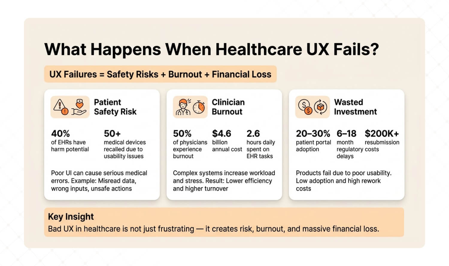
Answer: Healthcare UX failures create three cascading consequences: patient safety events (40% of EHRs have harm potential, FDA recalled 50+ devices for usability), clinician burnout (50% of physicians burn out from EHR design, costing US healthcare $4.6 billion annually in turnover), and wasted investment (portals nobody uses, regulatory delays from failed usability validation). |
Patient Safety: When the Interface Becomes the Hazard
This isn’t theoretical. A glucose meter with poor UI contrast caused patients to misread their blood sugar levels. Several ended up in diabetic comas or required hospitalization. The FDA recalled the device and forced manufacturers to increase contrast, enlarge decimal displays, and lock measurement units. In just five years, the FDA recalled over 50 devices due to usability failures — including interfaces that reversed left/right body sides and misconnected components in surgical equipment.
The FDA’s position is clear: “use error” is not user error. It’s design failure.
Clinician Burnout: The $4.6 Billion UX Problem
2025 research found that nearly 50% of US physicians experience burnout directly tied to inefficient EHR design. Excessive clicks, long forms, data loss, and fragmented workflows are the proxies for what’s really happening: software designed without regard for how clinicians actually work. Physicians spend an average of 2.6 hours daily on clerical EHR tasks — equivalent to the time needed to see nine additional patients.
One review study went further: 75% of physicians with burnout symptoms cite the EHR as the source. Burnout drives turnover, and physician turnover costs US healthcare an estimated $4.6 billion annually. That’s not a technology problem. It’s a user experience problem with a billion-dollar price tag.
Wasted Investment: Building What Nobody Uses
Beyond patient safety and burnout, bad healthcare UX destroys ROI. Patient portals with 20–30% real-world adoption represent millions in development cost serving a fraction of the population. Medical device companies that fail usability validation testing face 6–18 month regulatory delays and $200K+ resubmission costs. Telehealth platforms with high abandonment rates lose the patients who need remote care most — elderly, rural, and chronically ill users.
The pattern is always the same: build first, discover usability problems after launch, then spend 3x the original budget trying to fix what should have been diagnosed before a single line of code was written.
How Do You Audit Healthcare UI UX Before Building Anything New?
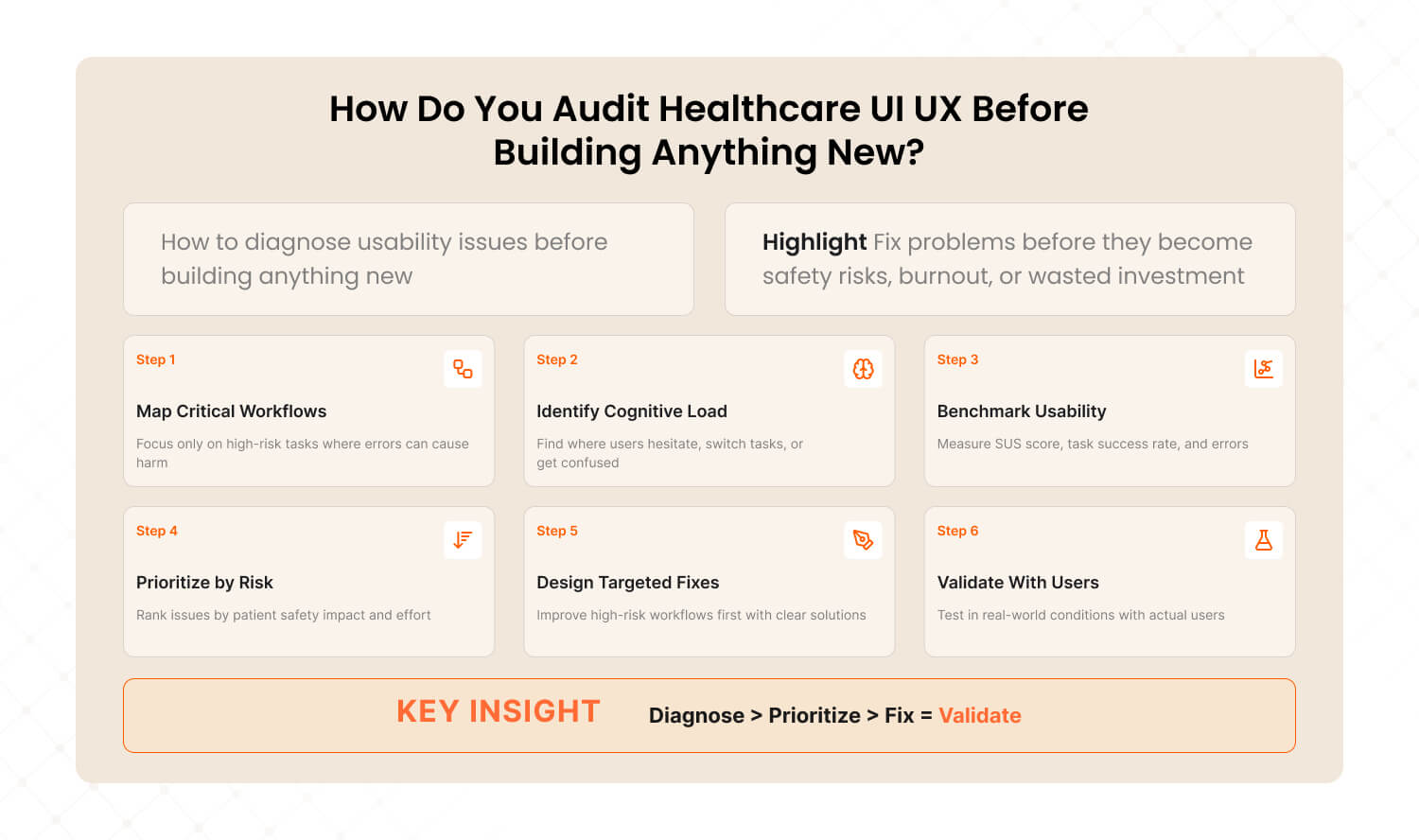
Answer: The Healthcare UX Audit Framework diagnoses usability problems before they become patient safety events, regulatory failures, or wasted investment. Six steps: map critical workflows, identify cognitive load hotspots, benchmark against usability standards, prioritize by safety impact, design fixes for highest-risk workflows first, and validate with real users in realistic conditions. |
After auditing digital products across SaaS, e-commerce, and enterprise platforms, we’ve adapted our methodology for healthcare’s unique constraints: regulatory requirements, multi-stakeholder environments, and zero-tolerance error contexts. We call it The Healthcare UX Audit Framework — the same diagnostic approach that achieved a 72% conversion lift for Barbeque Nation and a 38.6% bounce rate reduction for JustWravel, adapted for environments where the cost of poor UX isn’t a lost sale — it’s a harmed patient.
Step 1: Map Critical Workflows (Not All Workflows)
In consumer UX, you optimize every workflow. In healthcare, you start with the workflows where errors cause harm. The FDA defines a critical task as “a user task which, if performed incorrectly or not performed at all, would or could cause serious harm.” Identify these first. Everything else is secondary.
How to execute: Interview 5–10 clinicians. Ask: “Which task in this system makes you most nervous about making a mistake?” The answers reveal your critical workflow map.
Step 2: Identify Cognitive Load Hotspots
Cognitive load hotspots are the moments where users switch tasks, lose context, or encounter decision fatigue. In healthcare, clinicians average 1.4 task switches per minute inside EHR systems. Each switch is a potential error point. Map where they happen and why.
How to execute: Shadow 3 clinicians for 2 hours each. Mark every moment they hesitate, backtrack, or say “wait, where was I?” Those moments are your redesign targets.
Step 3: Benchmark Against Usability Standards
Run System Usability Scale (SUS) scoring on your top 3 workflows. The industry average for EHRs is 45 (Grade F). A score of 68 is considered “acceptable.” Anything below 50 represents a usability emergency. Also measure task completion rate (should be 90%+ for critical tasks), error rate, and time-on-task.
How to execute: Recruit 10–15 representative users. Give them the 5 most common tasks. Measure completion rate, error count, and satisfaction. Compare against SUS benchmarks.
Step 4: Prioritize by Patient Safety Impact × Implementation Effort
Not every usability problem needs immediate attention. Plot findings on a 2×2 matrix: Patient Safety Impact (high/low) × Implementation Effort (high/low). Fix high-impact, low-effort items first. These are your “quick wins” that reduce risk while you plan the larger redesign.
Low Implementation Effort | High Implementation Effort | |
High Safety Impact | FIX NOW — Highest priority. Low cost, high risk reduction. Alert hierarchy, visual contrast, confirmation steps for critical actions. | PLAN & RESOURCE — Important but complex. Navigation redesign, workflow restructuring, role-specific interfaces. Schedule in next sprint cycle. |
Low Safety Impact | QUICK IMPROVEMENT — Easy wins for satisfaction. Cosmetic fixes, better labels, faster load times. Handle during regular maintenance. | DEPRIORITIZE — Low safety value, high cost. Backlog for future consideration. Don’t let these consume resources needed for critical fixes. |
Step 5: Design Fixes for the Highest-Risk Workflows First
Start with the critical tasks from Step 1 that scored worst in Step 3 and sit in the top-left quadrant of Step 4. Design specific interventions: confirmation steps for irreversible actions, visual hierarchy improvements for data-dense screens, role-specific default views to reduce cognitive load.
How to execute: Prototype fixes for the top 3 critical issues. Test each prototype with 5 representative users before committing to development. If the prototype doesn’t reduce errors by at least 50%, iterate before building.
Step 6: Validate With Real Users in Realistic Conditions
This is where healthcare UX diverges most from consumer UX. The FDA requires usability validation testing under conditions that simulate actual use — including distractions, protective gear, lighting variations, and multiple user types. This isn’t a usability lab with eye-tracking. It’s a nurse wearing gloves in a noisy ward trying to enter medication data during a shift change.
How to execute: Run summative usability testing with 15+ representative users per user group, performing all critical tasks in simulated use environments. Document every use error, near-miss, and difficulty. This data feeds your regulatory submission and your next design iteration.
This is the same diagnostic methodology we applied to Barbeque Nation, where we identified 12 friction points in the booking flow, found that forced account creation was blocking conversions, and streamlined the experience to 2 steps — resulting in a 72% conversion lift and 31,000+ new visitors. The approach works the same way in healthcare: diagnose the workflow, find the friction, fix the highest-risk issues first, and validate before you ship.
Dimension | Building Without Audit | Audit-First (Healthcare UX) |
Starting point | Feature requirements from stakeholders | Critical workflow analysis from actual users |
Risk discovery | Post-launch complaints and incident reports | Pre-launch usability testing reveals risks early |
Regulatory risk | Usability validation failure delays launch 6–18 months | Iterative testing builds validation-ready evidence throughout development |
Redesign cost | 3–10x original budget for post-market fixes | 1x budget with built-in iteration |
Patient safety | Discovered through adverse events | Designed out through proactive risk mitigation |
Time to market | Faster initial launch, slower total lifecycle | Slightly longer initial timeline, dramatically faster total lifecycle |

What’s a Healthcare UI UX Design Checklist for 2026?
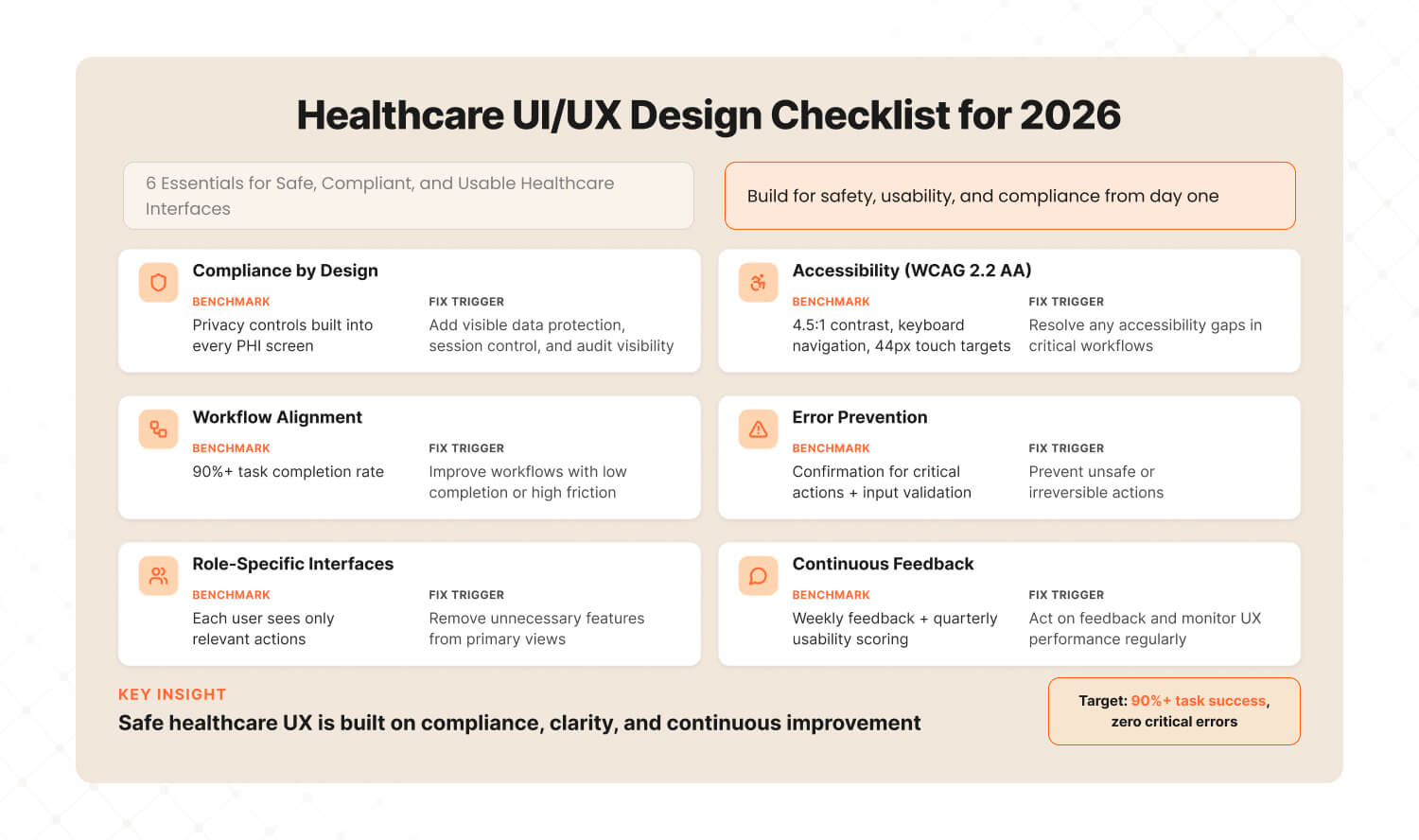
Answer: A healthcare UI UX checklist for 2026 must cover six essentials: HIPAA/GDPR compliance baked into the design layer, WCAG 2.2 AA accessibility as a minimum, clinical workflow alignment with 90%+ task completion, error prevention design for critical actions, role-specific interfaces for different user groups, and continuous usability feedback loops updated weekly — not quarterly. |
1. Compliance Baked Into Design (Not Bolted On)
Benchmark: Every screen that handles PHI (Protected Health Information) has privacy controls designed into the layout — not added as a separate settings page.
Tool: HIPAA Security Rule checklist mapped to UI elements: data visibility controls, session timeouts, audit trails visible to admins.
Fix when: Compliance is “something the backend handles” and the UI has no visible privacy indicators.
2. WCAG 2.2 AA Accessibility (Minimum)
Benchmark: All text meets 4.5:1 contrast ratio. All interactive elements reachable via keyboard. All images have alt text. Touch targets are 44px minimum.
Tool: axe DevTools for automated testing + manual keyboard navigation testing + screen reader walkthrough.
Fix when: Any critical workflow fails keyboard-only navigation or drops below 4.5:1 contrast on primary text.
3. Clinical Workflow Alignment
Benchmark: 90%+ task completion rate for the top 5 clinical workflows. Zero critical task failures in usability validation.
Tool: Task analysis for each workflow (document every step, decision point, and potential error). SUS scoring per workflow.
Fix when: Any critical workflow has completion rate below 90% or SUS score below 68.
4. Error Prevention Design
Benchmark: Every irreversible action (medication order, record deletion, permission change) requires explicit confirmation. Every critical data field has input validation and range checking.
Tool: Failure Mode and Effects Analysis (FMEA) mapped to every critical task. Design safeguards for each identified failure mode.
Fix when: Any critical action can be completed in a single click without confirmation, or any data field accepts out-of-range values without warning.
5. Role-Specific Interfaces
Benchmark: Each user group (clinician, patient, administrator) has a default view optimized for their top 3 tasks. No user group sees another group’s administrative controls by default.
Tool: User persona matrix with task-priority mapping. Validate that each persona can complete their top 3 tasks in under 3 clicks.
Fix when: A nurse sees billing controls on their main screen, or a patient sees clinical jargon without plain-language explanation.
6. Continuous Usability Feedback Loops
Benchmark: Usability feedback collected weekly from active users. SUS scoring repeated quarterly. UX audit conducted annually or after any major feature release.
Tool: In-product feedback widget (thumbs up/down on key screens) + monthly NPS per user role + quarterly SUS benchmarking.
Fix when: Last usability feedback is more than 30 days old, or NPS drops below 20 for any user role.
3 Quick Wins for Healthcare Product Teams This Week
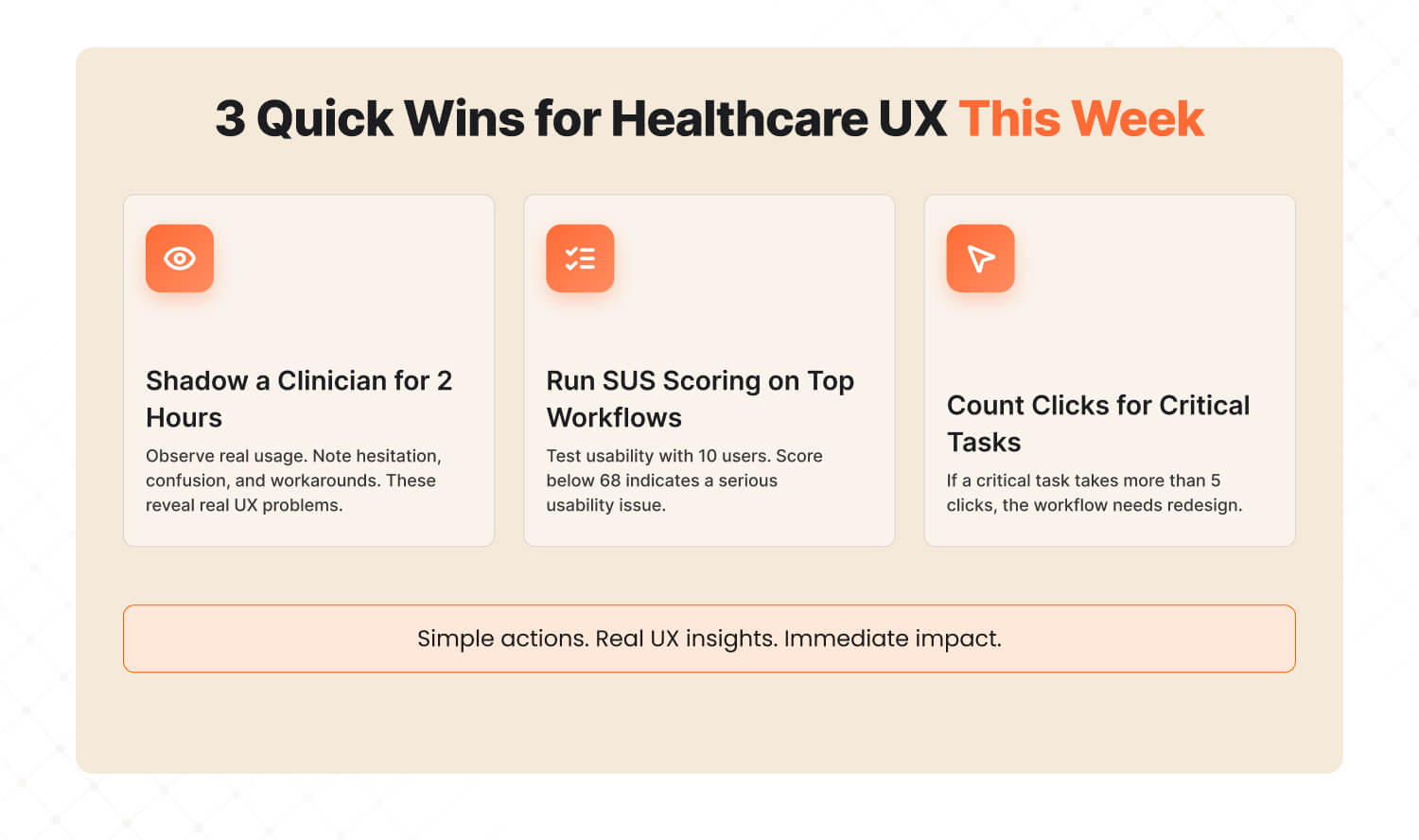
Answer: Three actions you can take this week to immediately improve healthcare UX: shadow a clinician for 2 hours and note where they fight the interface, run SUS scoring on your top 3 workflows to benchmark where you stand, and count clicks to complete a critical task — if it’s more than 5, that workflow needs redesign. |
Quick Win #1: Shadow a Clinician for 2 Hours Don’t send a survey. Don’t schedule a focus group. Sit next to a clinician and watch them use your product for 2 hours during a real shift. Note every moment they hesitate, squint at the screen, click back, switch to paper, or mutter under their breath. Those moments are your redesign priorities. Two hours of observation will teach you more about your product’s UX problems than six months of analytics dashboards. |
Quick Win #2: Run SUS Scoring on Your Top 3 Workflows The System Usability Scale takes 5 minutes to administer and gives you a benchmarkable score. Run it on your 3 most-used workflows with 10 users each. Industry average for healthcare software is 45 (Grade F). If you’re below 68, you have a usability emergency that’s costing you clinician satisfaction, patient safety, and contract renewals. If you’re above 80, you’re in the top tier — and should market that aggressively. |
Quick Win #3: Count Clicks to Complete a Critical Task Pick your product’s single most critical clinical task. Count the clicks from start to completion. Then ask: which clicks are necessary for the task, and which exist because of the interface? If total clicks exceed 5 for a critical task, that workflow needs redesign. Compare against your top competitor — if they complete the same task in fewer clicks, your clinicians know it, even if they haven’t told you yet. |
Healthcare Deserves Better Than F-Grade UX
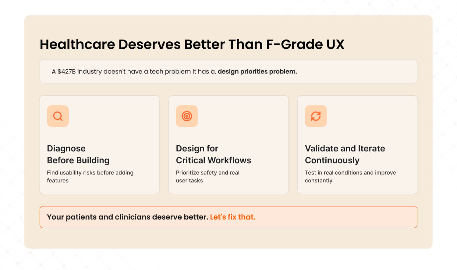
A $427 billion industry running on F-grade interfaces isn’t a technology gap. It’s a design priorities gap. The technology exists. The regulatory frameworks exist. What’s missing is the discipline to put users — clinicians, patients, and device operators — at the center of every design decision, before stakeholder wishlists and compliance checkboxes.
The organizations winning in healthcare technology in 2026 aren’t the ones with the most features. They’re the ones applying The Healthcare UX Audit Framework: diagnosing before building, designing for the critical workflow first, validating with real users in realistic conditions, and iterating continuously. Not once. Not annually. Continuously.
That’s why a subscription UI/UX model makes more sense for healthcare than traditional project-based design. Regulated environments need ongoing iteration, not one-off redesigns that become outdated the moment clinical workflows evolve or regulations change.
Your next 48 hours:
This week, run Quick Win #1. Shadow a clinician for 2 hours. Next week, bring the observations to your product team and map them against your critical task list. The friction points you witness firsthand will tell you more about your product’s usability problems than any analytics dashboard, stakeholder meeting, or competitor comparison.
If those observations reveal that your base UX needs work before new features make sense — that’s not a setback. That’s the insight that prevents the next usability recall, the next burned-out physician, the next patient portal that nobody uses.
Your patients and clinicians deserve better than F-grade interfaces. Let’s fix that.

Frequently Asked Questions
Last updated:
Abhinav Sharma
Founder & CEO | Enterprise UX & Growth Strategy
Abhinav Sharma is the Co-Founder & CEO of Mad Brains, specializing in enterprise UX audits, conversion-focused product design, and high-impact experience systems. He helps SaaS, healthcare, and fintech companies reduce usability risk, increase conversions, and build scalable, user-centered platforms.

