UX Audit
Enterprise Food App UX Audit: The Hidden Conversion Killer Costing Your Platform Millions
By

Abhinav Sharma


Enterprise Food App UX Audit: The Hidden Conversion Killer Costing Your Platform Millions
We recently wrapped a six-week UX audit for a restaurant platform doing about $50M in annual revenue. When they brought us in, they couldn't figure out why 34% of users were abandoning checkout. They had the tech. ERP integration, supply chain dashboards, real-time inventory. All the boxes checked.
The problem wasn't what they had. It was how people actually used it.
After we diagnosed and fixed the core issues, their order bookings jumped 45%. That translated to 31,000 new orders in month one.
I want to walk through what we found, because I'm seeing the same patterns across most enterprise food platforms we audit.
Why Enterprise Food Platforms Keep Losing Conversions
The online food delivery market is projected to hit $1.4 trillion in 2025. That's a staggering number, and it makes the conversion problems even more frustrating. Most enterprise food platforms serving B2B delivery, restaurant chains, and foodtech ERPs are leaving somewhere between 30-50% of potential conversions on the table.
Here's what I keep telling product teams: 80% of B2B purchasing decisions are driven by user experience, not price or product features. Yet when I look at how enterprise food platforms are built, they're consistently prioritizing feature density over whether someone can actually complete a task.
We've audited over 50 enterprise food platforms across the USA, UK, and India. The issues repeat themselves with almost predictable regularity:
Supply chain dashboards that throw so much data at users they can't find what matters. ERP integrations that create more friction than they remove. Booking flows designed by developers for developers, not for restaurant managers trying to place an order during a lunch rush. Mobile experiences that feel like they were added as an afterthought because someone said mobile mattered.
This isn't fundamentally a design problem. It's a diagnosis problem. Most teams genuinely don't know where users are dropping off, or why they're leaving.
What a UX Audit Actually Uncovers
A proper UX audit for enterprise food platforms isn't a redesign proposal. I need to be clear about that upfront. It's a conversion diagnosis. We're systematically examining every friction point between what a user wants to do and what actually happens.

B2B Food Delivery: Complexity That Kills Conversions
B2B food delivery platforms deal with challenges consumer apps don't even think about. Complex pricing tiers, multi-location ordering, regulatory compliance requirements, integration with restaurant ERPs. These aren't just features to check off a list. When implemented poorly, each one becomes a potential conversion killer.
In our audits, we see something I've started calling "feature-first design fatigue." Platforms present every possible option to users upfront instead of guiding them through the optimal path for their specific situation. A franchisee placing a routine weekly order doesn't need the same interface as someone setting up a new vendor relationship. But they're both staring at the same overwhelming screen.
Supply Chain Dashboards: Where Operations Teams Get Stuck
Restaurant supply chain dashboards are information-dense by necessity. I get that. But there's a meaningful difference between comprehensive and overwhelming, and most platforms land on the wrong side of that line.
Research shows 88% of users won't return to a site after a poor UX experience. In B2B, that lost user often has purchasing authority and the ability to switch vendors. These aren't casual browsers. They're decision-makers.
The dashboard failures we diagnose most often: no clear visual hierarchy (when everything looks equally important, nothing is), critical alerts buried under routine notifications, real-time data updating so frequently it creates anxiety rather than clarity, and export functions hidden behind multiple clicks when operators need instant access during a crisis.
ERP Integration: When Streamlining Creates Friction
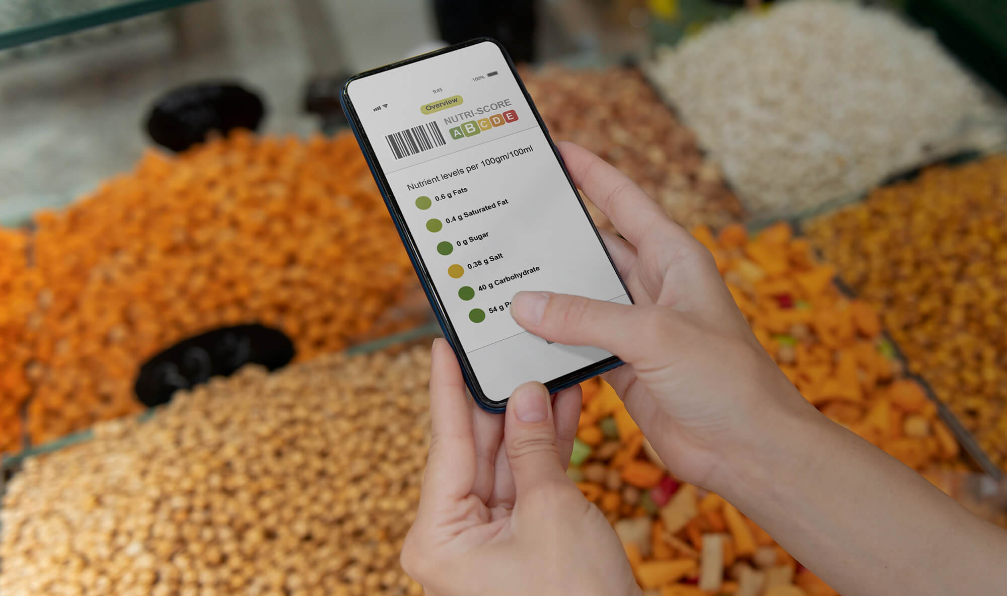
Example = convert this image according to heading and brand guideline

ERP integration is supposed to streamline operations. That's the pitch. In practice, poorly designed ERP interfaces create compliance nightmares and user resistance. I've seen restaurant management systems that require 12 clicks to process a single order. At that point, you don't have an efficiency tool. You have an expensive obstacle course.
The food and beverage wholesale industry is valued at roughly $7.2 trillion globally. Platforms serving this market can't afford to sacrifice usability for feature checklists. Yet that's exactly what most do.
Case Study: Barbeque Nation's 45% Booking Rate Increase
I want to get specific here, because generalities only go so far.
When Barbeque Nation came to us, they were a pioneer in live-grill dining with locations across India. Their in-restaurant experience was excellent. Their website wasn't matching it.
What they were seeing: High bounce rates with users leaving before engaging. Low booking rates because the table reservation process was multi-step, unintuitive, and slow. A visual disconnect between the lively dining atmosphere and the website. Poor mobile experience with misaligned elements and slow load times, which was particularly painful since over 60% of their traffic came from mobile devices.
What our audit found: The booking flow had seven unnecessary steps. Seven. Essential information like menu, offers, and outlet locations was genuinely difficult to find. Pages were cluttered with excessive text that nobody was reading. And the mobile version wasn't just unoptimized. It was actively hostile to conversions.
What we fixed: We streamlined the booking flow with step-by-step guidance and live availability updates. Redesigned the navigation architecture so users could instantly access reservations, menu, and offers. Compressed images and optimized code to cut load times in half. Built a mobile-first redesign with touch-optimized elements and clear calls to action. Enhanced accessibility with proper contrast ratios and keyboard navigation.
The results: 31,000 new orders booked in the first month. 45% increase in order booking rate. 34% reduction in bounce rate. 60% higher mobile engagement. 94% of users rated the new website as easier to use and visually appealing in post-launch surveys.
This wasn't a ground-up rebuild. We didn't throw out everything and start fresh. It was targeted optimization based on specific conversion barriers we identified through systematic analysis. That distinction matters.
What Growing Restaurant Platforms Keep Missing
When restaurant platforms scale from 10 locations to 100, UX debt compounds exponentially. I've watched it happen again and again. Features added for one region don't translate to another. Admin interfaces built for power users alienate new franchisees who just need to complete basic tasks. Mobile apps designed primarily for Android perform terribly on iOS.
Forrester's research indicates that well-thought-out UX design can raise conversion rates by up to 400%. For enterprise food platforms, that's not a nice-to-have improvement. That's the difference between market leadership and watching competitors take your customers.
A scalable restaurant platform UX review examines cross-market consistency (does your platform work equally well in Birmingham as it does in Bangalore?), user role segmentation (are franchise managers, kitchen staff, and delivery coordinators all fighting the same interface?), performance under load (does your platform maintain sub-3-second load times during peak ordering hours?), and integration coherence (do your ERP, POS, and supply chain tools feel like one system or three duct-taped together?).

The ROI Numbers
Industry research consistently shows that every $1 invested in UX can return up to $100. That's a 9,900% ROI when done right. Slow-loading websites cost businesses up to $2 billion annually in lost revenue. 88% of online users are less likely to return after a bad experience. Good UI alone can boost conversions by 200%, and strong UX can push that to 400%.
For enterprise food platforms processing thousands of orders daily, even a 10% conversion improvement translates to millions in additional revenue. The real question isn't whether you can afford a UX audit. It's whether you can afford to keep guessing about where your conversions are leaking.

What a Professional UX Audit Includes
A comprehensive UX audit isn't a checklist review. Here's what our process actually looks like:
Conversion Funnel Analysis: We map every step from landing to conversion, identifying exactly where users drop off and why.
Heuristic Evaluation: Your platform is evaluated against 400+ UX performance parameters, benchmarked against industry leaders.
User Journey Mapping: We document the actual paths users take, not the ones you designed, and identify friction points.
Mobile UX Assessment: With 80%+ of food delivery orders placed via mobile, this isn't optional.
Accessibility & Compliance Review: WCAG compliance, HIPAA considerations for healthcare food services, and regional regulatory requirements.
Prioritized Recommendations: Not a 200-page wish list, but a ranked roadmap of fixes by impact and implementation effort.
Frequently Asked Questions
What is an enterprise food app UX audit?
It's a systematic evaluation of your food platform's user experience across all touchpoints, from ordering flows and supply chain dashboards to ERP integrations and mobile interfaces. Unlike a design review, a UX audit diagnoses specific conversion barriers using data analysis, heuristic evaluation, and user journey mapping. The output is a prioritized roadmap of fixes that directly impact business metrics like booking rates, order completion, and user retention.
How long does a UX audit take?
A comprehensive enterprise food platform UX audit typically takes 2-4 weeks, depending on system complexity. This includes analysis of your web platform, mobile apps, admin dashboards, and any integrated ERP or supply chain tools. For multi-location restaurant chains or B2B food delivery platforms with complex user roles, allow 4-6 weeks for a thorough evaluation. The Barbeque Nation audit and implementation took approximately 6 weeks from diagnosis to measurable results.
What's the difference between a UX audit and a website redesign?
A UX audit identifies what's broken and why. A redesign builds something new. Many platforms jump straight to redesign without understanding their actual conversion barriers, resulting in expensive rebuilds that don't solve the real problems. We recommend auditing first. In most cases, strategic fixes based on audit findings deliver faster ROI than ground-up redesigns. Barbeque Nation wasn't a complete rebuild. It was targeted optimization based on specific audit findings.
How much does an enterprise food app UX audit cost?
Costs vary based on platform complexity, number of user flows, and depth of analysis required. For B2B food delivery platforms and restaurant chains, audits typically range from $5,000-$25,000 USD. The ROI is substantial though. Research shows every $1 invested in UX can return up to $100. For a platform losing 30% of conversions to UX issues, even a modest audit investment can translate to millions in recovered revenue. We offer a free initial consultation to scope your specific needs.
What metrics improve after a foodtech ERP UX audit?
The most common improvements we see after implementing audit recommendations include conversion rate increases of 25-45%, bounce rate reductions of 20-35%, task completion time decreases of 30-50% for admin dashboards, mobile engagement improvements of 40-60%, and support ticket reductions of 15-25% due to improved self-service UX. For Barbeque Nation specifically, we achieved a 45% increase in booking rate, 34% bounce rate reduction, and 31,000 new orders in the first month post-implementation.
Do you audit supply chain dashboards and ERP interfaces?
Yes. Supply chain dashboard UX and foodtech ERP interface optimization are core specialties. These B2B interfaces often suffer from feature-first design that prioritizes functionality over usability. We audit inventory management systems, vendor portals, order processing dashboards, and restaurant management ERPs, evaluating information hierarchy, alert systems, data visualization, and workflow efficiency. Poor ERP UX doesn't just frustrate users; it directly impacts operational efficiency and compliance.
Can you audit platforms serving multiple countries?
Absolutely. We specialize in scalable restaurant platform UX reviews for multi-market operations. This includes evaluating cross-regional consistency, localization effectiveness, payment gateway UX across different markets, and compliance with regional accessibility standards. For platforms operating in the USA, UK, and India, we assess whether your UX scales across different user expectations, connectivity conditions, and regulatory requirements.
What's included in a B2B food delivery UX optimization audit?
A B2B food delivery UX audit covers ordering portal analysis (including bulk ordering, recurring orders, and custom pricing tiers), admin dashboard evaluation, delivery tracking UX, integration touchpoints with restaurant POS and ERP systems, mobile app assessment for delivery personnel and customers, and accessibility compliance review. We benchmark against industry leaders like DoorDash, Uber Eats, and regional competitors to identify gaps and opportunities.
How do I know if my food platform needs a UX audit?
Common signs your enterprise food platform needs a UX audit include high bounce rates above 50%, low conversion rates compared to industry benchmarks (under 2% for food platforms), increasing customer support tickets about usability issues, user complaints about finding things or too many steps, mobile traffic that doesn't convert at desktop rates, and franchise or operator resistance to using your platform tools. If you're adding features but not seeing proportional growth in conversions, you likely have a UX debt problem.
What happens after the UX audit is complete?
After audit completion, you receive a detailed report with prioritized recommendations ranked by business impact and implementation effort. We walk through findings in a presentation session with your team, answering questions and discussing implementation strategy. From there, you can implement fixes with your internal team, or engage us for design and development support. Many clients choose our UI/UX subscription model for ongoing optimization based on audit findings.
Stop Guessing. Get a Diagnosis.
Your enterprise food platform isn't failing because it lacks features. It's failing because the features you have aren't working for your users.
A UX audit doesn't tell you what to build next. It tells you what's already broken and exactly how to fix it.
We've helped brands like Barbeque Nation, Tanishq, and Kotak Life transform their digital experiences. The patterns are consistent. The solutions are proven. The ROI is measurable.
Ready to know what's blocking your conversions?
→ Schedule Your Free UX Audit Call — Get a data-backed diagnosis of your platform's conversion barriers.

→ See How We Helped Barbeque Nation Increase Conversions by 45%
_____________________________________________
Related Services:
Last updated:
Abhinav Sharma
Founder & CEO | Enterprise UX & Growth Strategy
Abhinav Sharma is the Co-Founder & CEO of Mad Brains, specializing in enterprise UX audits, conversion-focused product design, and high-impact experience systems. He helps SaaS, healthcare, and fintech companies reduce usability risk, increase conversions, and build scalable, user-centered platforms.