UI/UX Design
Why Your SaaS Dashboard Is Bleeding $2 for Every $1 of New Revenue (And How UX Design Fixes It)
By

Abhinav Sharma


TL;DR: Key Takeaways
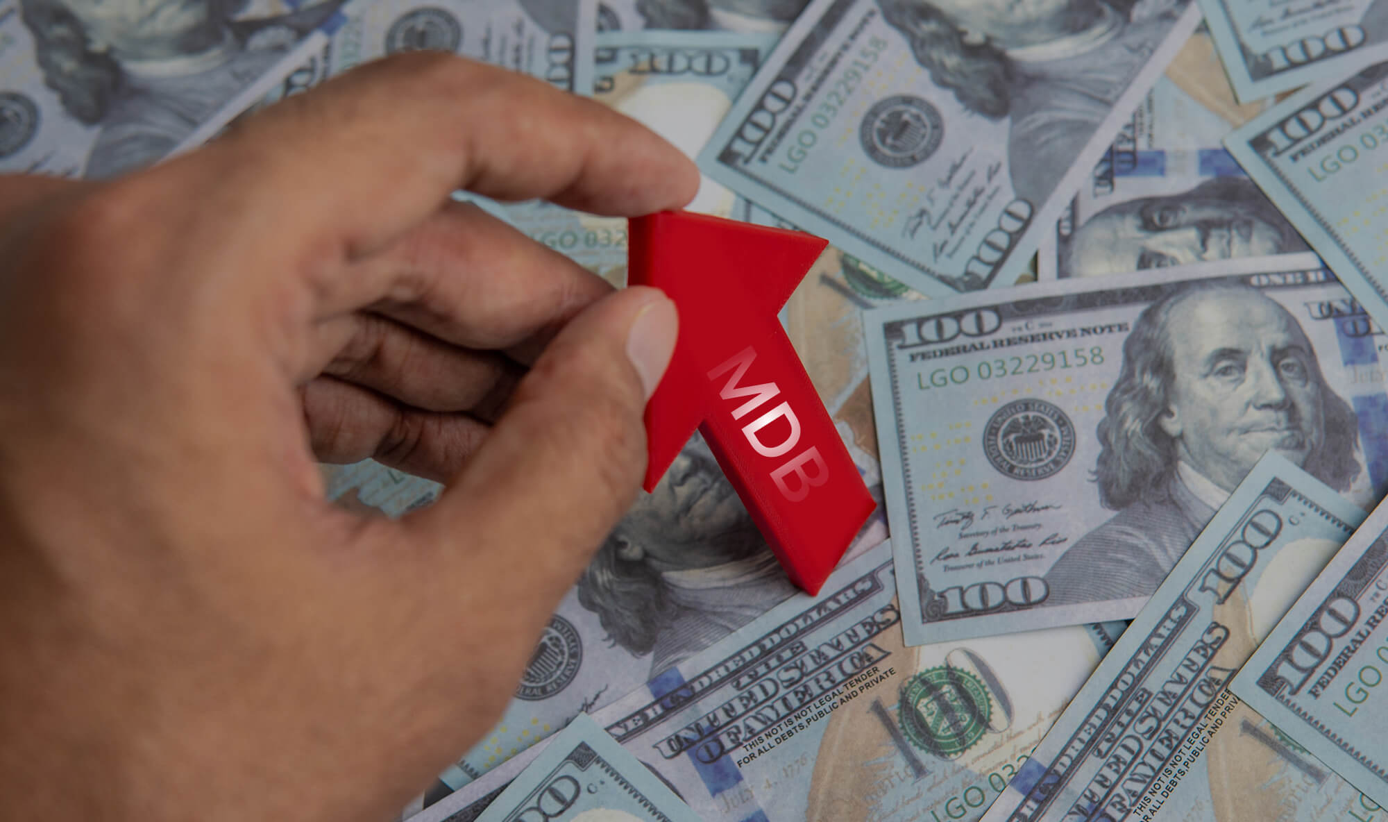
SaaS companies now spend $2 to acquire just $1 of new ARR—a 14% increase from 2024
Every $1 invested in UX design returns $100 (9,900% ROI according to Forrester)
75% of users churn in the first week due to poor onboarding and confusing dashboards
Improving user activation from 40% to 60% cuts CAC by 33%—without touching ad spend
Mad Brains helped Barbeque Nation achieve 72% conversion lift through strategic UX redesign
Last week, a SaaS founder showed us their dashboard analytics. Their CAC payback period had ballooned to 23 months. Their trial-to-paid conversion was stuck at 12%. And their support tickets? Through the roof.
The product worked. The features were solid. The market was there.
But users were bouncing within minutes of signing up.
Here's what we found after auditing their onboarding flow: 17 friction points in a 5-step process. A dashboard that looked like a cockpit from a 1990s aircraft. Empty states that made users feel lost instead of guided.
We've seen this pattern kill SaaS products. And we've seen the right UX design resurrect them.
Why Is UX Design So Critical for SaaS Platforms?
UX design directly determines whether your product makes money or burns it. For SaaS, this isn't abstract—it's the difference between a sustainable business and one hemorrhaging cash.
The numbers are brutal. According to Benchmarkit's 2025 SaaS Performance Metrics report, the median New CAC Ratio hit $2.00 in 2024—meaning companies spend $2 in sales and marketing for every $1 of new Annual Recurring Revenue. Fourth-quartile performers? They're spending $2.82.
That's not a growth strategy. That's a slow bleed.
Here's why UX is the lever most SaaS founders ignore:
Acquisition costs are climbing relentlessly. CAC has surged 222% over eight years. Privacy changes, channel saturation, and attribution challenges have made paid acquisition a money pit. You can't outspend your way to profitability anymore.
Your dashboard is where value dies—or compounds. Users who find value in their first session are 2.6x more likely to convert. But 75% of users churn within the first week because they never reach that "aha" moment. Your dashboard isn't just displaying data—it's either accelerating activation or accelerating churn.
Retention economics crush acquisition economics. Bain & Company research shows that improving customer retention by just 5% can boost profits by 25-95%. Yet only 18% of SaaS companies focus on retention—while 44% dump resources into acquisition.
The smartest SaaS operators know this: fixing your UX is the highest-leverage move you can make. It compounds every other investment in your business.
How Does Poor Dashboard UX Impact Customer Acquisition Costs?
Poor UX forces you to pay twice—once to acquire customers, and again when they churn and you have to replace them.
When users can't navigate your dashboard, three things happen simultaneously. First, your trial-to-paid conversion tanks because users never experience value. Second, your support costs spike as confused users flood your help desk. Third, your churn rate accelerates because customers who don't activate never stick around.
Each of these directly inflates your effective CAC.
Consider the math. B2B SaaS companies average a CAC of $1,200 per customer. If your activation rate is 40% and you could improve it to 60%, you've effectively cut your CAC by 33%. That's not marketing optimization—that's UX work. And it costs a fraction of what you'd spend on additional ad budget.
The research backs this up. According to Forrester, every dollar invested in UX returns $100—a 9,900% ROI. A well-designed UI can boost conversion rates by 200%, and strong UX can push that to 400%.
We see this constantly in our audits. The SaaS products struggling with CAC aren't struggling because their marketing is bad. They're struggling because users who land in their product don't know what to do next.

What Are the Most Common UX Problems in SaaS Dashboards?
Most SaaS dashboards fail in the same predictable ways. Understanding these patterns is the first step to fixing them.
Empty state disasters. A blank dashboard is a conversion killer. Research shows 84% of users who encounter empty states without contextual help abandon in their first session. Your dashboard shouldn't greet new users with a void—it should show them exactly what success looks like.
Feature overload on day one. Progressive disclosure exists for a reason. Products using it see 35% fewer support tickets during onboarding. Yet most dashboards dump every feature on users immediately, creating choice paralysis that freezes activation.
Unclear information hierarchy. Users should identify what they're looking for within 5 seconds. When everything screams for attention, nothing gets it. The result: users click around aimlessly, get frustrated, and leave.
Broken mental models. Your navigation might make perfect sense to your product team. But if it doesn't match how users think about their tasks, you've built a beautiful maze. Funnel drop-off data combined with think-aloud testing reveals whether friction comes from UI complexity or mental model mismatch.
No guidance, no progress indicators. Users want to know they're making progress. A setup flow without visual milestones feels endless. Adding progress bars and step indicators isn't cosmetic—it directly impacts completion rates.
When we audited Barbeque Nation's booking flow, we found 12 friction points crammed into just 4 steps. Users weren't failing because they didn't want to complete the action—they were failing because the path was unnecessarily complicated.

How Does UX Design Directly Reduce SaaS CAC?
Strategic UX design attacks CAC from multiple angles simultaneously. It's not a single fix—it's a system that compounds over time.
Faster time-to-value shrinks your conversion window. The quicker users experience your product's core benefit, the less nurturing they need. One SaaS company we studied found that lifting activation from 40% to 60% cut their effective CAC by 33%—without touching their ad spend.
Lower support costs free up budget. Poor UX generates tickets. Good UX prevents them. When your interface answers questions before users need to ask, your support team can focus on expansion rather than firefighting.
Improved retention reduces replacement costs. Every churned customer needs to be replaced. If your annual churn is 20%, you're spending 20% of your acquisition budget just to stay flat. UX improvements that boost retention by even 5% translate to substantial CAC relief.
Higher word-of-mouth lowers paid acquisition dependency. Users who love your product tell others. Referral-driven acquisition averages $150 CAC for B2B SaaS—versus $1,200+ for paid channels. Great UX makes your customers your best marketers.
Better trial conversions increase marketing efficiency. The same traffic produces more customers. Your cost per lead stays flat, but your CAC drops because a higher percentage convert.
This is the math that changes businesses. And it's why we start every engagement with a UX audit before recommending any marketing spend increase.
What's Mad Brains' Approach to SaaS Dashboard UX Design?
Most agencies redesign. We diagnose first.
Our UX audit process examines your product through three lenses: heuristic analysis (does it follow proven usability principles?), behavioral data (where are users actually dropping off?), and user research (why are they dropping off?).
This methodology revealed exactly what was killing Barbeque Nation's conversions. Their booking flow had 12 friction points hidden in a 4-step process. Users wanted to complete the reservation—the intent was there. But the interface kept getting in the way.
Fixing just 3 of those friction points drove a 72% conversion lift and brought in 31,000 new visitors. That's the power of targeted UX work versus cosmetic redesign.
Here's what we focus on for SaaS dashboard design:
Onboarding architecture. We map the shortest path from signup to "aha" moment. Every step that doesn't directly contribute to activation gets questioned.
Information hierarchy. We structure dashboards so users see what matters first. The 5-second rule applies: if users can't identify their next action in 5 seconds, the hierarchy is broken.
Progressive disclosure. We reveal complexity as users grow into the product—not before they're ready. This reduces cognitive load while ensuring power users still get depth.
Empty state design. We turn blank screens into guided opportunities. Sample data, quick-start actions, and contextual help prevent the abandonment that kills activation.
Visual feedback systems. Progress indicators, success states, and micro-interactions confirm that users are on the right track. These small details compound into dramatically better completion rates.
This is the same methodology we applied to JustWravel, where we reduced bounce rate by 38.6% while adding 50,000 new users. The pattern repeats: find the friction, remove it systematically, and watch the metrics move.
What Should Founders Look For in a SaaS UX Design Partner?
Not all UX agencies understand SaaS economics. Here's what separates partners who drive outcomes from those who deliver pretty Figma files.
Conversion focus, not just aesthetics. Your design partner should talk about activation rates, time-to-value, and CAC payback—not just typography and color systems. If they can't explain how their work will impact your unit economics, they don't understand SaaS.
Audit-first methodology. Redesigns without diagnosis are expensive guesses. A proper UX audit reveals the specific friction points killing your conversions. This prevents the costly mistake of rebuilding things that weren't broken while ignoring the actual problems.
Experience with design-to-development handoff. The best designs fail if they can't be built accurately. Your UX partner should deliver production-ready specifications, not aspirational mockups. Development teams should be able to implement without endless clarification rounds.
Data-informed process. Look for partners who combine qualitative research (user interviews, usability testing) with quantitative analysis (funnel data, behavioral analytics). Opinions about UX are cheap. Evidence-based recommendations move needles.
Product thinking, not service thinking. The best UX partners understand your business model. They know that a feature improving enterprise retention might matter more than one boosting trial signups. They prioritize based on impact, not scope.
This is why companies like Tanishq (Tata Group) and Kotak Life trust us with their digital products. We don't just design—we partner on outcomes.
How Long Does It Take to See ROI from UX Design Investment?
The timeline depends on scope, but early wins often appear within the first 90 days.
Quick-win optimizations—like fixing broken onboarding flows, adding progress indicators, or redesigning empty states—can show measurable impact within weeks of deployment. These are low-hanging fruit that most products have never addressed.
Comprehensive dashboard redesigns typically show full impact over 3-6 months. This includes time for research, design iterations, development, and enough user data to validate improvements.
The companies winning in 2025—Slack, Spotify, Notion, Canva—treat UX optimization as continuous, not one-time. They run activation experiments constantly, refining based on data.
One benchmark worth tracking: Forrester's Total Economic Impact studies show organizations adopting continuous UX research see revenue retention improvements of up to 10.8% over three years. The ROI compounds as insights accumulate.
Our recommendation: start with a 90-day activation experiment centered on a single metric. Prove the impact, then expand systematically.
Ready to Stop Bleeding Acquisition Dollars?
If your SaaS product is struggling with trial conversions, high churn, or a CAC that keeps climbing—your dashboard UX is probably the culprit.
We've helped 50+ SaaS and AI platform clients identify exactly where users drop off and why. The same methodology that delivered 72% conversion lift for Barbeque Nation and 38.6% bounce rate reduction for JustWravel works for dashboards, onboarding flows, and complex product interfaces.
What you get with a Mad Brains UX Audit:
Comprehensive friction point analysis of your user journey
Prioritized recommendations ranked by conversion impact
Specific, actionable fixes—not vague "improve the flow" suggestions
Baseline metrics and tracking framework to measure improvement
Stop guessing why users aren't converting. Get a diagnosis.

Or see how we approach complex product UX: Explore Our UX Audit Services →
About Mad Brains
Mad Brains is a conversion-focused digital product and UX partner helping SaaS and growth brands improve conversions, user experience, and product performance. We've worked with Tanishq (Tata Group), Barbeque Nation, JustWravel, and Kotak Life to deliver measurable UX improvements. Our approach: diagnose first, design second, measure always.
Keywords: UI UX design services, SaaS dashboard UX, design to development handoff, product design agency, AI platform UX design, reduce SaaS CAC
Last updated:
Abhinav Sharma
Founder & CEO | Enterprise UX & Growth Strategy
Abhinav Sharma is the Co-Founder & CEO of Mad Brains, specializing in enterprise UX audits, conversion-focused product design, and high-impact experience systems. He helps SaaS, healthcare, and fintech companies reduce usability risk, increase conversions, and build scalable, user-centered platforms.