UX Audit
SaaS UI Design That Actually Converts: The Audit-First Approach Most Teams Skip
By

Mad Brains Technologies


TL;DR — Key Takeaways
✓ Healthcare UI UX design isn’t about pretty interfaces — it’s about patient safety. EHRs scored 45/100 (Grade F) on the System Usability Scale across 30,000 US physicians.
✓ Nearly 50% of US physicians experience burnout driven by inefficient EHR design, and 75% of burned-out doctors cite the EHR as the source.
✓ The FDA has recalled 50+ medical devices for usability failures in just five years. “Use error” is design failure, not user failure.
✓ Patient portal adoption averages 20–30% in the real world — billions spent building tools nobody uses.
✓ Every $1 invested in UX returns $100 (Forrester). In healthcare, the ROI includes something money can’t buy: patient lives.
You’ve got product-market fit. ARR is climbing. Your dev team is shipping features faster than ever.
But your activation rate plateaued three months ago. Churn is creeping up. Support tickets keep asking the same question: “How do I actually do this?”
The problem isn’t your product. It’s your interface.
SaaS UI design — the way your product looks, feels, and guides users through every interaction — is the single biggest determinant of whether people stick around or quietly drift to a competitor. And according to Forrester Research, every $1 you invest in UX design returns $100. That’s a 9,900% ROI. Not a typo.
Yet here’s what we see constantly at Mad Brains Technologies, a UX-led digital product agency specializing in conversion optimization for SaaS and e-commerce brands: teams pouring six figures into full redesigns without ever diagnosing what’s broken. It’s like replacing the engine when the problem was a flat tire.
This guide breaks down the SaaS UI design mistakes that silently bleed revenue, why most redesigns fail, and the audit-first alternative that’s driven measurable results for brands like Barbeque Nation and JustWravel. You’ll also walk away with three things you can do this week to start diagnosing your own product — no agency required.
What Is SaaS UI Design and Why Does It Impact Revenue?
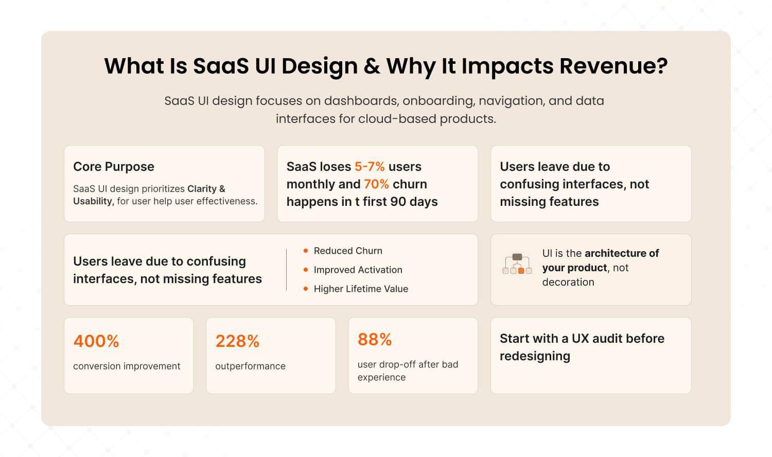
Answer: SaaS UI design is the practice of designing user interfaces for cloud-based software products — encompassing dashboards, onboarding flows, navigation systems, and data displays. Unlike consumer apps, SaaS interfaces must balance complexity with clarity because users interact with them daily for work. When SaaS UI design is done right, it directly reduces churn, accelerates activation, and lifts customer lifetime value. |
Here’s a number that should keep every SaaS founder up at night: the average SaaS product loses 5–7% of its users every single month. That’s not a slow leak. That’s a fire hose of revenue walking out the door.
And the kicker? Seventy percent of those lost users disappear within the first 90 days. They don’t write angry emails. They don’t leave scathing reviews. They just… stop logging in. The soft, silent goodbye.
Most product teams point fingers at pricing, feature gaps, or competition. But after auditing 50+ SaaS products, we’ve found that the real culprit is almost always the same: the interface made users feel confused instead of confident.
The data backs this up. According to Forrester, a well-designed UX can boost conversion rates by up to 400%. Design-driven companies have outperformed the S&P 500 by 228% over a decade. And 88% of users say they won’t return to a site after a bad experience.
Here’s how SaaS UI design connects directly to the metrics your board cares about:
Business Metric | How SaaS UI Design Impacts It |
Activation Rate | Clearer onboarding = users reach “aha moment” faster |
Churn / Retention | Less friction = fewer users silently dropping off |
LTV (Lifetime Value) | Better UX = longer subscriptions + expansion revenue |
Support Costs | Intuitive interface = fewer “how do I...” tickets |
CAC Payback | Higher activation + retention = faster payback on acquisition spend |
SaaS UI design isn’t the paint on the walls. It’s the architecture of the building. It determines whether your product is a tool people have to use — or one they choose to use.
This is why we always recommend starting with a UX audit before making any design changes. You need to understand the building’s foundation before you start renovating.
What Are the Biggest SaaS UI Design Mistakes That Kill Conversions?
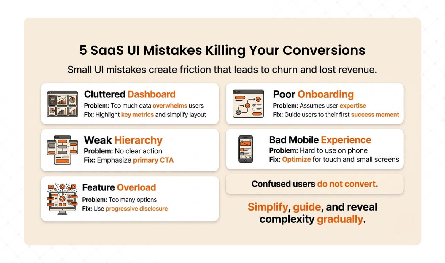
Answer: The five most conversion-killing SaaS UI mistakes are cluttered dashboards that overwhelm users, onboarding flows that assume expertise, poor information hierarchy that buries key actions, ignoring mobile responsiveness, and feature overload without progressive disclosure. Each creates friction that compounds into churn — and each has a specific, actionable fix. |
We’ve audited SaaS products across fintech, HR tech, project management, and analytics. The mistakes are startlingly consistent. Here are the five that show up in nearly every audit — and exactly how to fix each one.
1. The Dashboard Data Dump
You know the type. The dashboard that shows 50 metrics on one screen because someone believed more information equals more value. It doesn’t. It equals paralysis.
We call this “data vomit.” The user opens your product, sees a wall of numbers and charts, and has no idea where to look first. According to Baymard Institute, users form usability judgments within the first few seconds. If that first impression is “overwhelming,” you’ve already lost the moment.
The fix: Apply progressive disclosure. Identify your user’s single most important metric and make it 3x the visual weight of everything else. Collapse secondary data into expandable panels. Use “traffic light” color coding — red, amber, green — so users understand status before reading a single number.
How to diagnose it: Open your dashboard and ask: “Can I identify the #1 metric in under 3 seconds?” If you can’t, your users definitely can’t.
2. Onboarding That Assumes Expertise
Your onboarding flow shouldn’t feel like reading a technical manual. Yet we consistently see SaaS products that dump users into a full-featured dashboard on day one with nothing more than a “Welcome!” modal and a blank canvas.
Seventy percent of new SaaS users churn within 90 days. The onboarding experience is where retention battles are won or lost. If a user can’t reach their first “aha moment” within minutes, they’re already mentally checking out.
The fix: Map your user’s “aha moment” — the exact action where they first experience real value. Then design your onboarding as a straight-line path to that action. Remove every step that doesn’t serve it. Use checklists, tooltips, and contextual guidance that appear only when relevant.
How to diagnose it: Use a tool like Hotjar or FullStory to watch 10 new-user session recordings. Time how long it takes each one to complete the core action. If it’s over 2 minutes, your onboarding has a problem.
3. Information Hierarchy That Buries the Lead
When everything on the screen is shouting for attention, nothing gets heard. We regularly find SaaS interfaces where the primary action button is the same visual weight as a tertiary navigation link. Users shouldn’t have to think about where to click next — the interface should make it obvious.
The fix: Apply the squint test. Blur your screen to 20% clarity. Can you still identify the primary action? If not, increase contrast, size, or color differentiation for your key CTA. Use visual hierarchy: one primary action in a bold accent color, secondary actions in muted tones, and tertiary links as plain text.
How to diagnose it: Screenshot your three most critical screens. Show them to someone outside your team for 5 seconds. Ask: “What should I do first on this page?” If they hesitate, your hierarchy is broken.
4. “We’ll Do Mobile Later”
Mobile traffic drives over 70% of online usage. Yet we still encounter SaaS products where the mobile experience is an afterthought — or doesn’t exist at all. Mobile users are five times more likely to abandon a task if a site isn’t optimized. That’s not a rounding error. That’s half your potential user base hitting a wall.
The fix: You don’t need a full mobile app. Start by ensuring your top 3 user workflows (the ones that drive retention) function cleanly on a phone screen. Test them on an actual device — not just a resized browser. Prioritize touch targets (44px minimum), readable type without zooming, and core navigation within thumb reach.
How to diagnose it: Check Google Analytics: what percentage of your sessions are mobile? Then complete your product’s core workflow on your phone. If you struggle, your users have already given up.
5. Feature Overload Without Progressive Disclosure
Adding features is exciting. Burying users in features is lethal. The best SaaS products layer functionality — core tools are prominent on day one, while advanced features reveal themselves as users grow. Nielsen Norman Group calls this progressive disclosure, and it’s one of the most powerful UX principles for complex products.
The fix: Audit your navigation. If a new user sees more than 7 top-level items, you’re overwhelming them. Group advanced features into “pro” or “advanced” sub-menus. Use role-based defaults — a junior user sees a simplified view, while a power user can toggle into full mode.
How to diagnose it: Count the number of clickable elements on your main dashboard. If it’s over 30, you have a feature overload problem. Slack keeps their core interface to roughly a dozen elements. That’s the benchmark.
Recognizing these patterns in your own product? You’re not alone. Our UX Audit pinpoints exactly where users drop off — and delivers a prioritized roadmap to fix what matters most. |
Why Do Most SaaS Redesigns Fail?
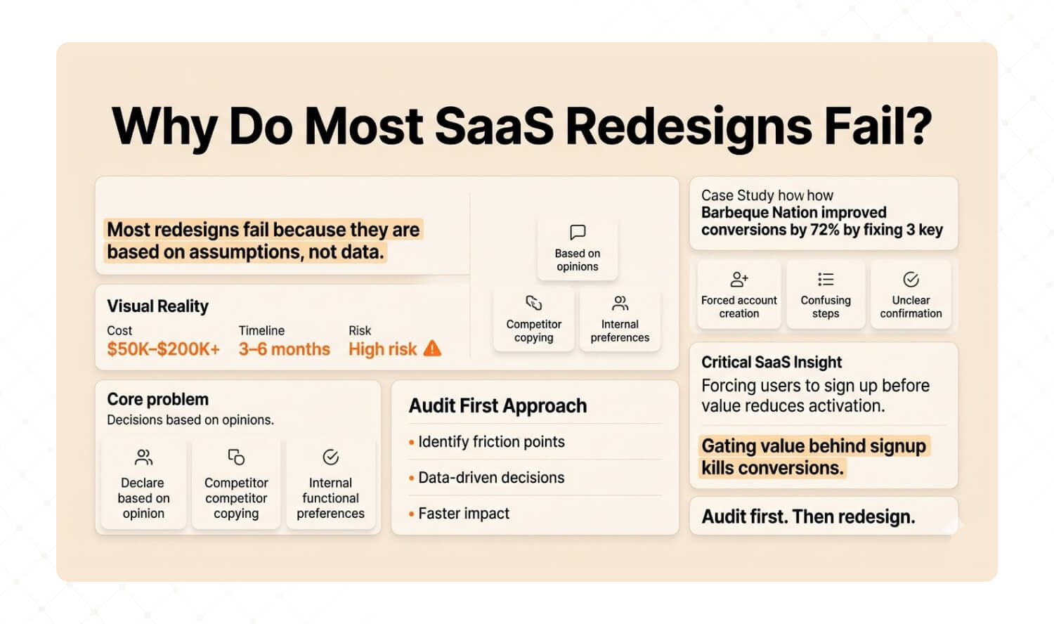
Answer: Most SaaS redesigns fail because they’re built on assumptions rather than evidence. Teams spend months and six-figure budgets rebuilding interfaces based on competitor mimicry or internal preferences — without first understanding where users actually struggle. The audit-first alternative diagnoses friction points with data before changing a single pixel, dramatically reducing risk and improving outcomes. |
Here’s a conversation we have almost weekly with SaaS founders:
“Our product looks dated. Users are churning. We need a redesign.”
Our response: “How do you know it’s a design problem? And which parts of the design?”
Silence.
That silence is expensive. A full SaaS redesign typically costs $50K–$200K+ and takes 3–6 months before users see any change. And here’s the brutal truth: if you’re redesigning based on gut feel, competitive jealousy, or a CEO’s aesthetic preferences, you’re gambling with your product’s future.
Most agencies redesign. We diagnose first.
A UX audit takes 2–4 weeks and uncovers the 10–15 specific friction points that are actually hurting conversions. Not opinions. Not hunches. Data-backed findings you can act on immediately.
Proof: How We Drove 72% More Conversions for Barbeque Nation
This isn’t theory. When we audited Barbeque Nation’s booking flow, we found 12 friction points in a 4-step process. Users were getting stuck on forced account creation, confusing date selection, and unclear confirmation states.
We didn’t redesign the entire platform. We fixed 3 critical friction points.
Challenge | What We Found | The Fix | Results |
Booking flow had high drop-off despite strong traffic | 12 friction points in a 4-step process; users confused by forced account creation | Streamlined flow to 2 steps, removed 3 critical friction points | +72% conversions, +31K new visitors, +45% growth |
Why this matters for SaaS founders: The forced-account-creation friction we found at BBQ Nation is identical to what we see in SaaS onboarding flows every week. Requiring users to fill out a profile, confirm an email, or set up billing before they experience any value is the #1 activation killer across both industries. If you’re gating value behind registration, you’re doing the same thing.
Here’s how the two approaches compare:
Factor | Full Redesign | Audit-First (Mad Brains) |
Starting point | Assumptions + competitor mimicry | User behavior data + heuristic analysis |
Timeline | 3–6 months before any impact | 2–4 weeks to actionable insights |
Risk level | High — betting everything on guesswork | Low — targeted fixes backed by evidence |
Typical ROI | Unpredictable | 72% conversion lift (Barbeque Nation) |
Cost | $50K–$200K+ | Fraction of a full redesign |
What you get | A new interface (that may or may not work) | A prioritized roadmap of what to fix and why |

How Does a UX Audit Improve SaaS Product Design?
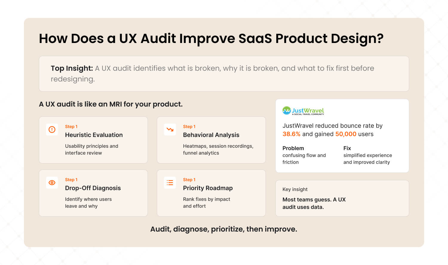
Answer: A UX audit systematically evaluates your SaaS product’s user experience by combining heuristic analysis, user behavior data (heatmaps, session recordings, funnel analytics), and expert review. It identifies where users struggle, why they drop off, and what specific changes will have the highest impact on conversions and retention — all before any redesign work begins. |
Think of a UX audit as an MRI for your product. You wouldn’t let a surgeon operate without imaging first. So why would you let a design team rebuild your interface without understanding what’s broken?
Here’s what our audit process at Mad Brains uncovers that most teams miss:
1. Heuristic evaluation: We assess your product against established usability principles — visibility of system status, error prevention, recognition over recall, flexibility. This catches the obvious friction that your team has become blind to because they use the product every day.
2. Behavioral analysis: Heatmaps, session recordings, and funnel analytics reveal what users actually do — not what you think they do. We consistently find a gap between intended user flows and real user behavior. That gap is where revenue hides.
3. Drop-off diagnosis: We map every step where users abandon tasks and diagnose the root cause. Is it confusion? Friction? Missing context? A technical bug? Each drop-off has a different fix — and misdiagnosing it means wasting your engineering team’s time.
4. Priority roadmap: Not all fixes are equal. We rank findings by impact and effort, giving you a clear sequence of changes that will move metrics fastest. Most audits reveal 10–15 actionable improvements, but typically 3–5 of those drive 80% of the impact.
Proof: How JustWravel Cut Bounce Rates by 38.6%
We see this pattern constantly. JustWravel, a travel booking platform, was experiencing high bounce rates despite strong organic traffic. The team assumed they needed a new homepage design.
Our audit told a different story. Users were bouncing because the search-to-booking flow had invisible friction — unclear filters, too many options presented simultaneously, and a checkout process that didn’t communicate trust signals. After implementing audit-backed changes, JustWravel saw their bounce rate drop by 38.6% and gained 50,000 new users.
The homepage wasn’t the problem. The journey was.
The SaaS parallel: This is the same pattern we see in SaaS products with complex search, filtering, or configuration flows. If your user can’t navigate from “I want to do X” to “I’m doing X” without confusion, your conversion problem isn’t about design aesthetics — it’s about information architecture.
For teams looking to address these issues on an ongoing basis, our UI/UX design subscription provides continuous design support so improvements don’t stall after the audit.
What Should a SaaS UI Design Checklist Include?
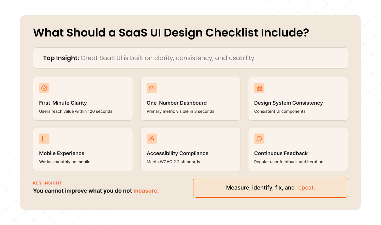
Answer: An effective SaaS UI design checklist covers six essentials: clear onboarding that gets users to value in under 2 minutes, dashboard hierarchy that highlights one primary metric, a consistent design system with reusable components, mobile-responsive layouts, accessible interfaces meeting WCAG 2.2, and continuous feedback loops with real user data for iterative improvement. |
After hundreds of audits and product builds, we’ve distilled what actually moves metrics into a framework any SaaS team can use. Here it is — with the specific tools and benchmarks for each:
1. First-minute clarity
Benchmark: Can a new user complete their first core action within 120 seconds?
Tool: Hotjar or FullStory session recordings. Watch 10 new user sessions and time the path to first value.
Fix it when: More than 40% of new users fail to complete the core action in their first session.
2. One-number dashboard
Benchmark: Can you identify the #1 user metric within 3 seconds of opening the dashboard?
Tool: The squint test — blur your screen and see if the primary metric still stands out.
Fix it when: Your dashboard shows more than 8 metrics at top level without clear visual hierarchy.
3. Design system, not design chaos
Benchmark: Does every page use consistent components, spacing, and interaction patterns?
Tool: Google Lighthouse for performance audit. Figma component library audit for consistency.
Fix it when: You find more than 3 variations of the same button style, or inconsistent spacing between pages.
4. Mobile isn’t optional
Benchmark: Can users complete your top 3 workflows on a phone without zooming or horizontal scrolling?
Tool: Google Analytics (check mobile session %). Chrome DevTools responsive testing.
Fix it when: Mobile sessions are above 20% of traffic AND mobile conversion rate is less than half of desktop.
5. Accessibility is table stakes
Benchmark: Does your product meet WCAG 2.2 AA standards?
Tool: axe DevTools browser extension for automated accessibility testing.
Fix it when: You have more than 5 critical accessibility violations on your core pages. EU companies face fines of $75K–$150K per WCAG violation.
6. Continuous feedback loops
Benchmark: Are you collecting and acting on user behavior data at least monthly?
Tool: Hotjar heatmaps + NPS surveys. Pair quantitative data (where users click) with qualitative data (why they’re frustrated).
Fix it when: Your last round of user feedback is more than 60 days old.
Want the complete 25-point SaaS UI audit checklist we use internally? It covers everything from onboarding friction to checkout optimization to accessibility compliance. |
3 Things You Can Do This Week — No Agency Required
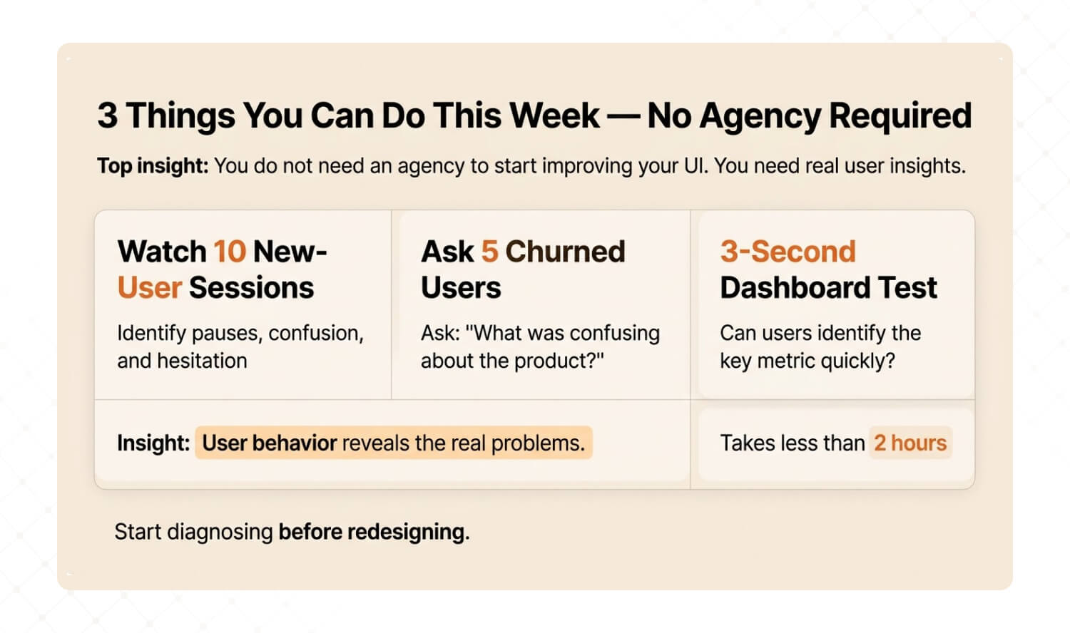
Answer: You don’t need to hire anyone to start diagnosing your SaaS UI problems. This week, watch 10 new-user session recordings, ask your last 5 churned customers one question about what confused them, and run the 3-second dashboard test. These three actions will tell you more about your UI problems than any competitor analysis. |
We’re a UX agency, so you’d expect us to say “hire us.” And yes, a professional audit goes deeper. But here’s the thing: the best clients who come to us have already started diagnosing. They arrive with hypotheses, questions, and data. That makes the audit faster, sharper, and more valuable for everyone.
So here are three actions you can take before your next sprint planning meeting:
Quick Win #1: Watch 10 New-User Sessions Sign up for Hotjar or FullStory (both have free tiers). Filter for users in their first session. Watch 10 recordings without skipping ahead. Write down every moment where the user pauses, backtracks, or hovers without clicking. Those hesitation patterns ARE your UX problems. |
Quick Win #2: Ask Your Last 5 Churned Users One Question Email them: “What was confusing about [product name]?” Not “why did you leave?” — that triggers defensive answers. “What was confusing?” gets you specific, actionable UX feedback. You’ll be stunned by the patterns that emerge from just 5 responses. |
Quick Win #3: The 3-Second Dashboard Test Open your product’s main dashboard. Close your eyes. Open them and start a timer. Can you identify the single most important metric in under 3 seconds? Now show the same screen to someone who’s never used your product. If they can’t answer “what matters most here?” in 3 seconds, your information hierarchy needs work. |
These three exercises take less than 2 hours combined. But the patterns they reveal will change how you think about your product’s interface forever.
And if the findings are alarming? That’s when a professional UX audit turns those raw observations into a prioritized roadmap for fixing what matters most.
Stop Redesigning. Start Diagnosing.
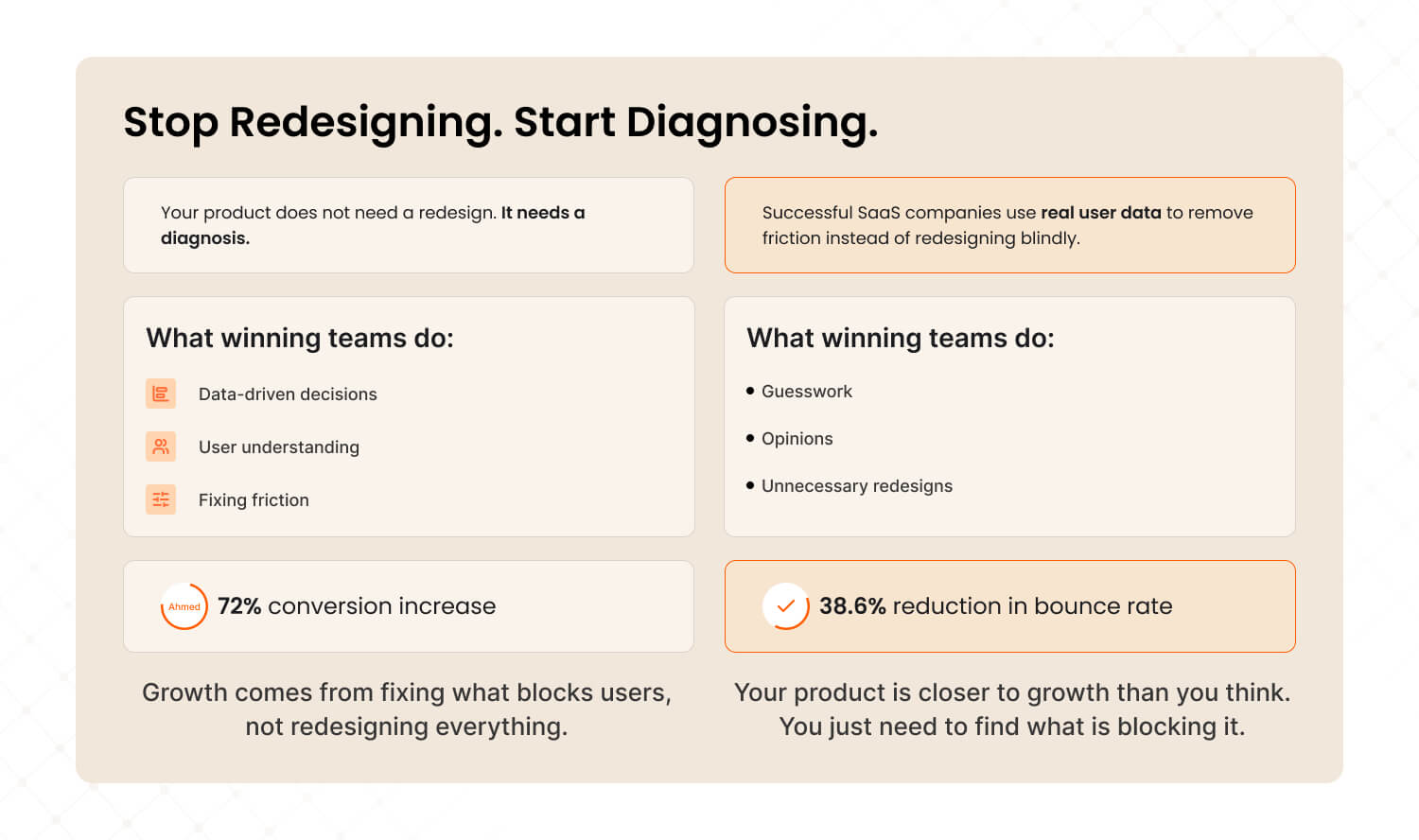
Here’s the honest truth most agencies won’t tell you: your SaaS product probably doesn’t need a redesign. It needs a diagnosis.
The companies winning in 2026 aren’t the ones with the flashiest interfaces. They’re the ones that understand their users deeply enough to remove friction surgically. They invest in UX audits before touching a single pixel. They make decisions based on behavioral data, not boardroom opinions.
That’s the approach that drove a 72% conversion lift for Barbeque Nation and a 38.6% bounce rate reduction for JustWravel. Not massive redesigns. Targeted, evidence-based interventions.
Your product is closer to its next growth milestone than you think. You just need to find what’s blocking it.

Frequently Asked Questions
Last updated:
Mad Brains Technologies
Enterprise UX & Product Strategy Team
Mad Brains is an enterprise UX and product consultancy focused on reducing product risk and accelerating growth. Through UX audits, conversion-led design, and full-stack development, the team helps organizations build scalable digital platforms that drive measurable business outcomes.