UX Audit
By

Abhinav Sharma



Most UX audit checklists are written by people who have never run an actual audit.
They list 50 generic best practices, half of which do not affect conversions, and call it a "comprehensive checklist."
This one is different.
We built this UX audit checklist from patterns we found across 50+ real audits for SaaS, eCommerce, and healthcare companies. Every point on this list has directly impacted conversion rates, bounce rates, or user satisfaction in actual projects.
30 points. Six categories. Each one is a simple pass or fail. Go through your website, score yourself honestly, and you will know exactly where your biggest UX problems are in about 15 minutes.
The team behind audits for brands like Tanishq (Tata Group) and Barbeque Nation is sharing the exact framework we use. Let us get into it.
How Should You Use This UX Audit Checklist?

Go through each of the 30 points and mark it pass or fail for your website. Count your total passes. 25-30 means your UX is strong. 18-24 means you are leaving revenue on the table. Below 18 means UX friction is likely costing you significant conversions every month.
Each point has three parts:
The check: What to look for (pass or fail)
Why it matters: The business impact, backed by data from our audits or industry research
You can do this yourself in 15 minutes with no tools. For a deeper analysis, we will show you the tools that go further at the end.
Ready? Open your website in one tab and this checklist in another. Let us start.
What Do Users See in the First 5 Seconds? (Points 1-5)
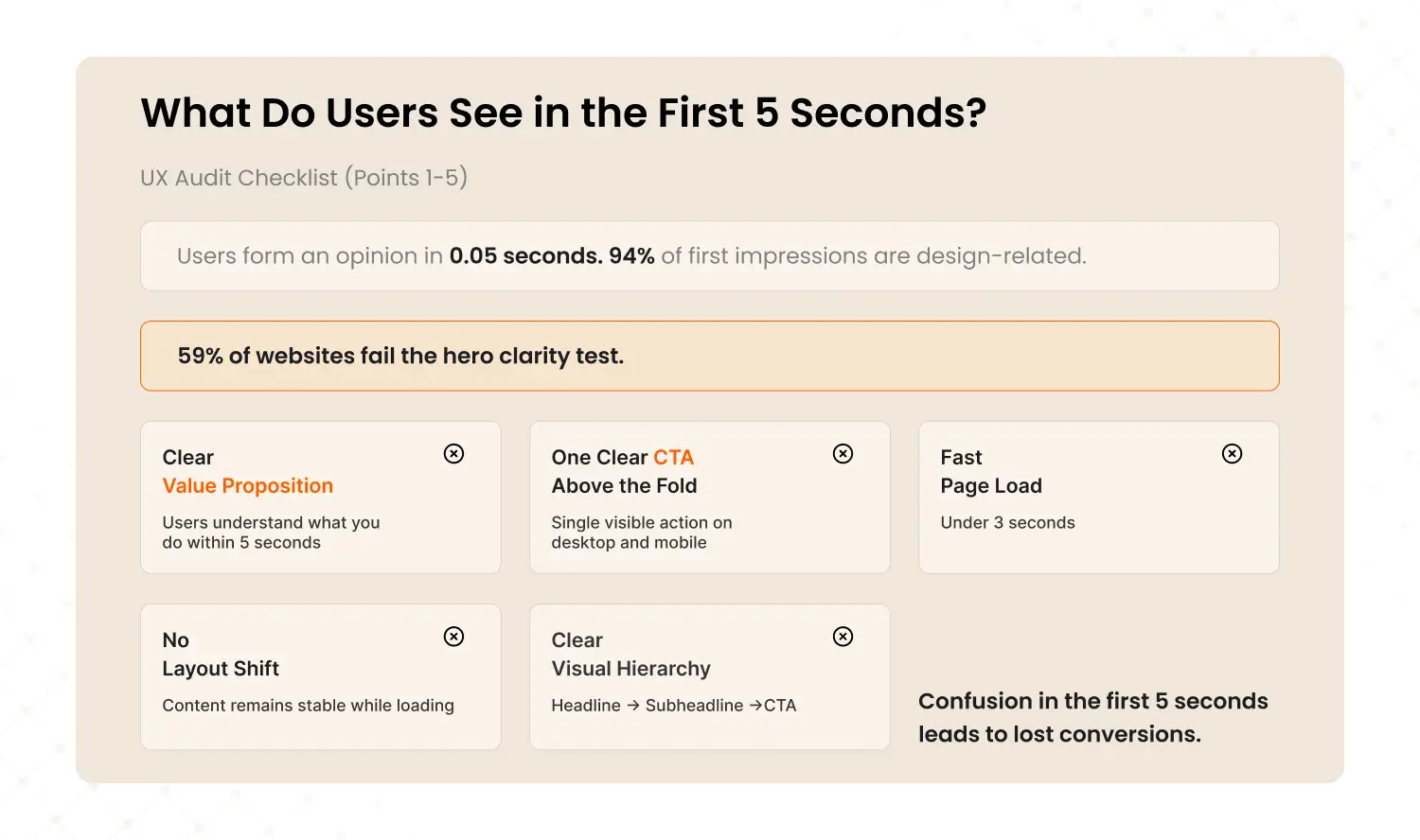
Users form an opinion about your website in 0.05 seconds. These five checks determine whether they stay or bounce. 94% of first impressions are design-related, and in our audits, 59% of websites failed the hero clarity test.
1. Your value proposition is clear within 5 seconds
Open your homepage. Can a first-time visitor understand what you do, who it is for, and what to do next without scrolling? If your hero says something vague like 'Empowering Innovation' or 'Welcome to Our Platform,' you fail this check.
Why it matters: 59% of sites we audited had generic hero content with no clear value proposition. It was the 5th most common friction point across all audits.
2. There is one clear primary CTA above the fold
Is there a single, obvious action you want users to take? Is it visible without scrolling on both desktop and mobile? If there are three competing CTAs or none at all, you fail.
Why it matters: When Airbnb simplified their booking flow from multiple confusing steps to a clear three-step process, booking conversions increased 35%.
3. The page loads in under 3 seconds
Test your homepage at pagespeed.web.dev right now. If it takes longer than 3 seconds on mobile, you are losing visitors before they see any content.
Why it matters: Every extra second of load time reduces conversions by 7%. A site loading in 5 seconds instead of 2 seconds is losing roughly 21% of potential conversions.
4. There is no visible layout shift during loading
Does content jump around as the page loads? Text shifts down, images pop in late, buttons move after you try to click them. This is Cumulative Layout Shift (CLS), and it frustrates users.
Why it matters: Google uses CLS as a Core Web Vital ranking signal. Poor CLS hurts both user experience and search ranking.
5. Visual hierarchy guides the eye in a logical order
Is there a clear order of importance? Headline first, then subheadline, then CTA, then supporting content. If everything on the page looks equally important, nothing stands out and users do not know where to look.
Key Takeaway: First impressions drive 80% of the stay-or-bounce decision. If you fail 3 or more points in this section, fixing your above-the-fold experience should be priority number one.
Can Users Find What They Need? (Points 6-10)
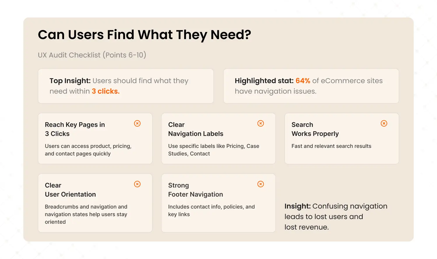
Navigation and information architecture determine whether users can accomplish their goals or give up trying. If a user cannot find the right page within 3 clicks, they will leave. In our audits, confusing category and filter structures were the 4th most common friction point, found in 64% of eCommerce sites.
6. Users can reach any key page in 3 clicks or fewer
Start from your homepage. Try to reach your product page, pricing page, and contact page. If any of them takes more than 3 clicks, your information architecture needs work.
Why it matters: Nielsen Norman Group's research shows that users expect to find what they need quickly. Every extra click is a decision point where users can choose to leave.
7. Navigation labels are specific, not vague
Labels like 'Solutions,' 'Resources,' or 'Platform' are meaningless to first-time visitors. Users should know exactly what they will find before clicking. 'Pricing,' 'Case Studies,' 'Contact' are clear. 'Explore' is not.
8. Site search works and returns relevant results
If you have a search bar, test it now. Search for your top product or service. If the results are irrelevant, empty, or slow, your search is actively hurting conversions.
Why it matters: In one eCommerce audit, we found that 22% of users used site search, but the search returned irrelevant results 40% of the time. Fixing search alone lifted conversion by 18%.
9. Users always know where they are in the site
Breadcrumbs (Home > Category > Product), highlighted navigation states, and clear page titles prevent the 'lost' feeling. If users have to use the back button to orient themselves, you fail.
10. The footer contains all essential links
Contact info, privacy policy, terms, key service pages, social links. The footer is the safety net for users who could not find what they needed in the main navigation. A missing or thin footer signals a site that does not take itself seriously.
If your navigation is failing users, it is failing your revenue too. Our UX Audit maps the exact user journey on your site and identifies where people get lost. Learn about our UX Audits →
Does Your Mobile Experience Actually Work? (Points 11-16)
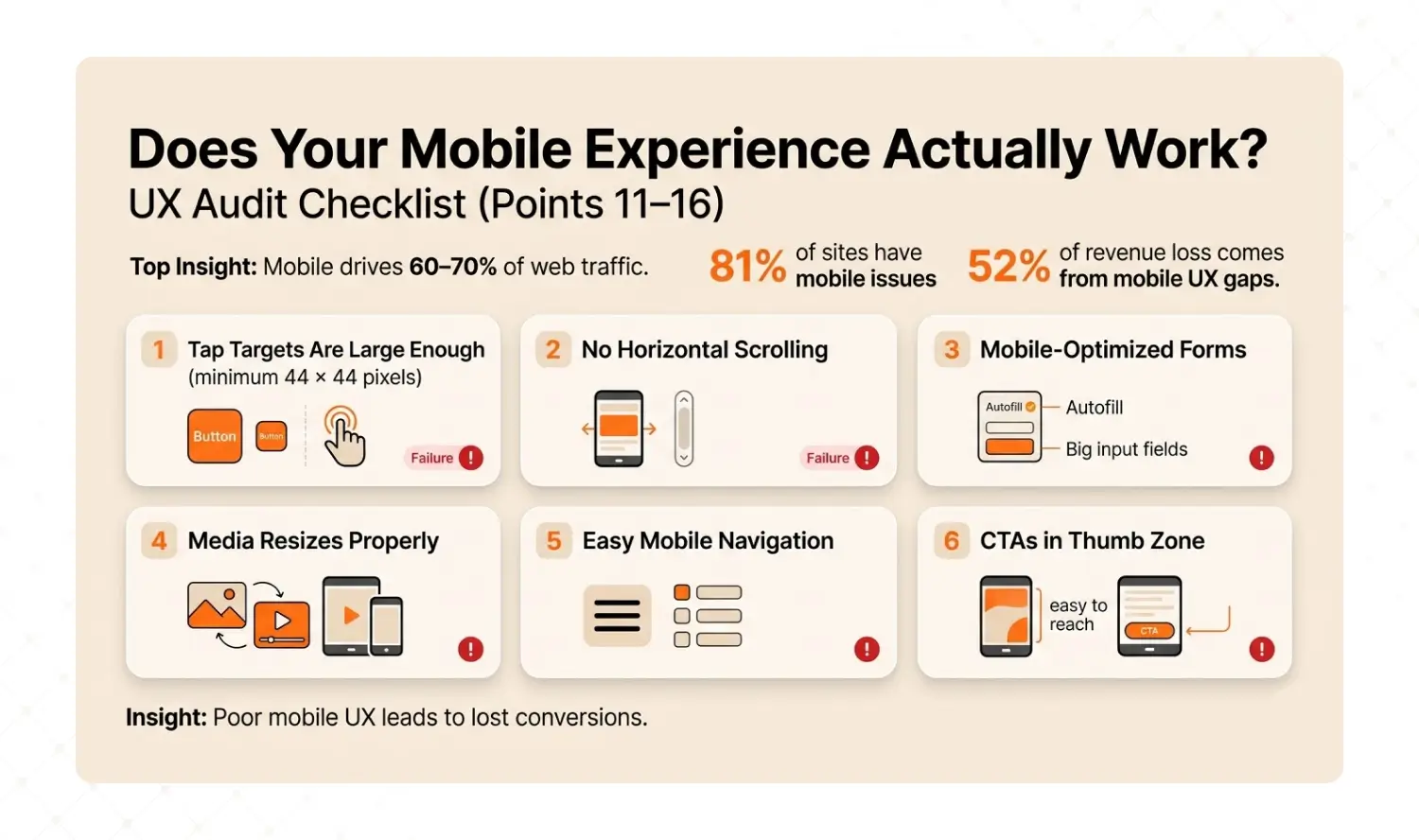
Mobile accounts for 60-70% of web traffic, but in our audits, 81% of sites had mobile navigation problems. This is the single biggest revenue leak for most businesses. 52% of total revenue leakage we identified came from mobile-specific UX gaps.
11. All tap targets are at least 44x44 pixels
Buttons and links need to be large enough to tap accurately with a thumb. If users have to pinch-zoom to hit a button, your mobile conversion rate is suffering.
Why it matters: Apple's Human Interface Guidelines and Google's Material Design both specify 44-48px minimum tap targets. This is not a suggestion. It is a usability standard.
12. There is no horizontal scrolling on any page
If any page requires sideways scrolling on mobile, something is broken. Test on a real phone, not just the browser's responsive mode. Real devices reveal problems that emulators miss.
13. Forms are optimized for mobile input
Form fields should be full-width on mobile. The keyboard should switch type based on the field (email keyboard for email, number pad for phone). Labels should remain visible while typing, not disappear as placeholder text.
Why it matters: In our audits, form abandonment on mobile was 3x higher than desktop when forms were not mobile-optimized.
14. Images and videos resize properly on mobile
No images spilling off-screen. No videos that cannot be played. No text on images that becomes unreadable when scaled down.
15. The mobile menu is easy to open, navigate, and close
The hamburger menu icon should be obvious and easy to tap. The menu itself should be easy to scan. And closing it should take one tap, not guesswork.
16. Key CTAs are positioned in the thumb zone
The most important buttons should be in the bottom half of the mobile screen, within natural thumb reach. Not buried at the top of a long page that requires scrolling.
Why it matters: Walmart saw mobile revenue grow 98% year-over-year after redesigning their mobile experience with a touch-first approach, including repositioning key actions within natural reach.
Key Takeaway: 52% of the revenue leakage we find in audits comes from mobile UX gaps. 'Responsive' does not mean 'optimized.' Test every critical flow on an actual phone.
Is Your Site Fast Enough? (Points 17-20)
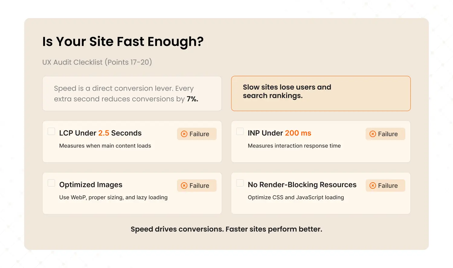
Speed is a direct conversion lever. Every additional second of load time costs you roughly 7% of conversions. Google uses Core Web Vitals as ranking signals, so slow sites get penalized twice: once by users who leave, and again by search engines that rank them lower.
17. Largest Contentful Paint (LCP) is under 2.5 seconds
LCP measures when the main visible content finishes loading. Google considers anything above 2.5 seconds 'needs improvement' and above 4 seconds 'poor.' Test at pagespeed.web.dev.
Why it matters: Only 48% of websites pass Core Web Vitals on mobile (HTTP Archive, 2025). Being in the passing half gives you a direct ranking advantage.
18. Interaction to Next Paint (INP) is under 200 milliseconds
INP measures how fast your site responds when users click or tap. If there is a visible delay between tapping a button and something happening, the site feels broken.
19. Images are optimized (WebP format, properly sized, lazy loaded)
Unoptimized images are the number one cause of slow pages. Convert to WebP format. Serve images at the actual display size, not 4000px originals scaled down by CSS. Lazy-load everything below the fold.
20. No render-blocking CSS or JavaScript
Critical CSS should load inline. JavaScript should be deferred or loaded asynchronously. If your page waits for a 500KB script before showing any content, your LCP will suffer.
Why it matters: In one SaaS audit, removing two render-blocking scripts improved LCP from 4.2 seconds to 1.8 seconds. The same traffic, same content, 2.3x faster.
Speed is not a technical nice-to-have. It is a conversion lever. Every second you shave off load time is worth roughly 7% more conversions.
Does Your Site Build Enough Trust to Convert? (Points 21-26)
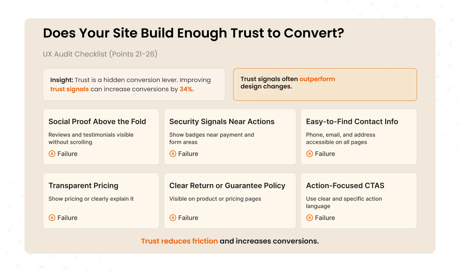
Trust is the hidden conversion lever most CRO audits undervalue. In our data from 50+ audits, repositioning trust signals (reviews, badges, guarantees) above the fold delivered an average 34% conversion lift. That is 7x more impactful than changing button colors.
21. Social proof is visible above the fold
Reviews, ratings, testimonials, client logos, or user counts should be visible without scrolling. Not buried at the bottom. Not hidden on a separate 'Testimonials' page.
Why it matters: We see this pattern constantly. One travel platform had excellent reviews but buried them below three scroll-lengths of content. Moving reviews to the hero section contributed to a 38.6% bounce rate reduction and 485% increase in clicks.
22. Security badges appear near sensitive actions
SSL badges, payment provider logos (Visa, Mastercard, PayPal), and 'Secure Checkout' messaging should appear exactly where users enter payment or personal information.
23. Contact information is easy to find from any page
Phone number, email, and physical address (if applicable) should be accessible from every page, ideally in the header or footer. Hidden contact info kills trust, especially for high-value purchases.
24. Pricing is transparent (or clearly explained)
If possible, show pricing on the website. 'Contact us for pricing' creates friction and signals that you might be hiding something. If pricing truly varies, explain why and give ranges.
25. Return, refund, or guarantee policy is clearly visible
For eCommerce: the return policy should be on product pages, not just buried in the footer. For SaaS: the cancellation policy should be on the pricing page. Users need to know the risk before committing.
Why it matters: Baymard Institute research shows that unclear return policies are one of the top 10 reasons for cart abandonment. Making the policy visible reduces purchase anxiety.
26. CTAs use action language, not generic labels
'Get Started' is better than 'Submit.' 'Book My Free Call' is better than 'Contact.' 'Download the Playbook' is better than 'Click Here.' The CTA should tell users exactly what happens next.
Trust signals are the most underrated conversion lever we find in audits. Want to know what trust gaps exist on your site? Book a 15-minute strategy call →
Is Your Site Accessible to All Users? (Points 27-30)

Accessibility is not optional in 2026. The European Accessibility Act took effect in June 2025. US ADA enforcement is expanding. Beyond legal compliance, accessible design improves usability for everyone: Microsoft research shows inclusive design increases overall usability by up to 30%.
27. Text meets WCAG AA color contrast (4.5:1 minimum)
Use the WebAIM contrast checker (webaim.org/resources/contrastchecker). The most common fail: light gray text on white backgrounds. If your body text contrast ratio is below 4.5:1, fix it.
Why it matters: Low contrast text is the most common accessibility failure on the web. It hurts readability for ALL users, not just those with visual impairments.
28. All meaningful images have descriptive alt text
Screen readers use alt text to describe images to blind and low-vision users. Check your product images, hero banners, and infographics. Empty alt attributes on meaningful images mean those users get nothing.
29. The entire site is navigable by keyboard alone
Try using your site with only the Tab key and Enter. Every link, button, dropdown, and form field should be reachable and usable. If you get 'trapped' in a component or cannot reach a key action, keyboard users cannot either.
30. Form fields have visible labels and specific error messages
Every form field needs a visible label that stays visible while typing (not placeholder-only). Error messages should be specific: 'Please enter a valid email address' is useful. 'Error' or 'Invalid input' is not.
Why it matters: In one healthcare audit, we found that 60% of form abandonment came from users who encountered vague error messages and did not know how to fix the problem.
Key Takeaway: Accessibility improvements benefit ALL users. Fixing color contrast makes text easier to read for everyone. Keyboard navigation benefits power users who prefer keyboard over mouse. Accessibility is a conversion lever disguised as a compliance requirement.
What Does Your Score Mean? (And What Should You Do Next?)
25-30 points means your UX is strong and you should focus on CRO-level optimization. 18-24 means you are leaving significant revenue on the table. Below 18 means UX friction is a critical revenue problem that needs urgent attention.
25 to 30 points: Strong UX
Your site experience is solid. The next step is CRO-level optimization: A/B testing headlines, CTAs, form flows, and pricing page layouts. You are past the UX fundamentals and into fine-tuning.
Read our guide: What Is a CRO Audit? The Complete Guide
18 to 24 points: Needs Work
You are likely losing 15 to 30% of potential conversions to UX friction. The problems are real but fixable. A focused UX audit will identify the 3 to 5 highest-impact fixes that move revenue fastest.
Below 18 points: Critical UX Problems
Your site has serious experience issues that are costing substantial revenue every month. The longer these go unfixed, the more you pay in lost conversions, wasted ad spend, and customer attrition. A comprehensive UX audit should be a top priority.
How did you score?
This checklist gives you the self-assessment. The next step is finding the ROOT CAUSE behind each failure. That is what a professional audit does. It goes from 'what is broken' to 'why it is broken' to 'fix this first for the biggest revenue impact.'
Free Download: The Conversion Leak Finder A 30-minute self-audit playbook for SaaS and eCommerce teams. 8 diagnostic audits using free tools. [Download Free PDF]
Want to go deeper than this checklist? The Conversion Leak Finder walks you through 8 diagnostic audits with free tools. Same framework we use professionally, self-serve format.
Not sure whether you need a CRO audit or a full UX audit? Read: CRO vs UX Audit: Which One Does Your Business Actually Need?
Ready for a Professional UX Audit?
This checklist gives you the starting point. A professional audit goes deeper: AI-powered behavioral analysis, session recordings, competitive benchmarking, and a revenue-prioritized roadmap your team can implement immediately.
It is the same methodology behind 50+ audits that delivered 28 to 52% conversion improvements in 60 to 90 days for brands including Tanishq (Tata Group) and Barbeque Nation.
Three options:
Discovery Audit ($999): 15-page action report in 3 to 5 days. Your biggest conversion leaks identified fast.
Detailed Audit ($1,999): 60-page report + 90-day roadmap. Full UX + CRO analysis. Most popular.
Solutions Audit ($3,999): Everything above + wireframes, prototypes, design system, 6-month support.

Last updated:
Abhinav Sharma
Founder & CEO | Enterprise UX & Growth Strategy
Abhinav Sharma is the Co-Founder & CEO of Mad Brains, specializing in enterprise UX audits, conversion-focused product design, and high-impact experience systems. He helps SaaS, healthcare, and fintech companies reduce usability risk, increase conversions, and build scalable, user-centered platforms.