Web Design
By

Paras Attri
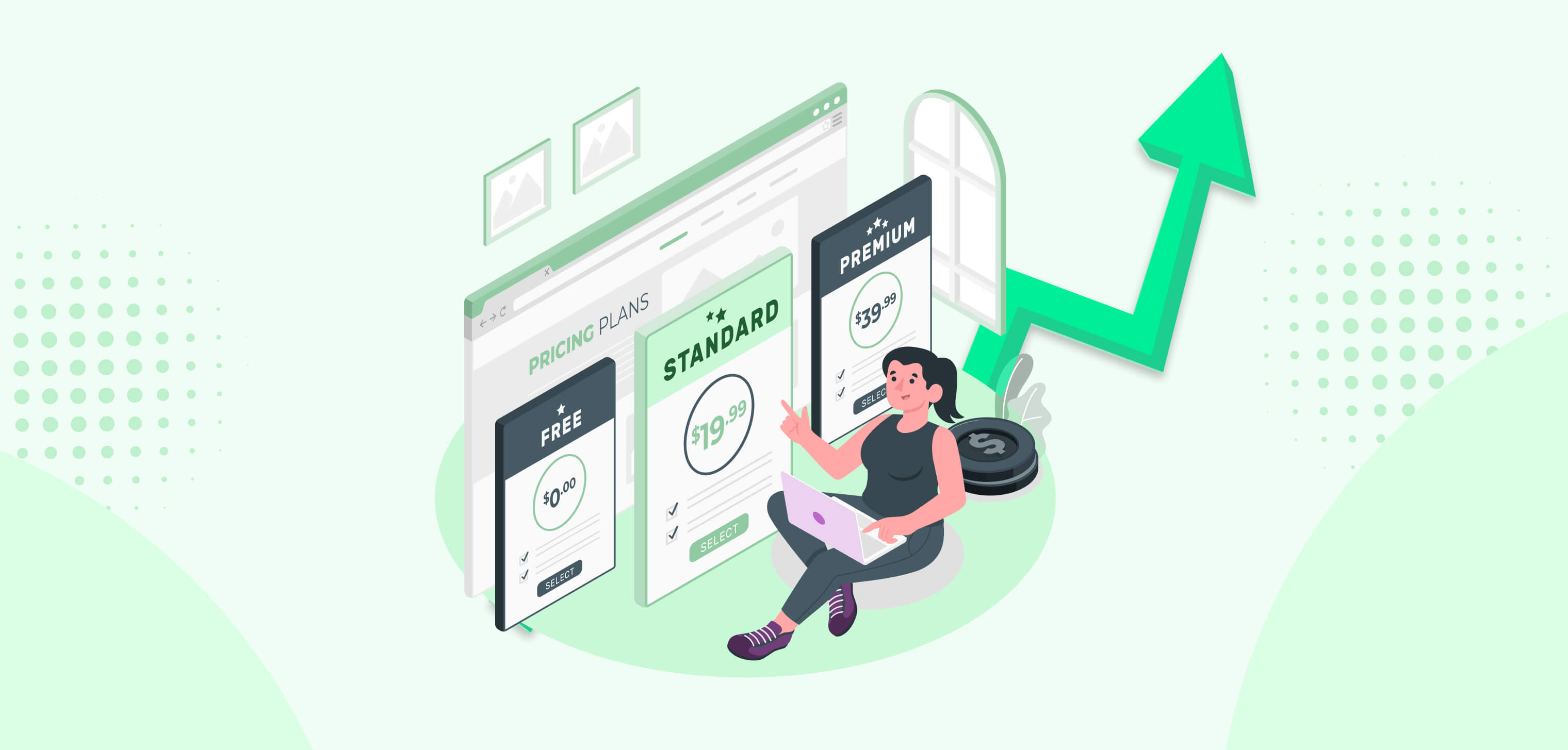


How to design the full subscription user experience, from pricing pages and sign-up to onboarding, billing, failed payments and cancellation, plus the metrics to track.
A good subscription user experience makes it easy to pick a plan, start paying, get value quickly and manage the subscription without calling support. Each of those moments decides whether someone signs up, stays or quietly cancels. Design them well, and you remove the most common reasons people leave.
Think about the last subscription you cancelled. Maybe you couldn't tell what you were paying for. Maybe a charge surprised you, or you only found the cancel button after three screens and a guilt trip. None of that was about the product itself. It was about the experience around it.
Looking for a design subscription service rather than tips on designing a subscription product? See our design subscription guide.
What Does Subscription UX Cover?
Subscription UX design covers every step of the customer's lifecycle, not just the sign-up form. Most subscription products share the same stages:
Stage | What the customer is asking | What good UX does |
|---|---|---|
Choosing a plan | Which plan fits me, and what will it really cost? | Clear comparison, honest pricing, one recommended plan |
Signing up and paying | How quickly can I start? | Short form, clear trial terms, familiar payment options |
Onboarding | Is this worth it? | Gets the customer to their first win fast |
Everyday use | Am I still getting value? | Shows progress, usage and what's new |
Managing the plan | Can I change, pause or update my card easily? | Self-service controls in one obvious place |
Renewing or cancelling | Should I stay? | Clear reminders, easy cancellation, a fair alternative offer |
When customers leave, it's often because one of these stages was harder than it needed to be.
Designing a Subscription Pricing Page That Converts
A good pricing page helps people pick the right plan in under a minute and trust what they'll pay. Confusion here costs sign-ups before anyone sees the product.
Limit the choice. Three plans is usually enough. More than that and people stall.
Highlight one plan. Mark the one most customers should pick, and say why in a few words.
Compare on what matters. List the features people actually decide on first, and put the long feature list behind a "Compare all features" link.
Be clear about billing. If you offer monthly and annual, show both prices and the real saving. Say exactly when the card is charged.
Explain the trial. Say how long it lasts, whether a card is needed and what happens when it ends, right next to the button.
Answer objections nearby. A short FAQ under the plans (cancellation, refunds, upgrading later) removes the reasons to wait.
Sign-Up and Checkout for Subscriptions
The sign-up flow should take as little effort as possible, because people decide whether to finish in seconds. Ask only for what you need to start the subscription. Everything else can come later.
Let people sign up with email or a single sign-on option like Google.
Offer the payment methods your customers expect, including Apple Pay and Google Pay on mobile.
Restate the plan, price and next billing date on the payment screen.
Send a confirmation email with the plan details and how to cancel.
Many of the same rules apply to ecommerce. Our guide to the ecommerce checkout process covers form fields, mobile checkout and payment options in more detail.
Onboarding That Gets Subscribers to Value Fast
Onboarding has one job: get new subscribers to the moment the product proves its worth, as quickly as possible. Trial users who never reach that moment have little reason to pay.
Define the first win. For a project tool, it might be creating the first project. For a meal kit, choosing the first week's recipes.
Remove steps before it. Every setup screen between sign-up and the first win is a chance to drop off.
Use a short checklist. Three or four tasks with visible progress keep people moving.
Design empty states. A blank dashboard should explain what to do next, not just sit empty.
Follow up by email. Nudge people who haven't reached the first win with a single, specific next step.
Self-Service Subscription Management
Subscribers should be able to change anything about their plan without contacting support. Put everything in one clearly labeled place, such as "Plan and billing", reachable from the account menu.
Upgrade and downgrade with the price difference shown before confirming.
Pause for a set time, if your model allows it. Some people who'd otherwise cancel will pause instead.
Update payment details in a couple of taps.
See invoices and the next billing date without searching.
Change delivery or usage settings, for physical subscriptions like meal kits or boxes.
Two more things help people stay: useful reminders, like a heads-up a few days before renewal or a tip based on how they use the product, and the same controls on every device, so managing a plan works as well in the app as on the website.
Handling failed payments without losing customers
Some churn isn't a decision at all. Cards expire, get replaced or hit their limit, and the subscription lapses without the customer meaning to leave. Good UX catches this early.
Remind customers before a card expires, with a one-tap link to update it.
When a payment fails, explain what happened in plain language and how to fix it.
Keep access for a short grace period while you retry, instead of cutting people off instantly.
Show a clear banner inside the product, not just an email that might be missed.
Designing a Fair Cancellation Flow
Make cancelling as easy as signing up. Hiding the cancel button or adding screen after screen of guilt trips might delay a few cancellations, but it damages trust, sparks complaints and increasingly runs into consumer protection rules in the US and UK.
A fair cancellation flow:
Puts "Cancel subscription" where people expect it, in plan and billing settings.
Asks one optional question about why they're leaving.
Offers one relevant alternative, such as pausing, switching to a cheaper plan or a discount, with a clear "No thanks, cancel" option.
Confirms the cancellation, the end date and what happens to their data.
Read the answers from step 2 every month. It tells you which part of the experience to fix next.
Subscription UX Metrics to Track
Track each stage of the lifecycle separately, so you know where to focus. These five numbers tell you most of what you need:
Metric | What it tells you |
|---|---|
Pricing page to sign-up rate | Whether the plans and pricing are clear |
Trial-to-paid conversion | Whether onboarding gets people to value |
Activation rate | How many new subscribers reach their first win |
Voluntary churn | How many choose to leave, and the reasons they give |
Involuntary churn | How many leave because of failed payments |
If one number is clearly worse than the others, start there. A UX audit can show exactly where subscribers get stuck at that stage and which fixes matter most.
How we approach subscription UX
At The Mad Brains, we study how people move through the subscription journey before designing any screens. A typical project covers user research into where people hesitate, mapped flows for plan selection, sign-up, payment, onboarding and plan management, then UI design and clickable prototypes. We test the key journeys with real users and keep refining them after launch as the numbers come in.
Conclusion
Sign up for your own product with a new email address, then try to change your plan, update your card and cancel. Write down every moment you hesitate, hunt or feel pushed.
That list shows where your subscription user experience is costing you subscribers. Fix the worst stage first, measure the change, then move to the next one. If you'd like help, talk to our team.
FAQs
Last updated:
Paras Attri
SEO Content Writer at MadBrains
Paras Attri is an SEO Content Writer at MadBrains with 3.5 years of experience across SEO, AEO (answer engine optimisation) and GEO (generative engine optimisation). He writes content built to rank on Google and get picked up by AI search tools like ChatGPT and Google’s AI Overviews. His topics include ecommerce, UI/UX design, web and app development, and how AI fits into building digital products, all written in plain English for founders and marketing teams.
When he’s not writing, he’s usually gaming, halfway through a new series, or picking out songs on his guitar.