Conversion Optimization
By

Mad Brains Technologies


Quick Highlights:
Define the conversion that matters before changing anything on the page
Look at the whole funnel, since the problem is often earlier than the final button
Use UX audits, analytics and user feedback to find where people get stuck
Fix the clear wins first, like confusing forms, vague CTAs and missing trust signals
Test with a clear hypothesis and record what you learn in a shared playbook
Conversion optimization is the disciplined process of improving the percentage of visitors, leads, or callers who take a desired action. It is not just button colors or quick design tweaks; it combines user experience, analytics, messaging, offer clarity, and testing so each step of the conversion funnel becomes easier to complete. This guide explains practical strategies you can use to improve conversion rates across websites, landing pages, calls, forms, and specialized funnels such as quizzes.
What Does Conversion Optimization Actually Improve?
Conversion optimization improves the path between user intent and business outcome. In plain terms, it helps more of the right people do the thing you want them to do, whether that is booking a call, completing a purchase, downloading a guide, submitting a form, starting a trial, or answering a quiz that leads to a tailored recommendation.
The most effective optimization work starts with a clear definition of the conversion. A homepage may aim to move visitors toward a service page. A service page may aim to generate consultation requests. A call-focused landing page may measure tap-to-call clicks, completed calls, or qualified conversations. Without that definition, teams often chase vague improvements instead of diagnosing the exact point where users hesitate, leave, or misunderstand the offer.
Strong conversion optimization also protects quality. A page can increase raw leads while attracting the wrong audience, creating more work for sales or support. The better goal is to improve meaningful conversion rates: actions from users who understand the offer, match the intended audience, and are more likely to become customers, patients, clients, subscribers, or qualified opportunities.
Also Read: What Is a CRO Audit? A Complete Guide to Finding Your Conversion Leaks
The Foundation: Understand the Conversion Funnel
A conversion funnel maps the stages someone moves through before taking action. It usually begins with awareness, continues through evaluation, and ends with a measurable step such as purchase, form submission, booking, or call. The funnel is useful because it shows where expectations are created, where friction appears, and where motivation must be strengthened.
A simple funnel might look like this:
Traffic source: Search ad, organic result, referral, email, social post, directory listing, or direct visit.
Landing experience: The first page or screen where the visitor decides whether they are in the right place.
Evaluation: The user scans benefits, proof, pricing cues, eligibility, service details, FAQs, examples, or next steps.
Action point: The form, checkout, phone number, scheduler, quiz, download button, or contact option.
Post-conversion experience: Confirmation page, follow-up email, call handling, onboarding, or next-step instructions.
Each stage has a different job. Traffic sources create expectations, so the landing page must match the promise that brought the visitor there. Evaluation content reduces uncertainty, so it needs to answer the questions that matter before the user is asked to act. The action point should feel simple, safe, and worth the effort.
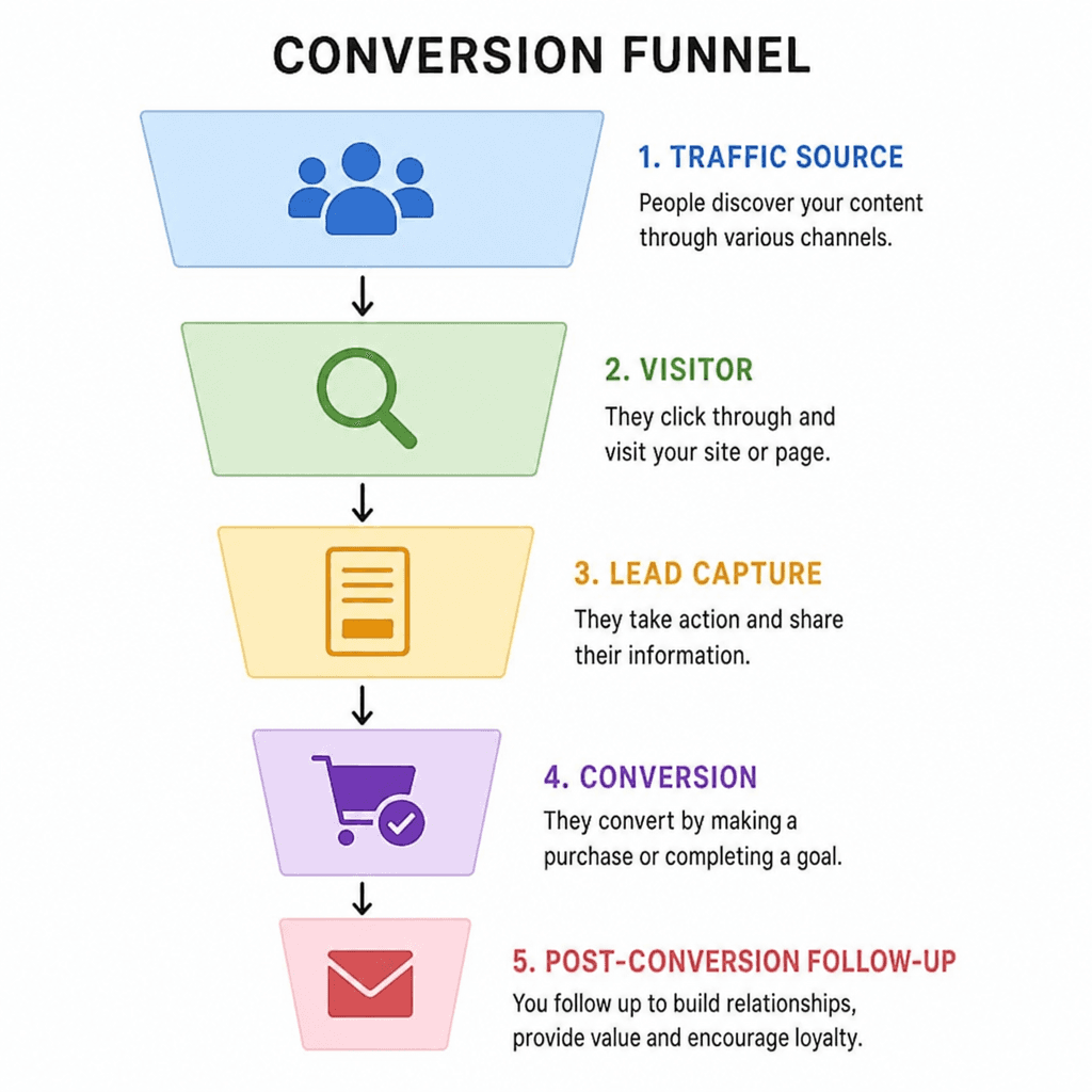
When conversion rates are low, the problem is not always at the final button or form. The issue may be earlier: the headline may not match search intent, the offer may be unclear, or the audience may not trust the page enough to continue. Looking at the whole funnel prevents shallow fixes and helps prioritize changes with the best chance of impact.
Set Conversion Goals Before Changing the Page
Before redesigning a page or testing a new headline, define what success means. This keeps optimization focused and prevents teams from celebrating vanity metrics that do not support the business. For example, a higher click-through rate can be useful, but not if those clicks lead to fewer qualified inquiries or abandoned forms.
Useful conversion goals are specific, measurable, and tied to user behavior. They should also distinguish between primary and secondary actions. A primary conversion might be “schedule a consultation,” while secondary conversions might include “download a comparison guide,” “click to call,” or “view pricing information.” Secondary actions matter because they show intent, but they should not distract from the main business outcome.
A Practical Goal-Setting Checklist
Use this checklist before starting a conversion optimization project:
Name the primary conversion. Decide whether the page exists to generate calls, leads, purchases, bookings, demo requests, or another specific action.
Define conversion quality. Identify what makes a conversion valuable, such as location, budget fit, service need, urgency, or completed contact details.
Identify key micro-conversions. Track meaningful steps like form starts, quiz completions, pricing page views, or call button clicks.
Choose the funnel segment. Optimize one journey at a time, such as paid search traffic to a landing page or organic visitors to a service page.
Document the baseline. Record current conversion rates, traffic sources, device mix, and drop-off points before making changes.
Decide how results will be judged. Look beyond one metric and consider lead quality, revenue, booked appointments, or qualified calls.
This step also makes conversion optimization services easier to evaluate. Whether work is handled in-house or by an outside partner, clear goals help everyone distinguish strategic testing from random page edits.
Also Read: How to Increase Conversion Rate: Why Most Fixes Fail (And What Actually Works)
Improve Message Clarity and Offer Alignment
People convert when they quickly understand what is being offered, why it matters, and what they should do next. If a page makes visitors work too hard to answer those questions, many will leave before they reach the call to action. Clarity is one of the highest-leverage areas in conversion optimization because it affects every visitor, regardless of device or traffic source.
Start with the first screen. The headline should communicate the core value proposition, not just describe the company category. The supporting copy should clarify who the offer is for, what problem it solves, and what happens next. If the page is tied to a specific ad, email, or search result, repeat the language that brought the user there so the experience feels continuous.
A strong offer also reduces ambiguity. “Get started” may work for a familiar product, but it can feel vague for a complex service. More specific calls to action, such as “Book a consultation,” “Compare options,” “Get a treatment estimate,” or “Find the right plan,” tell users what kind of commitment they are making. The better the action matches the user’s readiness, the more natural the conversion feels.
Message Elements That Deserve Attention
Conversion-focused copy should answer these questions early:
Who is this for? Make the audience recognizable without excluding qualified users unnecessarily.
What problem does it solve? Connect the offer to the visitor’s current need or desired outcome.
Why choose this option? Explain the differentiators that matter, such as process, specialization, convenience, transparency, or support.
What happens after the click? Reduce uncertainty by describing the next step, especially for forms, calls, consultations, and quizzes.
What proof supports the claim? Use real testimonials, case examples, credentials, guarantees, or data only when they are available and accurate.
The goal is not to make copy louder. The goal is to make the decision easier.
Use Ux Audit Services to Find Hidden Friction
UX audit services examine how real users experience a website, landing page, form, or funnel. A good UX audit looks beyond visual design and identifies the moments where users slow down, get confused, miss important information, or abandon the process. This makes it a valuable input for conversion optimization because many conversion problems are usability problems in disguise.
A page can look polished and still be difficult to use. Navigation may bury essential information. Mobile buttons may be too close together. Forms may ask for too much information too soon. Error messages may be unclear. The content may answer internal business questions while ignoring what visitors need before they feel ready to act.
An effective UX audit usually reviews several layers of the experience:
Information architecture: Whether pages, menus, and sections are organized around user needs.
Page hierarchy: Whether headlines, subheadings, visuals, and calls to action guide attention in the right order.
Mobile usability: Whether the experience works smoothly on smaller screens, including forms, buttons, sticky elements, and page speed.
Accessibility basics: Whether contrast, labels, keyboard navigation, and readable structure support a wider range of users.
Form and checkout friction: Whether required fields, validation, payment steps, or scheduling tools create unnecessary effort.
Trust cues: Whether users can find proof, policies, contact details, credentials, or other reassurance before converting.

The best audits end with prioritized recommendations. Not every issue has the same impact. A confusing form on a high-traffic page is usually more urgent than a minor layout inconsistency on a low-traffic page. Prioritization keeps the work practical and helps teams focus on changes that are likely to improve conversion rates.
How Should You Optimize Calls and Phone Leads?
Call conversion optimization focuses on increasing valuable phone interactions, not just phone-number clicks. The goal is to help high-intent users call at the right moment, understand what to expect, and reach a person or system that can handle the inquiry effectively.
Calls often matter most for service businesses, healthcare providers, legal practices, home services, local businesses, and high-consideration purchases. In these journeys, users may prefer a conversation because their situation feels urgent, personal, complex, or too specific for a standard form. If the website hides the phone number, fails to explain availability, or sends callers into a confusing experience, the business may lose conversions even when interest is strong.
Website strategies for better call conversion
Make calling easy without forcing it on every visitor. On mobile, tap-to-call buttons should be visible where they make sense, especially on high-intent pages. On desktop, the number should be readable and supported by a clear reason to call, such as scheduling, availability, estimates, or questions about fit.
Context matters. A phone number in the header is useful, but a call prompt near pricing, service details, location information, or emergency-related content may perform better because it appears when intent is higher. The copy around the number should tell users what kind of help they will receive. “Call to discuss availability” is more informative than “Call now.”
Operational factors that affect call conversion
The conversion does not end when the phone rings. Missed calls, long hold times, unclear routing, inconsistent scripts, or poor follow-up can reduce the value of website traffic. If call tracking is available, review not only call volume but also call duration, source, time of day, and outcome. This helps distinguish genuine conversion gains from low-quality or accidental calls.
For call-heavy funnels, align marketing and operations. The page should set expectations that the team can actually meet. If calls are answered during specific hours, say so. If users can leave a message or request a callback, make that clear. Trust is built when the digital promise matches the real experience.
Reduce Form Friction Without Lowering Lead Quality
Forms are one of the most common conversion points, and they are also one of the easiest places to create unnecessary resistance. Every field asks the user to spend attention, share information, and trust that the effort is worthwhile. Reducing form friction can improve conversion rates, but the goal is not always to make the form as short as possible.
A short form may increase submissions while reducing lead quality. A longer form may be appropriate when qualification matters, when the service is complex, or when the user expects a more tailored response. The right form length depends on the stage of the funnel and the value exchange. If you ask for more information, explain why it helps.
Better Form Design Practices
Consider these improvements before removing fields at random:
Group related questions. Users process forms more easily when contact details, preferences, and qualifying questions are organized logically.
Use plain labels. Avoid internal terminology that visitors may not understand.
Mark required fields clearly. Do not make users guess what they must complete.
Show progress for multi-step forms. Progress indicators reduce uncertainty when a form has several screens.
Make errors easy to fix. Error messages should appear near the field and explain the problem clearly.
Optimize for mobile input. Use the right keyboard type for phone numbers, email addresses, dates, and numeric entries.
Reassure users near sensitive fields. If asking for personal, financial, or health-related information, explain how it will be used in simple terms.
Multi-step forms can work well when the first step is easy and relevant. They create momentum, especially when the questions feel helpful rather than invasive. However, they should not trick users into a long process. The experience should remain transparent and respectful.
Build Trust at the Point of Decision
Trust is not a single badge or testimonial. It is the overall feeling that the page is credible, honest, and safe enough for the user’s next step. Trust becomes especially important when the conversion involves money, personal information, health concerns, legal issues, home access, or a major time commitment.
Different audiences need different types of reassurance. A software buyer may look for integrations, security information, reviews, and implementation support. A local service customer may look for service areas, photos, licensing information if applicable, and clear contact details. A mental health user may look for privacy, empathy, professional boundaries, and a sense that the next step will not be overwhelming.
Trust Signals That Support Conversion
Use only trust signals that are accurate and relevant. Common examples include:
Real testimonials or reviews, used with permission where needed.
Case studies or examples that reflect actual work.
Clear pricing information or honest pricing guidance when exact pricing is not available.
Professional credentials, certifications, or affiliations when they genuinely apply.
Transparent policies for privacy, refunds, cancellation, shipping, or scheduling.
Recognizable client logos only when permission exists.
Detailed contact information and clear next-step instructions.
Trust content should appear close to moments of hesitation. A privacy reassurance near a form can matter more than a generic trust section far below it. A short explanation of what happens after booking can reduce anxiety better than a broad claim about great service. The more specific the concern, the more specific the reassurance should be.
Create Calls to Action That Match Intent
A call to action works best when it matches the user’s current level of awareness and commitment. Someone who is ready to buy may respond to “Start checkout,” while someone comparing options may need “See plans” or “Request a recommendation.” If every visitor is pushed toward the same high-commitment action, the funnel may lose people who need one more step before converting.
Use a hierarchy of CTAs. The primary CTA should support the main conversion goal. Secondary CTAs can serve users who are interested but not ready. For example, a service page might prioritize “Schedule a consultation” while also offering “View services” or “Download a guide.” The secondary path should nurture intent, not distract from the business objective.
Button copy should be specific and outcome-oriented. Instead of relying only on generic phrases like “Submit,” choose language that reflects what the user receives: “Get my estimate,” “Book my call,” “Send my request,” or “View my results.” Even small wording changes can reduce uncertainty because they confirm the consequence of clicking.
Placement also matters. CTAs should appear where users have enough context to act. On longer pages, repeat the primary CTA after meaningful sections, but avoid crowding every screen with the same demand. When users feel guided rather than pressured, the action becomes easier to take.
Use Testing to Learn, Not Just to Win
Testing is a core part of conversion optimization, but it is often misunderstood. The point is not to run endless button-color experiments. The point is to learn which messages, layouts, offers, and user flows help more qualified visitors move forward.
A/B testing compares two versions of an element or page. It works best when there is enough traffic and when the change is tied to a clear hypothesis. For example: “If we explain the consultation process before the form, more visitors will complete the request because they will understand what happens next.” This is stronger than “Let’s try a different design and see what happens.”
For lower-traffic websites, structured observation may be more practical than formal testing. Teams can use analytics, session recordings, form analytics, user interviews, sales feedback, and usability reviews to identify likely friction points. Changes can then be rolled out carefully and measured over time.
A Simple Optimization Experiment Template
Use this format to keep tests strategic:
Observation: What behavior or feedback suggests a problem?
Hypothesis: What change do you believe will improve the outcome, and why?
Audience: Which traffic segment, page, or device group is affected?
Change: What exactly will be different?
Primary metric: Which conversion rate or outcome will determine success?
Guardrail metric: What must not get worse, such as lead quality or revenue per visitor?
Learning: What did the result teach you about user motivation or friction?
This approach creates a knowledge base, not just a list of wins and losses. Over time, the team learns what users value, what they distrust, and what information they need before acting.
Apply Quiz Funnels Carefully in Sensitive Categories
Quiz funnels can be effective because they turn a passive browsing experience into an interactive path. A well-designed quiz helps users clarify their needs, receive a more relevant recommendation, and feel understood before they reach the final conversion point. However, quiz funnel conversion optimization in mental health or other sensitive areas requires extra care.
Mental health-related quizzes should avoid exaggerated claims, manipulative urgency, or language that makes users feel diagnosed by a marketing tool. The quiz can help route people toward resources, service options, or next steps, but it should be framed responsibly. If the quiz collects sensitive information, the experience should clearly explain why the questions are being asked and how responses will be used.
Responsible Quiz Funnel Principles
For sensitive topics, keep these principles in mind:
Use supportive language. Avoid shame, fear, or pressure as conversion tactics.
Clarify the quiz purpose. Tell users whether the quiz provides guidance, matching, education, or intake support.
Avoid unsupported diagnosis. Do not present quiz results as medical or clinical conclusions unless the experience is built and reviewed appropriately by qualified professionals.
Respect privacy. Ask only for information that is needed, and make privacy expectations easy to understand.
Offer appropriate next steps. Results should guide users toward a safe, relevant action rather than forcing a sales pitch.
Include urgent-resource guidance where appropriate. If the context may involve crisis or immediate danger, the funnel should not be the only path presented.
Quiz funnels can improve conversion rates when they reduce overwhelm and personalize the next step. They can harm trust when they feel intrusive, misleading, or overly promotional. In sensitive categories, ethical clarity is part of optimization.
Document Insights in a Conversion Optimization Filetype Pdf or Playbook
Many teams run optimization work but fail to preserve what they learn. A shared playbook, internal report, or conversion optimization filetype PDF can help document hypotheses, test results, page changes, audience insights, and decision rules. The exact format matters less than the habit of recording what was tried and why.
This documentation is especially useful when teams change, agencies rotate, or multiple departments influence the funnel. Without a record, the same tests may be repeated, successful changes may be reversed, and decisions may depend on opinion rather than evidence. A concise optimization playbook gives everyone a common reference point.
Include these sections in a useful document:
Funnel map: Key pages, traffic sources, conversion points, and follow-up steps.
Baseline metrics: Current conversion rates and related quality indicators.
Audience insights: Common objections, motivations, search intent, and sales feedback.
Test history: Hypotheses, variants, dates, outcomes, and lessons learned.
UX audit findings: Prioritized friction points and recommended fixes.
Messaging guidelines: Approved value propositions, CTA language, proof points, and tone notes.
Future opportunities: Ideas ranked by potential impact, effort, and confidence.
Documentation also makes outside conversion optimization services more efficient. A consultant or agency can move faster when they can see past decisions, current constraints, and what the team already knows.
Prioritize Changes by Impact, Effort, and Confidence
Conversion optimization can produce a long list of possible improvements. Some are strategic, some are technical, and some are cosmetic. Prioritization prevents teams from spending time on low-impact changes while major friction remains untouched.
A practical prioritization model considers three factors. Impact estimates how much the change could affect the primary conversion goal. Effort estimates the time, cost, and complexity required. Confidence reflects the strength of the evidence behind the idea. A change supported by analytics, user feedback, and a UX audit deserves more attention than a change based only on preference.
High-priority work often includes pages with significant traffic, forms with obvious abandonment, mismatched ad-to-page messaging, unclear offers, broken mobile experiences, and weak calls to action near high-intent sections. Lower-priority work may include minor visual refinements, low-traffic pages, or experiments with no clear hypothesis.
Example Prioritization Table
Opportunity | Potential impact | Effort | Confidence | Priority |
|---|---|---|---|---|
Clarify headline and first-screen CTA on main landing page | High | Low | Medium | High |
Reduce unnecessary fields in consultation form | High | Medium | High | High |
Add privacy reassurance near sensitive form questions | Medium | Low | High | High |
Redesign entire homepage without funnel data | Unknown | High | Low | Low |
Change button color across the site | Low | Low | Low | Low |
Prioritization should stay flexible. Once new data appears, revisit the list. Optimization is an ongoing decision process, not a one-time redesign checklist.
Measure Conversion Rates in Context
Conversion rates are useful, but they can be misleading when viewed alone. A page that converts 10% of highly qualified referral traffic may be healthier than a page that converts 3% of broad cold traffic. Device type, traffic source, offer complexity, price point, and user urgency all influence expected performance.
Instead of comparing every page to one universal benchmark, compare performance within meaningful segments. Look at organic search separately from paid search. Review mobile and desktop behavior separately. Compare first-time visitors with returning visitors when possible. Evaluate lead quality alongside lead volume.
Metrics That Add Context
Track a mix of performance and diagnostic metrics:
Primary conversion rate: The percentage of visitors who complete the main action.
Micro-conversion rate: The percentage who take important intermediate steps.
Form start and completion rates: Useful for identifying form hesitation or abandonment.
Call click and qualified call rates: Important for call conversion optimization.
Revenue or value per visitor: Helpful when conversion quality varies.
Drop-off rate by funnel step: Shows where users exit before completing the journey.
Scroll depth and engagement signals: Useful when interpreted carefully, not as standalone success measures.
Source and device performance: Reveals whether a problem is universal or segment-specific.
Measurement should answer a practical question: where should you act next? If reporting does not guide decisions, simplify it until it does.
Common Mistakes That Weaken Conversion Optimization
Many optimization programs fail because they focus on surface-level changes while ignoring user motivation. Changing colors, adding pop-ups, or copying competitors may create activity, but not necessarily progress. Effective optimization is grounded in evidence, empathy, and a clear business goal.
Avoid these common mistakes:
Testing without enough context. Random experiments rarely produce useful learning.
Optimizing for clicks instead of outcomes. More clicks are not always better if fewer people become qualified leads or customers.
Ignoring mobile users. A funnel that works on desktop may fail on mobile because of layout, speed, form design, or tap targets.
Overloading pages with proof. Trust signals help, but too many badges, testimonials, and claims can feel cluttered or desperate.
Making CTAs too vague. Users should understand exactly what happens after they click.
Asking for sensitive information too early. This can be especially damaging in health, finance, legal, and personal-service contexts.
Treating optimization as a one-time project. Markets, offers, traffic sources, and user expectations change, so funnels need ongoing review.
The best teams treat mistakes as learning opportunities. If a change fails, ask what assumption was wrong. That question often leads to a stronger next test.
A Practical Roadmap for Ongoing Optimization
Conversion optimization works best as a repeatable cycle. Start by understanding the funnel, then diagnose friction, prioritize opportunities, implement changes, and measure results. Each cycle should produce both performance improvements and deeper knowledge about users.
A simple roadmap looks like this:
Define the conversion goal. Choose the primary action and the quality signals that matter.
Map the funnel. Identify traffic sources, landing pages, decision points, and follow-up steps.
Collect evidence. Review analytics, user behavior, form data, call data, customer feedback, and UX audit findings.
Identify friction and motivation gaps. Look for unclear messaging, missing proof, technical issues, form resistance, or mismatched intent.
Prioritize improvements. Rank ideas by impact, effort, and confidence.
Create a hypothesis. State why the change should improve conversion rates.
Implement and measure. Test when possible, monitor carefully when formal testing is not practical.
Document the learning. Add results and insights to a shared playbook or PDF.
Repeat with the next priority. Use each cycle to refine the funnel rather than restart from scratch.
This roadmap keeps optimization manageable. Instead of trying to fix everything at once, you improve the most important parts of the journey in a deliberate order.
Also Read: Why Your Website Needs a UX Audit Before Hiring a Agency USA?
Turning Better Experiences into Better Outcomes
Effective conversion optimization is not about pressuring users into action. It is about making the right action clear, credible, and easy for the right person at the right moment. When the conversion funnel aligns with user intent, every element has a job: the message creates relevance, the UX reduces friction, the proof builds trust, and the CTA guides the next step.
The strongest results come from combining strategy with evidence. Use analytics to see where users drop off, UX audit services to understand why friction exists, testing to validate improvements, and documentation to preserve what you learn. Whether you are improving call conversion optimization, refining a lead form, building a quiz funnel, or reviewing a full website, the same principle applies: optimize the experience around the user’s decision, not around assumptions.
Start with one high-impact funnel, define the conversion that matters, and make the next step easier to understand and complete. That focused approach is often the difference between scattered changes and meaningful growth in conversion rates.
FAQs
Last updated:
Mad Brains Technologies
Enterprise UX & Product Strategy Team
Mad Brains is an enterprise UX and product consultancy focused on reducing product risk and accelerating growth. Through UX audits, conversion-led design, and full-stack development, the team helps organizations build scalable digital platforms that drive measurable business outcomes.