UX Audit
UX Audit Checklist to Improve Conversions in 2026: Stop Spending More—Start Converting Better
By

Abhinav Sharma


TL;DR: Key Takeaways
A UX audit systematically identifies friction points killing your conversions—so you can fix them instead of spending more on ads
Every $1 invested in UX returns up to $100 in ROI; improving UX can boost conversions by 200-400%
This 15-point checklist covers: landing experience, navigation, onboarding, trust signals, CTAs, and accessibility
Prioritize findings by impact and effort—start with high-impact, low-effort fixes
Self-audits are valuable but limited; expert audits reveal issues you’re too close to see
Mad Brains’ UX audit helped Barbeque Nation achieve +72% conversions and JustWravel reduce bounce by 38.6%
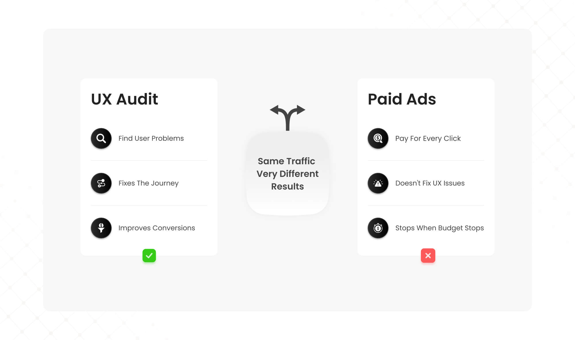
Your Meta ads are optimized. Your Google campaigns are dialed in. Traffic is flowing. But conversions? Flat.
Here’s the uncomfortable truth most SaaS founders and marketers don’t want to hear: pouring more money into paid acquisition when your product experience leaks conversions is like filling a bucket with holes.
Every $1 invested in UX returns up to $100 (a 9,900% ROI according to Forrester). Yet most companies keep increasing ad budgets while ignoring the friction that’s silently killing their conversion rates.
A UX audit changes that equation. It systematically identifies where users struggle, drop off, and abandon—so you can fix what’s broken before spending another dollar on traffic.
This checklist gives you a practical framework to audit your own site or SaaS product for conversion-killing UX issues. Use it to diagnose problems, prioritize fixes, and increase ROI without inflating your ad spend.
What Is a UX Audit (And Why It Beats Throwing Money at Ads)?
A UX audit is a systematic evaluation of your digital product to identify friction points that hurt conversions. It combines heuristic analysis (expert review against usability principles), behavioral data (analytics, heatmaps, session recordings), and user research to pinpoint exactly where and why users drop off.
For SaaS platforms specifically, a CRO-focused UX audit examines the entire user journey—from landing page to activation to retention—looking for barriers that prevent users from reaching value.
The ROI case is compelling. According to research, improving customer experience can raise KPIs by over 80%. A well-designed interface can boost conversion rates by up to 200%, and comprehensive UX improvements can push that to 400%.
Compare that to paid ads, where you’re paying for every click whether it converts or not. CRO and UX optimization let you extract more value from traffic you already have—making every marketing dollar work harder.
The 15-Point UX Audit Checklist for Conversions
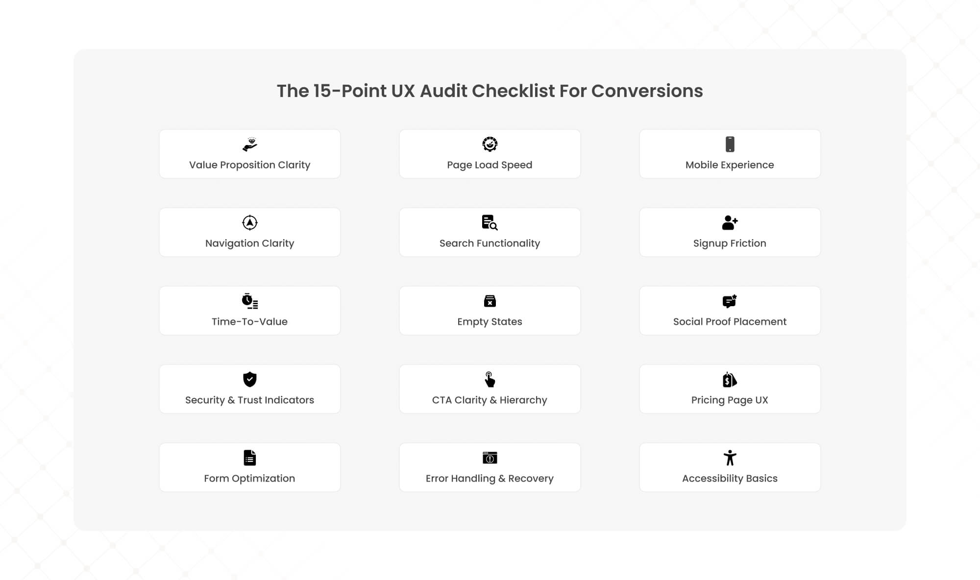
Use this checklist to systematically evaluate your website or SaaS product. Each item includes what to look for, why it matters for conversions, and how to assess it.
Part 1: First Impressions & Landing Experience
1. Value Proposition Clarity (Above the Fold)
What to check: Can a first-time visitor understand what you do, who it’s for, and why it matters within 5 seconds?
Why it matters: Users form opinions about websites in approximately 50 milliseconds. If your value proposition is buried or unclear, visitors bounce before engaging.
How to audit: Show your homepage to someone unfamiliar with your product for 5 seconds. Ask them to describe what you offer. If they can’t, your messaging needs work.
2. Page Load Speed
What to check: Does your site load in under 3 seconds on desktop and mobile? Are Core Web Vitals (LCP, INP, CLS) within Google’s recommended thresholds?
Why it matters: A 1-second delay in page load can reduce conversions by up to 20%. Sites loading in 1 second convert 3x better than those loading in 5 seconds.
How to audit: Run your key pages through Google PageSpeed Insights. Prioritize pages with the highest traffic and conversion intent (pricing, signup, checkout).
3. Mobile Experience
What to check: Is the mobile experience equivalent to desktop—not just “responsive” but genuinely usable? Are tap targets appropriately sized? Is text readable without zooming?
Why it matters: Over 60% of traffic comes from mobile devices. Mobile cart abandonment rates reach 79-85%, often due to poor mobile UX.
How to audit: Complete your own signup or purchase flow on a mobile device. Note every moment of friction, confusion, or frustration.
Part 2: Navigation & Information Architecture
4. Navigation Clarity
What to check: Can users find what they’re looking for within 3 clicks? Is the navigation structure logical and consistent across pages?
Why it matters: 94% of users cite easy navigation as the most important website feature. Confusing navigation increases bounce rates and prevents users from reaching conversion points.
How to audit: Attempt to complete 3-5 common user tasks (find pricing, contact support, understand a feature). Count clicks and note any dead ends.
5. Search Functionality
What to check: If you have search, does it return relevant results? Does it handle typos and synonyms gracefully?
Why it matters: Users who search convert at higher rates because they have specific intent. Poor search experiences frustrate high-intent visitors.
How to audit: Search for your top 10 products, features, or content pieces using terms your customers would use (not your internal terminology).
Part 3: Onboarding & Activation (SaaS-Specific)
6. Signup Friction
What to check: How many fields does your signup form require? Are you asking for information you don’t need immediately? Is there a clear single CTA?
Why it matters: Every additional form field reduces conversions. 68% of users won’t submit forms requiring too much personal information upfront.
How to audit: Count your signup form fields. For each field, ask: “Do we absolutely need this before the user experiences value?” Remove anything non-essential.
7. Time-to-Value
What to check: How quickly can a new user reach their first meaningful outcome (the “aha moment”)? What percentage complete onboarding?
Why it matters: Users who don’t experience value quickly don’t convert to paid. 63% of users say onboarding experience determines whether they’ll keep using a product.
How to audit: Measure time from signup to first key action. If it’s more than a few minutes for most users, you have an activation problem.
8. Empty States
What to check: When users encounter screens with no data (new accounts, empty dashboards), do you guide them toward the next action?
Why it matters: Empty states are decision points where users either engage or abandon. A blank screen with no guidance is a conversion killer.
How to audit: Create a fresh test account and screenshot every empty state. For each, ask: “Does this clearly show the user what to do next?”
Part 4: Trust & Credibility Signals
9. Social Proof Placement
What to check: Are testimonials, case studies, client logos, and reviews visible at key decision points (not buried on a separate page)?
Why it matters: 74% of consumers say reviews and testimonials influence purchasing decisions. Social proof reduces perceived risk at conversion moments.
How to audit: Map your conversion funnel and verify that relevant social proof appears at each stage, especially near CTAs and pricing.
10. Security & Trust Indicators
What to check: Are SSL certificates, payment security badges, privacy policies, and trust seals visible during checkout or data collection?
Why it matters: Security concerns cause significant cart and form abandonment. Users need reassurance when providing payment or personal information.
How to audit: Go through your checkout or signup as a skeptical first-time visitor. Note where you’d want reassurance that your data is safe.
Part 5: Conversion Points & CTAs
11. CTA Clarity & Hierarchy
What to check: Is there one clear primary CTA per page? Is the button text specific and action-oriented (not generic “Submit” or “Click Here”)?
Why it matters: Competing CTAs create decision paralysis. Vague button text reduces click-through. Specific CTAs like “Start Free Trial” outperform generic alternatives.
How to audit: On each key page, identify the primary action you want users to take. Is it visually dominant? Is the button text compelling?
12. Pricing Page UX
What to check: Can users easily compare plans? Is the recommended plan highlighted? Are features explained clearly (no jargon)?
Why it matters: Pricing pages are high-intent, high-stakes. Confusion here directly costs conversions. Clear tier differentiation and a recommended option reduce decision friction.
How to audit: Ask someone unfamiliar with your product to choose a plan. Watch where they hesitate or express confusion.
13. Form Optimization
What to check: Do forms use inline validation? Are error messages helpful and specific? Is progress indicated for multi-step forms?
Why it matters: Form abandonment is one of the largest conversion leaks. Poor error handling and lack of feedback frustrate users mid-conversion.
How to audit: Intentionally make mistakes in your forms. Are errors caught immediately with clear guidance, or do you get vague errors after submission?
Part 6: Performance & Accessibility
14. Error Handling & Recovery
What to check: When something goes wrong (broken links, failed submissions, system errors), do users get helpful guidance to recover?
Why it matters: Errors happen. How you handle them determines whether users retry or abandon. Generic “Something went wrong” messages kill conversions.
How to audit: Test edge cases: wrong passwords, invalid inputs, broken links. Evaluate whether error messages help users fix the problem.
15. Accessibility Basics
What to check: Is text readable (sufficient contrast, appropriate sizing)? Can the site be navigated by keyboard? Do images have alt text?
Why it matters: Accessibility issues affect a significant portion of users, including those with temporary impairments (bright sunlight, broken mouse). Poor accessibility means lost conversions.
How to audit: Use a tool like WAVE or axe DevTools to scan for major accessibility issues. Attempt to navigate your signup flow using only keyboard.
How to Prioritize UX Audit Findings
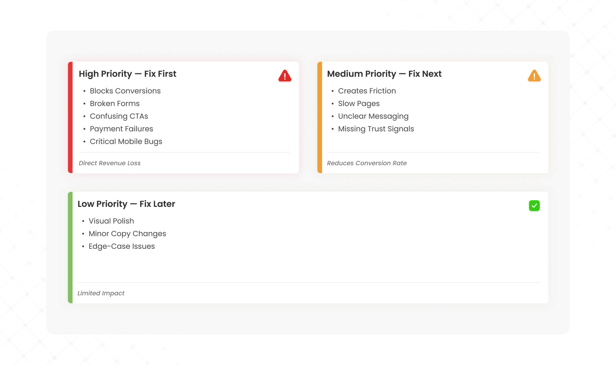
Once you’ve completed the checklist, you’ll likely have a list of issues. Prioritize them using this framework:
High Priority (Fix First) Issues that directly block conversions: broken forms, confusing CTAs, failed payment flows, critical mobile bugs. These are costing you money every day.
Medium Priority (Fix Next) Issues that create friction but don’t completely block users: slow pages, unclear messaging, missing trust signals. These reduce conversion rates incrementally.
Low Priority (Fix Later) Aesthetic improvements, minor copy tweaks, edge-case bugs. These matter but won’t move metrics significantly.
For each issue, estimate impact (how many users affected, how severely) and effort (development time, resources required). Start with high-impact, low-effort wins to build momentum.
From Checklist to Results: Why Most DIY Audits Fall Short
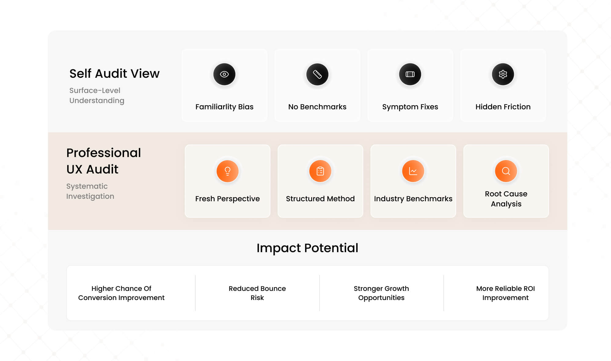
This checklist gives you a solid starting point. But self-audits have inherent limitations.
You’re too close to your own product. You’ve used it hundreds of times, so flows that confuse new users feel intuitive to you. You know what your copy means even when it’s unclear to outsiders.
You lack comparative data. Is your 3% conversion rate good or bad? Without benchmarks from similar SaaS products, you’re guessing about severity.
You might fix symptoms, not causes. A confusing pricing page might be the visible problem, but the root cause could be a value proposition issue that starts on the homepage.
This is where professional UX audits deliver outsized ROI. A structured expert audit combines fresh perspective, proven frameworks, competitive benchmarks, and systematic methodology to surface issues you’d never find on your own.
When we audited Barbeque Nation’s booking flow, we identified 12 friction points in what appeared to be a simple 4-step process. The team had looked at it countless times without seeing the problems. Fixing just three of those issues drove a 72% conversion lift and brought in 31,000 new visitors.
For JustWravel, our UX audit revealed user journey issues causing high bounce rates. The fixes reduced bounce by 38.6% while adding 50,000 new users—without increasing ad spend.
Ready to Find the Leaks in Your Conversion Funnel?
This checklist will help you spot obvious issues. But the friction points costing you the most conversions are often the ones you can’t see—because you’re too familiar with your own product.
Our UX Audit goes deeper. We combine heuristic analysis, behavioral data, and conversion expertise to identify exactly where users drop off and why. Then we prioritize fixes by revenue impact, so you know what to tackle first.
The result: higher conversions from existing traffic, lower customer acquisition costs, and ROI that compounds every month.

Want to see what a conversion-focused UX audit looks like in practice? See how we helped Barbeque Nation increase conversions by 72% →
About Mad Brains Technologies LLP
Mad Brains is a conversion-focused digital product and UX partner helping SaaS and growth brands improve conversions, user experience, and product performance through audits, design, and scalable development. Our UX audit methodology has helped brands like Tanishq (Tata Group), Barbeque Nation, JustWravel, and Kotak Life turn friction into revenue.
Explore UX Audit Services → | Learn about UI/UX Subscription →
Last updated:
Abhinav Sharma
Founder & CEO | Enterprise UX & Growth Strategy
Abhinav Sharma is the Co-Founder & CEO of Mad Brains, specializing in enterprise UX audits, conversion-focused product design, and high-impact experience systems. He helps SaaS, healthcare, and fintech companies reduce usability risk, increase conversions, and build scalable, user-centered platforms.