Food & Beverage
By

Paras Attri
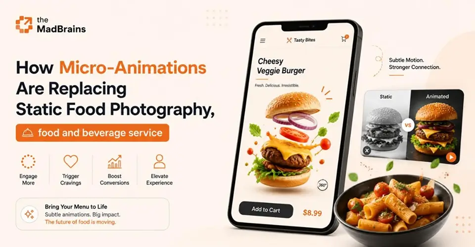


Micro-animations are replacing static food photography as the main way food brands grab attention. This post explains why motion works, how it reduces waiting and menu overload, and how to keep animations fast on mobile.
For years, food brands leaned almost entirely on photography. A glossy burger, coffee pouring in slow motion, a neat grid of dishes shot from above. The photos did the selling.
Photos still matter. But good food app design now leans just as much on motion: the small animations that respond when you tap, scroll or wait. They don't replace a great photo. They make the whole ordering experience feel more alive and easier to follow.
Why Static Photos Alone Aren't Enough
A photo is a single frame. It shows the dish, but it doesn't respond to anything the user does. Tap a button that doesn't react, and people wonder if it worked. Wait on a blank screen after paying, and they start to worry.
That's the gap motion fills. Done well, micro-animations:
confirm actions, so users know a tap registered
guide attention to what matters next, like the checkout button
make waiting feel shorter, by showing that something is happening
add personality, so the app feels like your brand rather than a generic template
Our eyes are naturally drawn to movement, which is exactly why motion needs to be used with purpose. A little goes a long way.
6 Micro-Animations That Make Food Apps Easier to Use
These are the moments in a food ordering journey where a small animation does the most work.
1. Add-to-cart feedback
When someone adds a dish, the item can fly into the cart or the cart icon can bounce and update its count. It's instant proof the tap worked, and it keeps the cart in the user's mind without a pop-up getting in the way.
2. Order status and tracking
After payment, the waiting starts. A progress bar that moves from "Order received" to "Being prepared" to "Out for delivery", or a map pin that moves as the courier gets closer, turns an anxious wait into something people can follow. It also means fewer people need to call the restaurant to ask where their food is.
3. Loading states that feel shorter
A blank screen or a spinning wheel feels slow. A subtle skeleton screen, showing the shape of the menu while it loads, or a small branded animation, like a whisk stirring, makes the same wait feel shorter and keeps people on the page.
4. Menus that reveal detail gradually
A menu with fifty dishes and every detail on show is overwhelming. Expanding a dish card smoothly to show ingredients, options and allergens only when someone taps it keeps the menu clean and helps people decide faster.
5. Customization that responds
When someone adds extra cheese or switches to a large size, the price should update with a gentle transition, and the chosen option should visibly change state. People feel in control of their order instead of guessing.
6. Small rewards
A short celebration when an order is placed, or a loyalty stamp filling up, gives a moment of delight at the end of the journey. Keep these brief, so they feel like a thank-you rather than a delay.
If ordering still feels like hard work, motion won't fix it on its own. Our guide to how friction in online ordering hurts restaurant growth covers the bigger problems to fix first.
Design Principles for Motion That Helps, Not Distracts
The difference between helpful motion and annoying motion comes down to a few rules.
Give every animation a job. It should confirm an action, show progress or guide attention. If it does none of these, cut it.
Keep it quick. Most interface animations should finish in well under half a second. Anything longer starts to feel like waiting.
Use natural easing. Movements that start gently and settle softly feel physical and smooth. Linear, robotic motion feels cheap.
Stay consistent. The same action should always animate the same way, so the app feels predictable.
Never block the user. People should be able to keep tapping and scrolling while an animation plays.
Keep It Fast and Accessible
An animation that slows the app down or drains the battery does more harm than good, however nice it looks.
Performance
Use lightweight formats like Lottie files or short WebM loops instead of heavy GIFs or video.
Animate cheap properties, like position and opacity, so animations stay smooth on mid-range phones.
Always provide a static fallback, so nothing breaks on a slow connection.
Test on an older Android phone over mobile data, not just the latest iPhone on office Wi-Fi.
Accessibility
Respect the phone's "reduce motion" setting and switch to simple fades or no animation when it's on.
Avoid flashing effects. WCAG guidance warns against anything that flashes more than three times a second.
Don't rely on motion alone to communicate. Pair it with text or icons, like "Added to cart", so everyone gets the message.
Where to Start
You don't need to animate everything at once. Walk through your own app as a customer, from opening it to receiving an order, and note three moments:
where you weren't sure a tap worked
where you waited without knowing what was happening
where the screen felt crowded
Those three moments are where micro-animations will help most. Start there, keep each animation short, and check that the app still feels fast.
Conclusion
Great food photography still sells the dish. Micro-animations sell the experience of ordering it: confirming every tap, making waits feel shorter and guiding people from the menu to the checkout without confusion. Used with purpose, they make a food app feel as considered as the food itself.
Planning a new food app or reworking an existing one? Talk to our team about where motion and a cleaner ordering flow could make the biggest difference.
FAQs
Last updated:
Paras Attri
SEO Content Writer at MadBrains
Paras Attri is an SEO Content Writer at MadBrains with 3.5 years of experience across SEO, AEO (answer engine optimisation) and GEO (generative engine optimisation). He writes content built to rank on Google and get picked up by AI search tools like ChatGPT and Google’s AI Overviews. His topics include ecommerce, UI/UX design, web and app development, and how AI fits into building digital products, all written in plain English for founders and marketing teams.
When he’s not writing, he’s usually gaming, halfway through a new series, or picking out songs on his guitar.