E-commerce Optimization
By

Mad Brains Technologies



Every successful ecommerce website employs one design choice that most users won’t even think about but will certainly experience: the way the navigation process works, the way the product page creates trust, the way the checkout process takes away any hesitation from users instead of building up more of it. That’s not something that happens by chance; it’s an outcome of proper they're the result of strategic ecommerce website design & development backed by user-focused UX/UI principles. However, many stores that don’t use proper UX/UI find themselves wondering why their traffic doesn’t lead to any purchases without realizing that the solution was right there in their designs all along. In this playbook, we explain UX/UI elements that distinguish ecommerce conversion sites from just ecommerce sites.
First Impressions: The 3-Second Trust Test
As soon as a user enters your website, an invisible timer kicks off. In just 3 seconds, the brain makes a choice: stay or go. This is the Trust Test, which is all about visuals.
1. The Above-The-Fold Checklist
To pass the test, the above-the-fold space has to answer three questions straight away:
"What is it?" The headline is a straightforward value proposition without any buzzwords or industry terms.
"How does it look?" The top-quality hero shot or video that illustrates the product at its best.
"What is my next step?" Clear CTA button such as "Shop New Arrivals."
2. Micro-Clues That Build Instant Credibility
Security Badges: Place payment badges like Visa, Mastercard, and PayPal, and also include the security padlock from SSL near the footer or header area.
Social Proof at First Glance: Include the star rating, or even just the line “Trusted by Customers” near your headline.
Professionalism: Clean design and plenty of white space mean professionalism, while clutter equals poor quality.
If your page takes too long just to load, users will leave before the test even begins. Speed is your first and most critical design asset.
Navigation & Information Architecture
Once the visitor completes the Trust Test, the next challenge is quite obvious: Can they locate what they were searching for easily? Confusing menu structure and hidden categorization are deadly factors that silently convert visitors into dropouts.
1. The 3-Click Rule
There shouldn’t be more than three clicks between any product and the homepage, since every extra click gives the customer a chance to bail out.
Homepage→Category →Product must be the standard depth for most catalogs.
Mega menus can be effective if you have lots of items to sell, but only if they are organized in a way that makes sense to your customers.
2. Search That Can Understand Your Intent
Autocomplete and correction functionality is more crucial than you think. If your search bar doesn’t find any results because of a minor spelling mistake, the buyer will immediately move on to another company.
Filtering options like size, price, category, and rating must reflect updated information without refreshing the page.
3. Breadcrumbs & Wayfinding
Breadcrumb links aren’t decorations. Breadcrumb links save time on backtracking and assure users that they haven’t lost their way through the website’s architecture.
The sticky navigation bar allows the user to go to the cart, search for something, and move through different product categories without having to scroll back up.
Once the user stops thinking about how to navigate, he/she is no longer thinking about what to purchase.
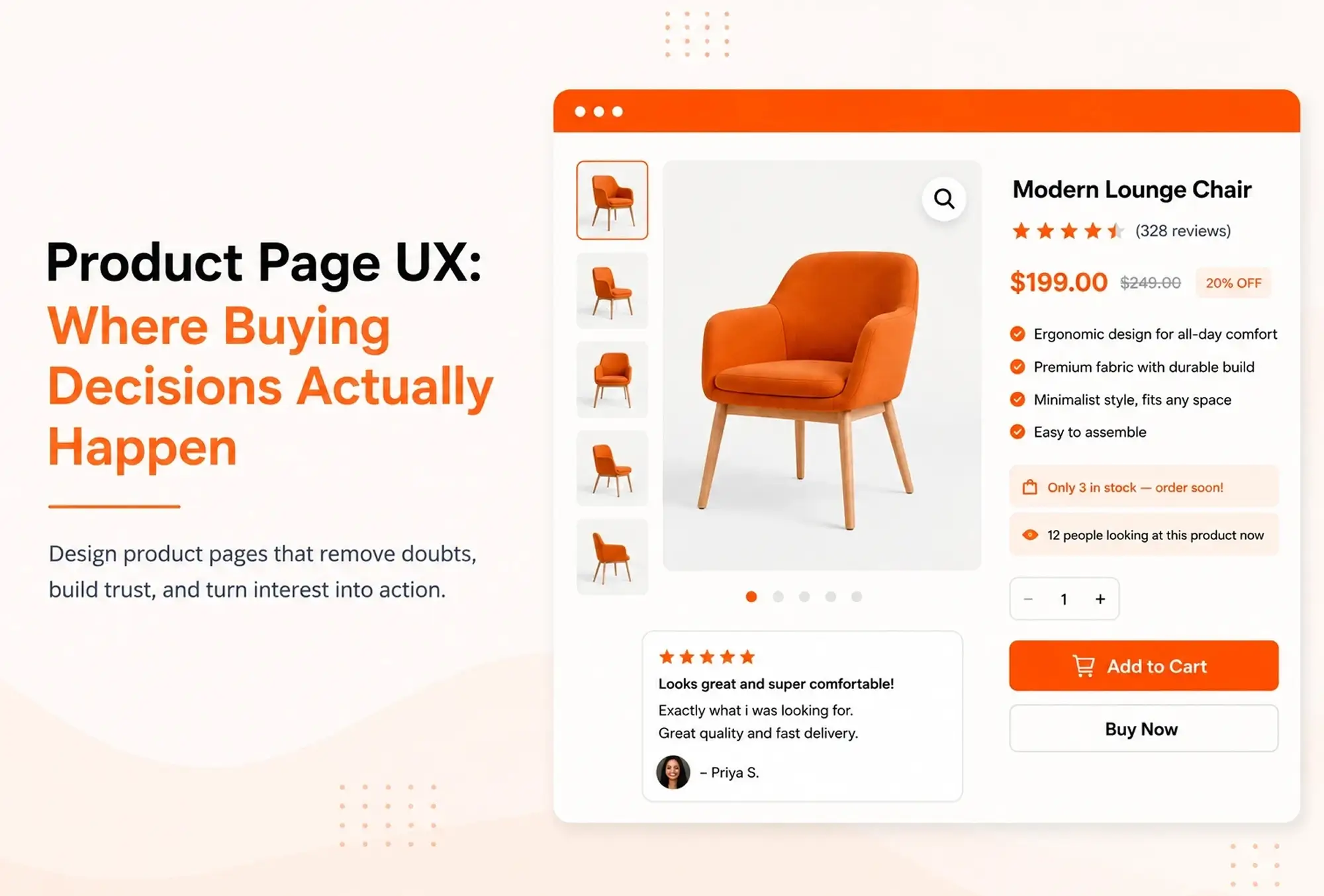
Product Page UX: Where Buying Decisions Actually Happen
The product page is where interest becomes intention. Everything here must perform one task: dispelling doubts.
Visuals that sell experience, not just the thing. Multi-angled, zoom, and lifestyle photos allow potential customers to see themselves in possession of an item that one studio shot can’t provide.
Scannable Product Descriptions. Use bullet points for product specifications and a story for its advantages. The buyers scan first, then read.
Product reviews are posted close to the “Add to Cart” button, not at the end of the webpage, ensuring that social proof is there just where buyers hesitate most.
Honest urgency triggers such as “Only 3 in stock” or “12 people looking at this product now” help create momentum without being manipulative.
A good product page does not have to persuade; it eliminates any excuse not to purchase the product.
Mobile-First Design Isn't Optional Anymore
Mobile browsing is now the norm in ecommerce, and an online store that simply works on mobile but hasn’t been optimized for mobile will have lost customers before they even get to check out.
Buttons, filters, and size selectors require sufficient space between them to prevent misclicks that silently drive users away from your application.
All forms should be defaulted to number pads or use autofill when possible, as typing on mobile devices is cumbersome and every additional tap may drive users away.
Sticky “Add to Cart” buttons at the bottom of the page on mobile device screens ensure visibility of the main action.
Mobile-first design is not simply a matter of reducing your desktop design. Rather, it’s a complete change in how you think about your process, thinking about thumbs rather than cursors.
Checkout Friction: The Silent Conversion Killer
More ecommerce dollars are not lost on the home page but rather at checkout, where most consumers leave their carts uncompleted. The main reasons behind this phenomenon are not just unexpected costs but simply too much friction in the process.
The guest checkout process must remain available at all times. The creation of an account prior to making a purchase is among the leading causes of cart abandonment.
Reduce the number of form fields. Each form field removed decreases cognitive load and the chances of an input mistake.
Include a progress bar (Cart > Delivery > Payment > Confirmation) to inform customers about how much more is left.
Increase trust with security seals and return policies in the last stage of the process that’s when customers have the most doubts.
Before redesigning your checkout, it's worth identifying where users experience friction. Read our blog, SaaS UI Design That Actually Converts: The Audit-First Approach Most Teams Skip, to learn how an audit-first strategy uncovers usability issues and helps improve conversions.
Why Design Partnership Matters: The Mad Brains Approach
Understanding the essence of excellent UX/UI is one thing; being able to deliver it flawlessly and consistently throughout the site, at all breakpoints, and for all customer journeys is something entirely different altogether. That’s when Mad Brains steps in.
Our specialty is designing and developing ecommerce website design & development in which everything revolves around actual customer behaviour, and not temporary trends in design. We focus on the creation of user-friendly experiences from the very beginning of a project through wireframing and UI/UX design, all the way through to developing a website in which users will be able to effortlessly browse for products and services. Our ecommerce solutions are always aimed at providing you with a website that will be able to deliver on its promise.
Ready to Turn Browsers Into Buyers? Great design isn't a finishing touch—it's the strategy behind every conversion. Partner with The Mad Brains to craft ecommerce experiences engineered around real buyer behavior, from the first click to the final purchase, helping you turn browsers into buyers. Request a Design Proposal.

Last updated:
Mad Brains Technologies
Enterprise UX & Product Strategy Team
Mad Brains is an enterprise UX and product consultancy focused on reducing product risk and accelerating growth. Through UX audits, conversion-led design, and full-stack development, the team helps organizations build scalable digital platforms that drive measurable business outcomes.