UI/UX Design
By

Mad Brains Technologies


Operating a retail store has its own difficulties. However, what makes it more difficult is the fact that your online store is working against you.
You may have the best supply chain, a perfect fit between product and market, and a great marketing strategy, but if the online platform that sells your goods causes inconvenience for users, your revenue stream is capped. The fact of the matter is that today's digital shoppers are not just judging your products but also the ease of buying them. That's why an ecommerce UX Audit is often the first step in identifying the friction points that prevent visitors from becoming customers.
It is especially so because today’s sophisticated e-commerce frameworks have transcended their simple storefront structures and become complex systems full of information and data. Today, the art of retail architecture needs to incorporate the aesthetics that can please consumers together with the superior logic used in SaaS product design.
When we consider the future of retail, the companies that rule the market sell more than products; they design an effortless experience for their consumers. Here, we discuss some important UX/UI trends shaping digital retail and how you can prevent your website from becoming an obstacle in the way of profits.
1. Spatial Design & AR Move From "Gimmick" to Conversion Machine
For many years, AR and 3D visuals have been considered as premium gimmicks—something to play around with at technology expos without contributing much to bottom-line figures.
But now all that has changed, and in big ways. The practice of spatial design—which is all about designing user interfaces that make use of depth and layers as well as 3D—is taking on the biggest challenge ever encountered in e-commerce: the lack of ability to interact with the product in question.
If a consumer can’t assess the real size of a piece of furniture in his living room or understand how a pair of glasses would look on him, he won’t buy it – he will just stop. In online shopping, a stopped consumer means lost sales.
The Bottom-Line Result: The proof is in the business pudding for this transition. Those who implement well-designed 3D and AR elements on their product webpages achieve a huge increase in conversions and experience a significant drop in returns than those using simple 2D designs on their webpages.
The UI Challenge: It is not only the technology that allows AR to come to life but also how the AR technology is designed. Retail UI of the future eliminates all impediments to the user's ability to use the technology. Rather than request customers to download an application or have to wait on complicated devices, the best UI for AR is through native single tap “View In Your Space” toggle buttons that work directly in your mobile browser and activate immediately
When spatial design is executed correctly, it transitions the customer's mindset from "I wonder if this will look right" to "I already see how this looks in my life." If your current product pages are still limited to a standard carousel of static photos, your UI isn't just outdated—it's actively capping your sales potential.
2. "Intent-Based" Adaptive Layouts Replacing Static Grids
Online retailers have used a very defined "template" for many years, with a large hero image at the top, rows upon rows of square merchandise squares extending out forever - the classic one-size-fits-all template. Forcing each customer to go through the same generic funnel, whether they're a first time browser or a loyal repeat consumer, is not only an outdated approach, but it's hurting conversion rates for today's e-commerce businesses.
The second generation of e-commerce is utilizing the Intent-Based User Interface. Using real-time behavioral data through machine-learning micro-models to analyze the speed someone clicks on an item or how long they hover over an item or how they navigate through a website to predict what a customer wants in that given session, the interface will dynamically change to meet that need.
Bento Grids are becoming increasingly popular as a new way to present information visually. They take inspiration from the compartmentalized layout of Japanese bento boxes and replace the traditional straight, square rows with non-uniform, custom sized blocks in different shapes and sizes.
For the deal hunter: A prominent Sell Centre provides deal hunters with the most visible location for discount modules, "Sale" tags, and clearance Bento Boxes by positioning them at the top of the hierarchy.
For the research-driven buyer: The design automatically provides the most visible layout for research-driven buyers (by prioritizing deep-dive product tutorial videos, verified reviews, and feature comparisons) while minimising large, generic banner spaces.
For the repeat subscriber: The design eliminates the discovery feed for repeat subscribers by highlighting a prominent, single tap reorder panel on the home screen.
Creating an interface that changes according to your intended use will also reduce the cognitive load on a customer attempting to find something. As a result, a customer will locate exactly what they are looking for quicker, leading to an increase in the ability to complete a task and decrease the rate at which customers leave.
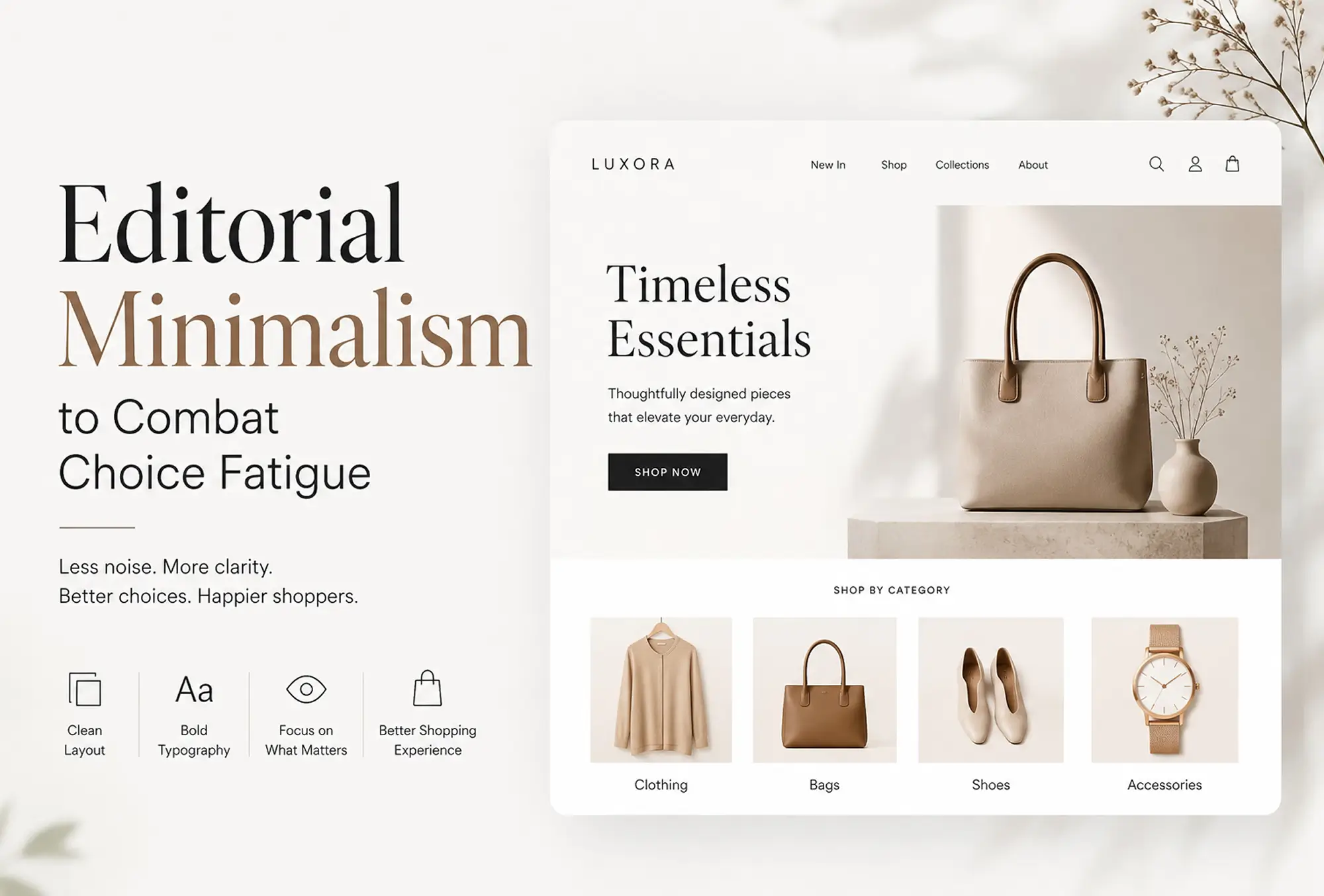
3. Editorial Minimalism to Combat Choice Fatigue
The internet suffers from a noise issue. For many years, design of e-commerce websites was based on the idea that “the more the merrier.” Web pages were filled with blinking discount clocks, turning prize wheels, chatting icons, and long lists of products. Far from helping sales, the overstimulation led to choice paralysis and made consumers close the browser without making any purchases.
To counteract this trend, today’s most successful companies are adopting Editorial Minimalism. This concept draws inspiration from high-end lifestyle and print magazines. It emphasizes spacious whitespace, bold typography, and one-product focus points.
Traditional E-Commerce Design | Editorial Minimalist Design |
Maximized screen real estate (dense grids) | Generous layout spacing and deliberate padding |
Intrusive marketing pop-ups & sticky badges | Integrated micro-copy and clean, passive notifications |
Massive walls of competing text | Bold visual hierarchy with sparse, high-impact copy |
You greatly decrease the mental effort of your customer when you reduce the options that he needs to see on one screen. The whole attitude towards the shopping process changes from crazy discount searching to luxury shopping. If the interface is beautiful, then the product becomes valuable.
4. Multimodal and Conversational Commerce
The search box is the single most important feature of any retail website but is the most commonly experienced error. For instance, if a customer enters an incorrectly spelled word or a natural spoken phrase such as "a nice warm jacket for a rainy morning hike" into a standard search engine it will return an unhelpful and frustrating screen stating "zero results found."
In next generation retail sites, rigid keyword matching will be replaced by semantic and AI-enabled conversational commerce. Customers will be able to type or talk to the search engine via the search interface and the system will understand (contextually) what the actual meaning of the words used
The future is, indeed, multimodal. Customers expect the ability to move effortlessly from voice input to typing on a screen and even to touch gestures during one interaction session. A customer may look at the virtual wardrobe layout, state aloud "Show me this top in emerald green," and see the screen update itself without selecting any options in a drop-down menu.
This demands a radical redesign of the user interface architecture. It is necessary to incorporate voice cues, feedback mechanisms and transition animations into the layout to make everything seamless for users.
Turn Trends into Conversions: How a Madbrains UX/UI Audit Unlocks Your Retail Potential
Implementing these trends isn't about guesswork; it requires diagnosing where your checkout funnel, navigation, or SaaS Product Design architecture creates friction. At Madbrains, our expert UX/UI audits identify the hidden bottlenecks capping your growth—whether you run a consumer storefront or a complex business dashboard. Let’s eliminate the obstacles in your layout, elevate your customer experience, and transform your digital platform into a powerful sales machine.
FAQs
Do I need to redesign my entire website, or can I implement these trends gradually?
Start small an audit pinpoints your biggest friction point so you can fix that first, not overhaul everything at once.How long does it take to see results after implementing UX/UI changes like these?
In most cases, there is better engagement observed just weeks after removing high-friction areas, although complete conversion optimization takes 1-3 months.
Last updated:
Mad Brains Technologies
Enterprise UX & Product Strategy Team
Mad Brains is an enterprise UX and product consultancy focused on reducing product risk and accelerating growth. Through UX audits, conversion-led design, and full-stack development, the team helps organizations build scalable digital platforms that drive measurable business outcomes.